 visuals + news apps
Improving User Engagement Through Subtle Changes: Updating the Book Concierge
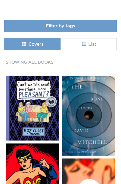
The NPR year-end 2013 Book Concierge was a big hit. Instead of writing a bunch of lists, the books team solicited over 200 short reviews by critics and staff and put them into a single, beautiful website designed to make discovering great books fun. Readers loved it. For the 2014 Book Concierge, our goal was to build on last year’s success and resist the urge to rewrite the code or wildly redesign.
This is a catalog of small improvements, why we made them, and the difference they made. We’re using analytics for the first five days following the site’s launch. Overall, pageviews are slightly down from last year (337,000 in the first five days in 2014 versus 370,000 in 2013), but engagement appears to have increased fairly significantly.
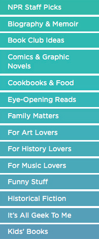
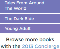
###Tag Styling In the 2013 concierge the list of tags blends together, making them difficult to scan. To improve the tags’ legibility and click-ability, we tried different color combinations and styles with varying success. We tried alternating between 2 tag colors, as well as varying the tag length, but neither were satisfying.
Our final solution was to apply a color gradient over the list of tags. This transformed the tags into individually identifiable buttons that still feel like a cohesive unit. This year, there was an average of 2.7 tag selections per visit versus 2.3 in 2013, a 17% increase. In 5 days, about 86,000 people clicked the most popular tag (NPR Staff Picks), up from about 75,000 in 2013.
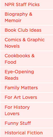
2013
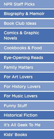
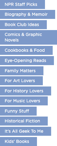
2014
###Modal Improvements
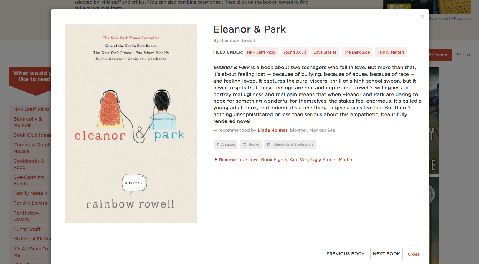
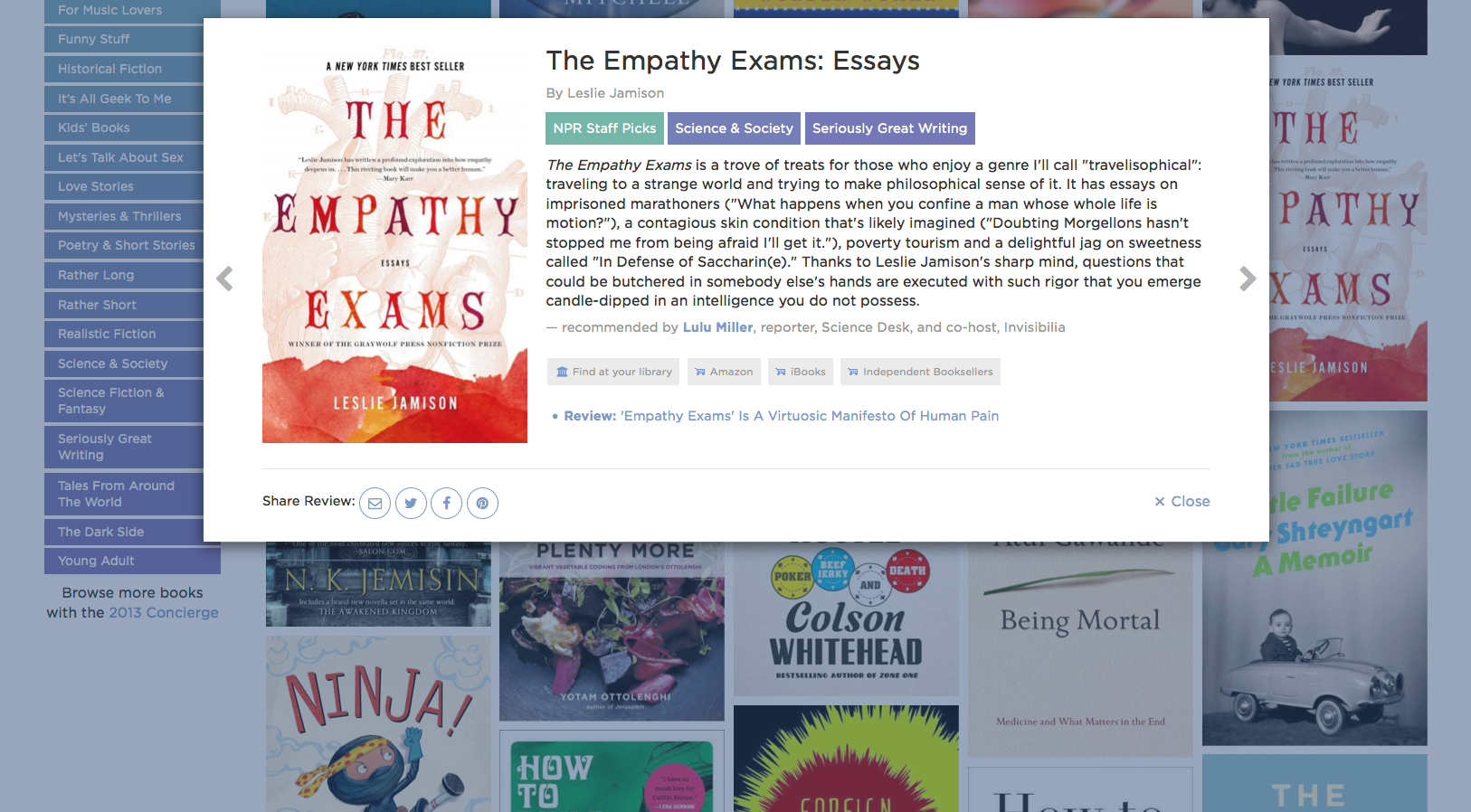
We changed the modal design to help encourage users to read more book reviews. We replaced the modal’s ‘previous’ and ‘next’ buttons — which were tucked away at the bottom of the review — with side paddles. This allows viewers to easily click through the reviews without having to hunt for the buttons at the bottom of each review. We also changed the modal proportions so that it fits into a wider range of screen sizes without forcing the user to scroll. By putting a max-width on the modal and limiting the book cover image size, we eliminated a lot of dead white space which improves the user’s reading experience. We believe these changes worked. This year, users viewed an average of 3.7 reviews per visit, up 54% from 2013.
2013</p>
2014
###Filter Button Location In the 2013 concierge the filter button is positioned in the header above the ad on mobile devices, leaving a gap between the button and the book grid. In the 2014 version, we moved the filter button under the ad below the header, grouping the button with the content that it affects. Although the tag usage per viewer on mobile is similar for both years, we thought that this change created a more organized layout.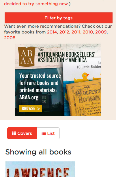
2013
2014
2014
###Lighten page load, improve performance We’ve been able to realize significant performance gains in recent projects by using custom builds of our libraries and assets. We shaved over 300kb off the initial page load by using a custom icon font generated with [Fontello](http://fontello.com/) rather than including all of Font Awesome. To further lighten the load, we dropped a few unnecessary libraries and consolidated all our scripts into a single file loaded at the bottom of the source. In 2013 each book had two images, a thumbnail for the homepage and a bigger version for the modal. This year, we cut the thumbnail and aggressively optimized the full-size cover images. The page weight is almost identical, but instead of loading a thumbnail for the cover and a full sized cover when looking at a review, only a single image is loaded. This makes load time feel faster on the homepage, and helps load the reviews faster. We also disabled CSS transitions at small viewport sizes to improve mobile performance and dropped all CPU intensive 3D CSS transitions. ### Responding to users after launch Finally, some librarians suggested to NPR Books that next year we should include a link to Worldcat, a site that will help you find a book at your local library.
2014
We thought this was a lovely idea and didn’t see why it needed to wait. So we used the Online Computer Library Center identifier API to get the magic book identifier used by Worldcat and added a “find at your library” link the day after launch. This quickly became the second most clicked exterior link after the “amazon” button. It’s always awesome to make librarians happy.