 visuals + editorial graphics
The Book Concierge: Bringing Together Two Teams, Nine Reporters, And Over 200 Books
This post is cross-posted with our friends at Source.
We started the Book Concierge with the NPR Books team about four weeks back in early November. I worked alongside Danny Debelius, Jeremy Bowers and Chris Groskopf. The project centered on Books’ annual best books review, which is traditionally published in multiple lists in categories like “10 Books To Help You Recover From A Tense 2012.” But this presentation was limiting; Books wanted to take a break from lists.
The Collaborative Process
We needed a process for working with Books. Previously, we collaborated with an external team, St. Louis Public Radio, on our Lobbying Missouri project. That project required a solid communication process. It worked out well and gave us a solid foundation to collaborate internally.
We created a separate, isolated HipChat room for the project. Web producer Beth Novey volunteered to be the rep for the Books team, and so we invited her to this chat room, which made for easy, direct communication, and we added her as a user on GitHub. We could assign her work tickets when needed. We used GitHub, HipChat, email, and weekly iteration reviews to communicate as a team.
Once we determined who our users were and what they needed, we started sketching out how the page would visually be organized. At this point, we were thinking the interface would focus on the book covers. The images would be tiled, a simple filter system would be in place, and clicking on a book cover would bring up a pop-up modal with deeper coverage. And because sharing is caring, everything has permalinks.
Implementing The Grid Layout
Isotope (a jQuery plugin) animated all of our sorting and fit the variably sized covers into a tight masonry grid. But loading 200 book covers killed mobile. So we used jQuery Unveil to lazy load the covers as the user scrolled. A cover-sized loading gif was used to hold the space for each book on the page.
Unfortunately, there were some significant difficulties with combining Isotope and Unveil. Isotope kept trying to rearrange the covers into a grid before the images had actually loaded. It didn’t yet know the exact size of the images so we ended up with books covers that were cut off and stacked up in an extremely strange ways. We ended up writing code so that as Unveil revealed the images, we would manually invoke the “reLayout” function of Isotope. As you can see, we also had to throttle this event to prevent constantly relaying out the grid as images loaded in:
There was an even thornier problem in that whenever Isotope would rearrange the grid, all the images would briefly be visible in the viewport (not to the naked eye, but mathematically visible) and thus Unveil would try to load them all. This required hacking Unveil in order to delay those events. Finding the careful balance that allowed these two libraries to work together was a tricky endeavor. You can see our full implementation here.
How The Tags UI Evolved
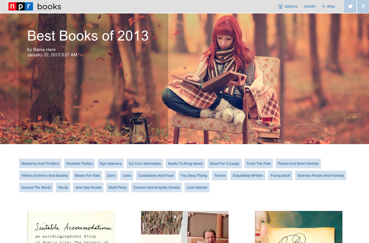
The tags list initially lived above the book covers on both desktop and mobile versions. A very rough cut (along with placeholder header art) can be seen below:
Our initial UI was oriented around a single level of tagging–books themselves could have multiple tags, but users couldn’t select multiple tags at once. Our feeling was that the data set of books wasn’t large enough to warrant a UI with multiple tags; it would result in tiny lists of just one or two books. But Books felt that the app’s purpose was to help readers find their “sweet spots” or each person’s perfect book. They also tagged each book in great detail, which ensured that there were extremely few two-tag combinations with only a few books in them.
Our interface focused heavily on the book covers. But Books felt that the custom tags were more of a draw–you can browse book images anywhere, but you can only get these specific, curated lists from NPR. Brains over beauty, if you will.
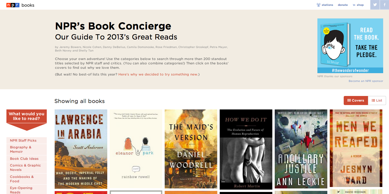
In the end, we agreed that multiple levels of tagging and drawing more attention to the tags were necessary to the user experience. In our final design, the tags list lives to the left of the book covers. A “What would you like to read?” prompt points readers toward the tags.
On mobile, we thought we would just use drop-down menus to display the tags list. However, the iOS 7’s new picker is super difficult to navigate and results in a bit of helpless thumb mashing. The low contrast makes the text hard to read and notice; the hit areas are smaller and difficult to navigate; etc. So we eschewed drop-down menus in favor of a tags list that slides in when a button is hit.
All of these UI changes were made to better present the tags and to allow for the multiple-tag functionality. It took about three weeks to develop/finish the project, and everything launched by the fourth week. Two teams, nine reporters, over 200 books, and one Book Concierge.
Check us out
Wanna see our code? You can find it here on our GitHub page. Don’t hesitate to get in touch with any questions or feedback.