 visuals + editorial graphics
Putting Radio On The Television
For election night 2014, we wanted to do something different.
We guessed that the dedicated wonks — the ones who want to drill down into detailed data and maps — would probably go to sources like the New York Times or Washington Post. Rather than reproduce that work, what could NPR do that would be unique, and would serve a broader audience?
To start, we had our organization’s thoughtful reporting and on-air coverage — a live event we could build something around. We had the results “big boards” we make every election year for the hosts in the studio (and shared publicly in 2012 — a surprise success). We had a devoted audience.
So we decided to throw a party — and put radio on TV.
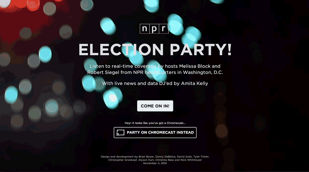
We built an app that people could pull up on their TVs or laptops or mobile phones and leave on in the background during their election parties. We imagined users muting cable news and listening to us instead — or even replacing cable news entirely for some users. We built in Chromecast support and made reaching out to cord-cutters part of our marketing pitch.
Did it work? Here’s what we learned.
Note: The usage figures cited below refer to a one-day slice of data: Nov. 4, 2014 (EST). The practice of measuring web usage is an inexact science — time on site is particularly problematic — so all of these figures are best read as estimates and used for relative comparison, not absolutes.
Traffic / Usage
| Overall | 7 minutes, 01 second |
| Desktop | 10 minutes, 19 seconds |
| Tablet | 5 minutes, 52 seconds |
| Mobile | 2 minutes, 57 seconds |
| Desktop | 54.5% |
| Mobile | 33.6% |
| Tablet | 11.9% |
| Chrome | 41.1% |
| Safari | 21.8% |
| Safari (in-app) | 17.5% |
| Firefox | 11.5% |
| Internet Explorer | 5.0% |
(Chrome usage likely also includes Chromecast. Safari (in-app) figures reflect users opening links within iOS apps, such as Twitter and Facebook.)
Browser usage of our app generally tracked with that of the overall NPR.org site. Exceptions: The share of Chrome users was a few percentage points higher for our app; the share of Internet Explorer users, a few percentage points lower.
Non-Interactivity
This project involved a lot of a little experiments aimed at answering one larger question: Will users appreciate a more passive, less-interactive election night experience?
As it turns out, this is a remarkably difficult thing to measure. We can’t know if our users put their laptop down on the coffee table, if they were with friends when they used it or if they plugged their laptop into their TV. Instead, we have to make inferences based on session duration and our relatively meager event tracking.
Overall, the feedback we received was quite positive. We prompted people to email us, and most of the folks who did so said they were happy with the experience.
Slide Controls
Although we optimized for a passive user experience, we needed to include some controls. From the very beginning our stakeholders asked for more control over the experience. We made an effort to balance this against our belief that we were building more for a distracted audience.
For passive users, each slide included a countdown spinner to signal that the display would change and to indicate how much time remained until the app would auto-advance to the next slide.
For more active users, we included “previous” and “next” buttons to allow users to skip or return to slides. 27 percent of users clicked the “next” button at least once to skip, while 18 percent used the “previous” button. 11 percent figured out that they could skip slides using their keyboard arrow keys. (We didn’t include any clue to this feature in the UI.) About a third of those who emailed us said they would have liked even more control, such as a pause button.
Audio Controls
The live radio broadcast would auto-play when users entered the app. 8 percent of users clicked the mute button. (Not including users who may have used the audio controls on their devices.)
Personalization
We guessed that, in addition to national election results, users might also want to see results for their state.
Our original plan was to ask our users to choose their state when they arrived. But as we learned from user testing and fine-tuned the welcome process, we killed the intermediary “pick your state” screen. Instead the site would guess the user’s location, and users could change their state via the controls menu.
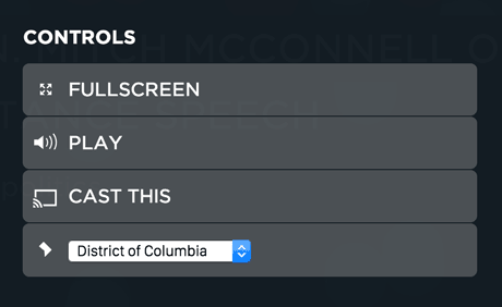
6 percent of users interacted with the state dropdown. The list of top states users switched to hints at interest in certain contentious races (Senate seats in Kentucky and Colorado, for example), regardless of where the user was actually located.
- Kentucky
- Colorado
- California
- Florida
- Arkansas
We heard feedback that some users who did use the dropdown were unsure of its purpose. If we had more time, we might have put more time into this feature. We hoped that if our attempt at presenting location-specific results worked seamlessly for most users, it would be okay.
The Chromecast Hypothesis
Our working theory was that Chromecast users would be the most passive in their interaction with the app — likely throwing it up on the TV and just letting it run — and therefore they would spend more time with it. And that theory held true: Chromecast users spent an average of 19 minutes and 53 seconds on the site (compared to the overall average of 7 minutes and 1 second).
That said, the Chromecast audience was pretty small: In only 0.7 percent of visits did a user initiate a Chromecast session by clicking on one of our “Cast This” buttons. (This does not include users who may have cast the page using the Chrome browser extension.) But we heard from many Chromecast users who seemed very excited that we built something for them: 15 percent of the feedback emails we received and 13 percent of tweets talking about the app mentioned Chromecast.
(We originally intended to also support Roku and AirPlay “casting,” but the native Chromecast experience proved to be far superior to the “mirrored” offered by other devices. We hope to continue experimenting in this arena.)
On a related note, one surprise: 3 percent of users clicked the fullscreen button — more than double our Chromecast users. And these users stayed on the site even longer, an average of 31 minutes, 38 seconds.
Conclusion
This project gave us some useful insights into how users interact (or not) with an app designed to be experienced passively.
We also learned a lot about user analytics, from what behavior to track to how to query for results. Our insights were limited somewhat by the tools we had and our ability to understand them — Google Analytics can be pretty opaque.
On all these counts, we’ll continue to try new things and learn with future projects. We look forward to refining this experiment as we plan for the 2016 elections.