 visuals + editorial graphics
Let’s tesselate: Hexagons for tile grid maps
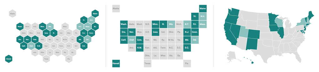
A hexagon tile grid, square tile grid and geographic choropleth map. Maps by Danny DeBelius and Alyson Hurt.
As the saying goes, nothing is certain in this life but death, taxes and requests for geographic data to be represented on a map.
For area data, the choropleth map is a tried and true visualization technique, but not without significant dangers depending on the nature of the data and map areas represented. Clarity of mapped state-level data, for instance, is frequently complicated by the reality that most states in the western U.S. carry far more visual weight than the northeastern states.
Are more northeastern states shaded than western? That’s hard to say with this type of choropleth. Whatever, though. West coast, best coast, right?
While this presentation is faithful to my Californian perception of the U.S. where the northeast is a distant jumble of states I pay little attention to, I’ve learned in four years of living in D.C. that there are actually a lot of people walking around that jumble, and they’d prefer not to be ignored in mapped data visualizations. There are approximately 74 million people living in the thirteen states the U.S. Census Bureau defines as the Western United States, while around 42 million people live just in the combined metropolitan statistical areas of New York, Washington, Boston and Philadelphia.
One popular solution to this problem is the cartogram — maps where geography is distorted to correspond with some data variable (frequently population). By shading and sizing map areas, a cartogram can display two variables simultaneously. In this New York Times example from the 2012 election, the size of the squares corresponds to the number of electoral votes assigned to each state, while the shade represents possible vote outcomes. NPR’s Adam Cole used this technique to size states according to electoral votes and ad spending, as seen in the map below. Cartograms can be a great solution with some data sets, but they introduce complexity that might not serve our ultimate goal of clarity.
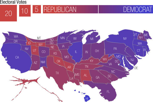
A cartogram of the U.S. with states sized proportionally by electoral votes. Map by Adam Cole.
Recently, a third variation of choropleth has gained popularity — the tile grid map. In this version, the map areas are reduced to a uniform size and shape (typically a square) and the tiles are arranged to roughly approximate their real-world geographic locations. It’s still a cartogram of sorts, but where the area sizing is based on the shared value of one “map unit.” Tile grid maps avoid the visual imbalances inherent to traditional choropleths, while keeping the map a quick read by forgoing the complexity of cartograms with map areas sized by a variable data point.
Tile grid maps are a great option for mapped state data where population figures are not part of the story we’re trying to tell with the map. Several news organizations have used this approach to great effect, including FiveThirtyEight, Bloomberg Business, The Guardian, The Washington Post and The New York Times.
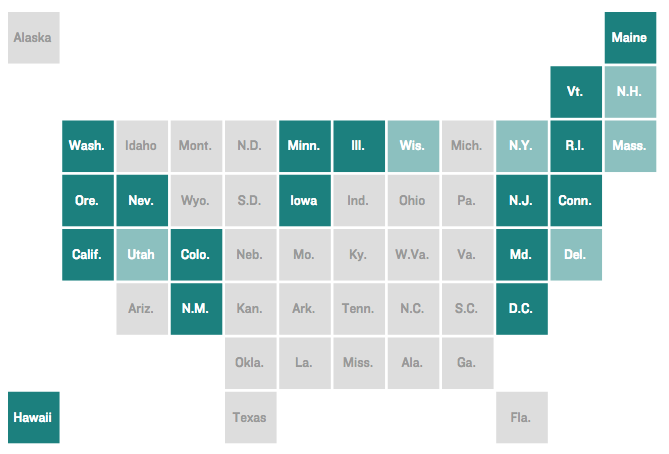
A square tile grid map.
Here at NPR, we recently set out to create a template for quickly producing this type of map, but early in the process my editor Brian asked, “Do the tiles have to be squares?”
More specifically, Brian was interested in exploring the possibility of using hexagons instead of squares, with the assumption that two additional sides would offer greater flexibility in arranging the tiles and a better chance at maintaining as many border adjacencies as possible.
The idea was intriguing, but I had questions about sacrifices we might make in scanability by trading the squares for hexagons. The columns and rows of a square grid lend to easy vertical and horizontal scanning, and I wondered if the tessellation of hexagons would provide a comfortable reading experience for the audience.
Here is Brian’s first quick pencil sketch of a possible state layout using hexagons:
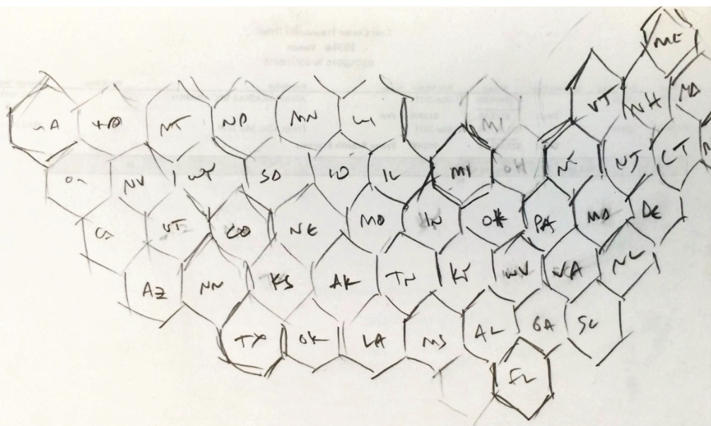
Brian’s hex grid sketch.
That proof of concept was enough to convince me that the idea was worth exploring further. I opened up Sketch and redrew Brian’s map with the polygon tool so we could drag the states around to experiment with the tile layout more easily. We tried several approaches in building the layout, starting from each coast and building from the midwest out, to varying degrees of success.
Ultimately, I decided to prioritize accuracy in representing the unique geographic features of the U.S. border (Texas and Florida as the southernmost tips, notches for the Great Lakes) and making sure the four “corners” of the country were recognizable for orientation.
The final layout that will power our tile grid map template looks like this:
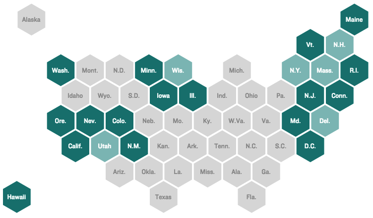
Six sides instead of four! That means it’s two better.
This map still has many of the same problems that other attempts at a tile layout of the U.S. have fallen into — the relationship of North and South Carolina, for one example — but we like the increased fidelity of the country’s shape the hex grid makes possible.
In case you were wondering, news dev Twitter loves talking about maps:
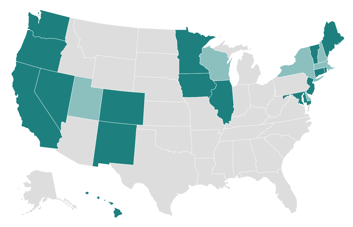
We recently published our first use of the hexagon tile grid map to show the states that currently have laws restricting discrimination in employment, housing and public accommodations based on sexual orientation, gender identity and gender expression. The hex grid tile map also made appearances in several presentations of last week’s U.K. election results, including those by The Guardian, Bloomberg Business and The Economist.
What do you think? Vote in the poll below!