 visuals + editorial graphics
Do visual stories make people care?
Since we published Borderland in April of 2014, the NPR Visuals Team has been iterating on a style of storytelling we call “sequential visual stories.” They integrate photography, text, and sometimes audio, video or illustration into a slideshow-like format. My colleague Wes Lindamood already wrote more eloquently than I can about the design approach we took to evolving these stories, and you should absolutely read that.
In this blog post, I will use event tracking data from Google Analytics to evaluate the performance of certain features of our sequential visual storytelling, focusing on our ability to get users to start and finish our stories.
With a few aberrations, we have consistently tracked user engagement on these stories and, with over 2 million unique pageviews on our sequential visual storytelling, we can come to some conclusions about how users interact with this type of storytelling.
Why Do This?
At NPR Visuals, our mission is to make people care. In order to determine whether or not we are making people care, we need a better tool than the pageview.
You may have heard the Visuals Team recently received a Knight Prototype Grant to build a product we’re calling Carebot. We’re hoping the Carebot can help us determine whether people cared about our story automatically and quickly. Consider this exploration a very manual, very early, very facile version of what Carebot might do.
Clear Calls To Action Work
A consistent feature among our set of stories is a titlecard that presents a clear call to action, often asking users to “Go” or “Begin”, which advances the user to the next slide. Using Google Analytics, we were able to track clicks on these buttons. Of the 16 stories we tracked begin rates on, nine of them have begin rates of greater than 70%.
For the stories where begin performance fell flat, we can point to a clear reason: “Put on your headphones” prompts or similar notices that audio will be a part of the experience. Of all users who saw a titlecard without an audio notice, 74.4% of them clicked to the next slide. If an audio notice was on the slide, only 59.8% of users faced with that titlecard moved forward. The lowest performing titlecard was on prompted users to “Listen” instead of “Begin.”
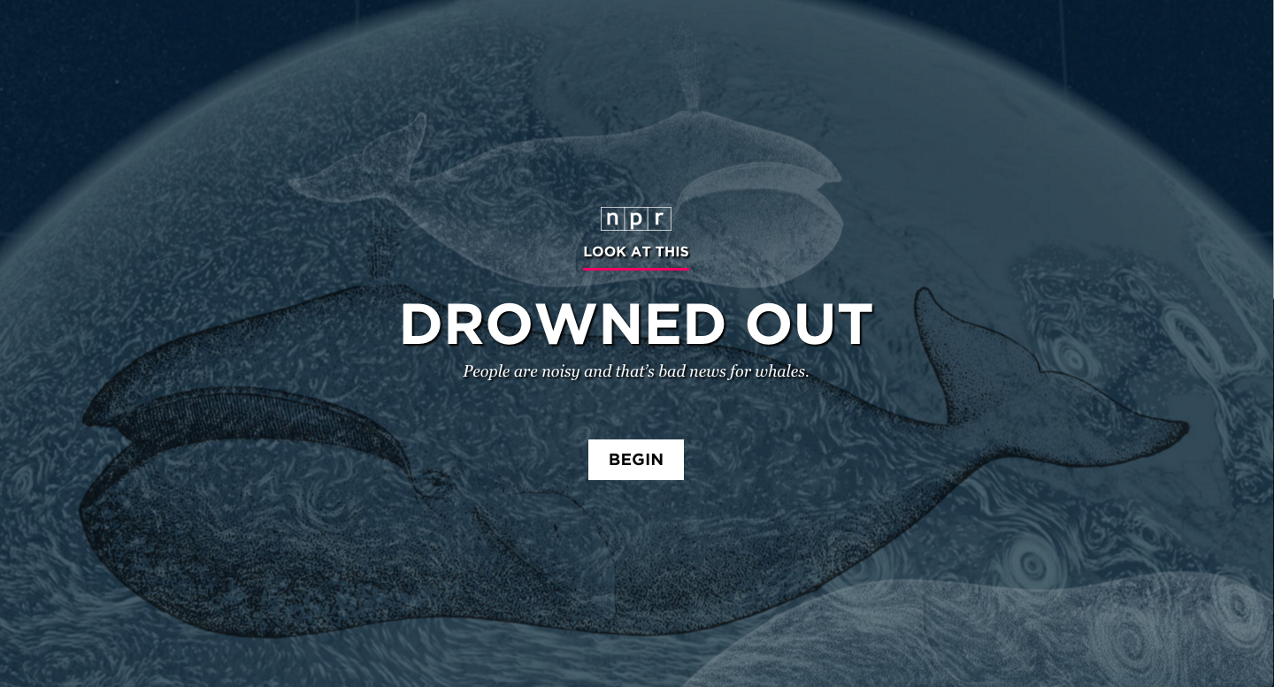
It is also worth noting that we have tried audio notices at other places in our stories, and we see similar levels of dropoff. In Drowned Out and Arab Art Redefined, we placed the audio notice on a second slide. With Drowned Out, only 61.28% of users got past both slides, while with Arab Art Redefined, only 44.3% did. Though these are two examples with lower traffic than most stories, it seems clear that this is not a more effective way of getting users into the story.
Does this mean we should remove audio notices from titlecards? Or stop doing sequential visual stories that integrate audio altogether? Not necessarily. As we will see later, stories with audio in them perform better in other aspects that filter out the begin rate.
People Read — Or Watch! — Sequential Visual Stories
One of the most important metrics for determining the success of our stories is completion rate. Completion is defined as when a user reaches the last slide of content in a sequential visual story.
We can calculate the mean completion rate for our sequential visual stories by taking the overall completion rate of each story, adding them together, and dividing by the total number of stories. This places equal weight on each story rather than letting certain stories with outsized traffic numbers skew the results.
Across our sequential visual stories, this method shows a 35.4% completion rate on average.
Compare that to Chartbeat data about the average web page, where 55% of users spend less than 15 seconds on a page. Chartbeat never talked about completion rate, but if the average web page were to compete with our sequential visual stories, 85-90% of users who spend more than 15 seconds with a page would have to finish the page. That seems unlikely.
However, completion rates varied wildly across stories. In our first sequential visual story, Borderland, we only acheived a completion rate of 20%. It was also 130 slides long, nearly twice as many slides as any other sequential visual story we’ve done. Meanwhile, The Unthinkable, a heavy story about the “war on civilians” in Yemen, managed a completion rate of 57.6%, our highest ever. It clocked in at 35 slides.
Despite these two data points, there seems to be no correlation between number of slides and completion rate. For example, Plastic Rebirth, a relatively quick story about plastic surgery in Brazil, only had 33 slides and had completion rate of 33.2% (which is a number we were still pretty happy with).
A Better Completion Rate
However, as demonstrated by the wide variance in begin rate across stories, completion rate is highly influenced by the ability for the titlecard to entice people to continue into the story. So I created a new metric, what I call “engaged user completion rate,” to find which of our stories were doing the best at pulling an engaged user all the way through. Engaged user completion rate uses the number of users who began the story as the denominator instead of the number of unique pageviews.
Our average engaged user completion rate across stories was 50.9%. But the data gets more interesting when we start dividing by story subtypes — particulary the divide between stories that integrate audio and those that do not. In that divide, the average engaged user completion rate for stories with audio is 54.5%, compared to 48.5% without.
(Note that for all of these calculations, I considered “beginning” the story getting after the audio notice on the second slide in the case of Drowned Out and Arab Art Redefined.)
So what’s the answer? I think the jury is still out on whether integrating audio into our sequential visual stories makes them perform better or worse because our sample size is still quite small, but early indicators point towards them being better for users that choose to engage. However, A Photo I Love: Reid Wiseman is our highest performing story overall with regards to engaged user completion rate, so we have evidence that at its best, combining audio and visuals can make a compelling, engaging story.
So, Did We Make People Care?
Maybe? It’s clear that we are achieving high completion rates even on our lowest performing stories. Consider that Borderland, our lowest performing story with a completion rate of 20.1% and engaged user completion rate of 31.6%, was over 2,500 words long.
Of course, in order to determine how successful we were, we often track other metrics such as shares per pageview, as well as qualitative measures like sampling Facebook comments and Twitter replies.
Ultimately, making people care is about the quality of the story itself, not about the format in which we tell it. But I think that, with stories where text plays a large role, we are capable of making people read stories longer than they normally would because of how sequential visual storytelling allows us to pace the story.
Of course, this is not an argument for telling all stories in the sequential visual story format. Sequential visual stories work when the visuals are strong enough for the treatment. Not all of our stories have worked. But when they do, we can tell important stories in a way that pulls people through to the end.
To truly evaluate the success of our sequential visual stories, it would help to see data from other organizations who have tried this type of storytelling. If you have insights to share, please share them with me in the comments, on Twitter or through email at tfisher@npr.org. Or, even better, write a blog post!