 visuals + editorial graphics
How we built White Lies
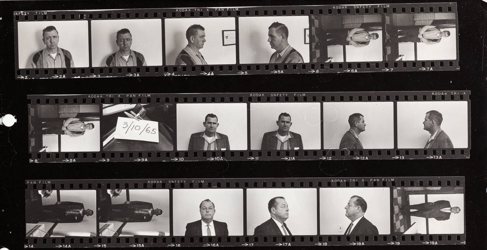
NPR’s new podcast White Lies re-investigates a civil rights era cold case and its legacy in modern-day Selma, Ala. To introduce the case — and the podcast — to a digital audience, the News Apps team worked in an interdisciplinary group to create a visual primer, including audio clippings, documents from the FBI case file and archive photos.
Design goals
In keeping with our hypothesis-driven design process, we started the project by identifying likely audiences for our digital experience, the contexts by which they’d come to the site (via a promo on social, etc.) and their expectations. With that audience exercise in mind, we decided on a few primary editorial goals for the project:
- Provide a standalone narrative for people who only encounter the story on the web (and may or may not go on to subscribe to the podcast)
- Intrigue readers and entice them to listen to the full podcast
- Provide multimedia material that couldn’t fit into an audio-only experience
- Introduce newcomers to the history surrounding the murder, including Bloody Sunday and the civil rights struggle
Notably, we didn’t want to use this page to play the podcast directly — NPR already has a podcast directory for that. We also didn’t want to spoil the podcast’s big reveals or try to cover the entire scope of the investigation. That provided some leeway with our narrative and design. A content audit gave us a better idea of what assets we had to work with — and what we needed to acquire.
We also looked at stories that other newsrooms had done, to see what kinds of storytelling approaches would be a good match — and also to establish some common vocabulary and reference points among team members. In particular, we were struck by the Washington Post’s story on the 1968 riots in DC, which combined different kinds of audio and video with a directed map of incidents. This kind of “scrolly-telling” interactive has become more common over the last few years, and is something that I’d worked on before, but it was a first for NPR.
Scenes and directors
The appeal of a scroll-linked interactive is simple: it requires only one “verb” — scroll — to interact with the page, one that’s already natural and intuitive to users. It’s also easy to make accessible: Instead of content being hidden and shown in JavaScript, these presentations place the primary content in the standard document layout, and only update the background layer in reaction to the visibility of certain elements.
Here’s the main code loop for triggering updates. It’s not too long — only about 50 lines.
Our code is entirely custom, but it’s very similar to frameworks like Scrollama. A listener registered to the window’s scroll event checks our foreground text blocks until it finds one in the window viewport, then calls a “director” function that matches the element’s declared type (image, audio, or map animation).
When their enter() function is called, directors examine the current block and make adjustments based on the attached metadata. For example, the image director sets the primary image from the block’s ID, but also creates a faded backdrop for texture on small screens. The fancier scene types may chain multiple directors together: for example, a map scene processes its own animations, but then yields to the audio director if there’s a clip to play with that particular view.
Each director also has an exit function, which is useful for halting any long-running processes (like animations or audio/video playback) or hiding the player UI. Unlike most scroll libraries, we only call exit() for a director when the scene type changes, since we have persistent elements in the map and audio scenes, and don’t want to risk interrupting our CSS transitions or animations.
We defined our sequence of scenes, along with most other text and content on the page, using ArchieML stored in Google Docs. A build task in our interactive template downloads the text, strips out comments, and then feeds that data into the templating engine for construction. Collaborating this way made it easier for non-technical team members to edit text, swap images or layouts, and assign tasks to each other.
Hear here
The audio player was by far the most complicated portion of the code, and the part that saw the most iteration. You may think to yourself, “HTML5 added the <audio> tag more than eight years ago. How hard can it be?” Oh, my friends, if only it were that simple.
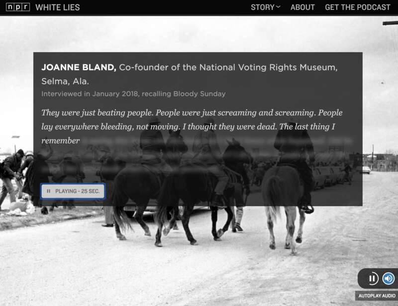
For each block marked “audio” in the source document, we indeed create an <audio> tag in the markup. Early prototypes of the page added controls to those tags so that they could be played inline. But it felt clunky to click through for sound when everything else updated automatically. I soon hid the tags themselves and built a player UI that would trigger playback when the text entered view — and halt it when the reader scrolled away. A VTT file is used to reveal the transcript as the clip plays, giving the reader the feeling that the words are being spoken into existence.
Here’s where things get complicated, because most browsers — mobile and desktop — no longer simply let you bombard your users with autoplaying music or speech the way they did back in the days of <bgsound> (RIP to my website’s MIDI soundtracks in the 90’s). Instead, the user has to indicate via a “gesture” (usually a click or tap) that they’re interacting with the page. You have to start playback immediately, or you lose permission. We iterated for a long time on how to get that gesture, but in the end the simplest solution won out: A big blue “Explore” button at the top of the page starts up the first clip and automatically scrolls down. If users skip it on the first slide, a floating button gives them (and our code) a chance to turn autoplay on (or off) whenever there’s a clip nearby.
The next pothole on the road to audio can be summed up in one word: Safari. Unlike other browsers, iPhones and iPads don’t grant autoplay permission for the whole page – only for a specific element. They also refuse to load media resources beyond an (undocumented) limit that may vary by device. The solution was to give our player the ability, if it sees that it’s running in Safari, to proxy audio through a single offscreen <audio> element, dispatching fake time and playback events back to the original element for our UI code to handle. It’s a hack, but an acceptable one.
Editorially, we understand that most readers on the page won’t play audio (something that analytics backed up after publication). The team made sure that the audio enriched the visuals but wasn’t required to understand the story. I’m still glad we put in the effort for those who are interested and able to listen. I think it creates a richer, more textured experience, and highlights the stellar work that went into the interviews and evidence in the podcast itself.
Mapping the attack
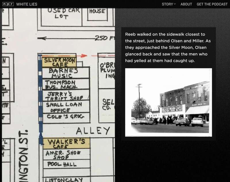
One of the most striking visual artifacts that we had from the investigation was a map from the FBI case file that showed the path the ministers took through downtown Selma before and after the attack on Jim Reeb. We weren’t always sure how we wanted to incorporate this into the story, but we knew it would definitely play a role. To add annotations and animation to the map, I used a technique that I’ve found valuable for scrolly-telling in the past: dynamic pan and zoom.
The Scalable Vector Graphics format is a common tool for creating data visualizations and illustrations on the web from text markup. If you’ve seen any of our daily graphics over the last five years (or indeed, almost any D3 graphic), you’ve been looking at an SVG. Every vector graphic (implicitly or explicitly) includes a view box, which defines the coordinate system of its contents. Shapes outside of the viewbox still exist, but they’re not shown on screen. In my opinion, this simple but powerful tool is bizarrely underused.
By updating the viewBox attribute, we can effectively tell an SVG to move its “camera” around a larger scene, panning and zooming on demand. The preserveAspectRatio attribute gives us control over how it art-directs that view (including alignment and sizing). In our case, I placed the map into an SVG, then added lines and rectangles to highlight key buildings and paths. Then, using the getBBox() method to retrieve the target coordinates, I dynamically associated scenes in our scrolling document with specific locations on the map.
By default, transitions between camera positions are relatively slow, so that they give users a chance to orient themselves, and don’t distract from the text. However, users with vertigo, vestibular disorders or motion sensitivity may find this full-screen motion unsettling. By checking the prefers-reduced-motion media query, and eliminating the transition time if it’s set, we were able to easily accommodate those users while still providing them with detailed views of the map.
A visual record
Projects like this launch for White Lies are the product of many people with different specialties working together to assemble complex pieces into a coherent whole. Along with myself and Alyson Hurt from News Apps, the team included photo editors Nicole Werbeck and Ben de la Cruz, UX designer Scott Stroud, and writers/producers Nicole Beemsterboer and Cat Schuknecht (who also produced the White Lies podcast). Desiree F. Hicks edited the digital story, along with Meg Anderson and Susan Vavrick.
Unfortunately, we probably won’t be able to open-source the entire code repository, since there’s a lot of archival and rights-encumbered material in the final presentation. However, we hope to be able to re-use much of this work, and when that happens we will make available what we can. You can browse through a gist with the code blocks described in this post. We’ve also published this project with source maps turned on, so that you can view the pre-compilation JavaScript through the dev tools in your browser to see how it works.