 visuals + editorial graphics
Retrospective: WBEZ's summer recommendations
The News Apps team builds tools for our own use, but we exist in a larger ecosystem of people who use, adapt, and improve those tools–both inside public media and outside. This year, we’re working on initiatives to collaborate more closely with our Member stations, and so we’re pleased to present this guest post from WBEZ, which has been using NPR’s toolset for their big digital projects. If you have a similar story, we’d love to hear from you. Drop us a note at nprapps@npr.org.
I’m Paula Friedrich, a digital producer at WBEZ in Chicago. I recently built WBEZ’s crowdsourced summer activity guide, which is a filterable list of 400 recommendations we gathered from our audience through a Google Form.
The project was inspired by conversations reporter Natalie Moore and Morning Shift producer Dan Tucker had on Twitter about how many “Best of Chicago” lists gloss over the South and West Sides. In those threads, people eagerly recommended their favorite places in those parts of town, which sparked the idea to make a summer activity guide built in collaboration with our audience.
Step One: Framing the ask
When I pitched this project, my editor Shawn Allee had the smart insight that we were essentially offering the audience two products: the experience of making something with us and a tool for summertime inspiration.
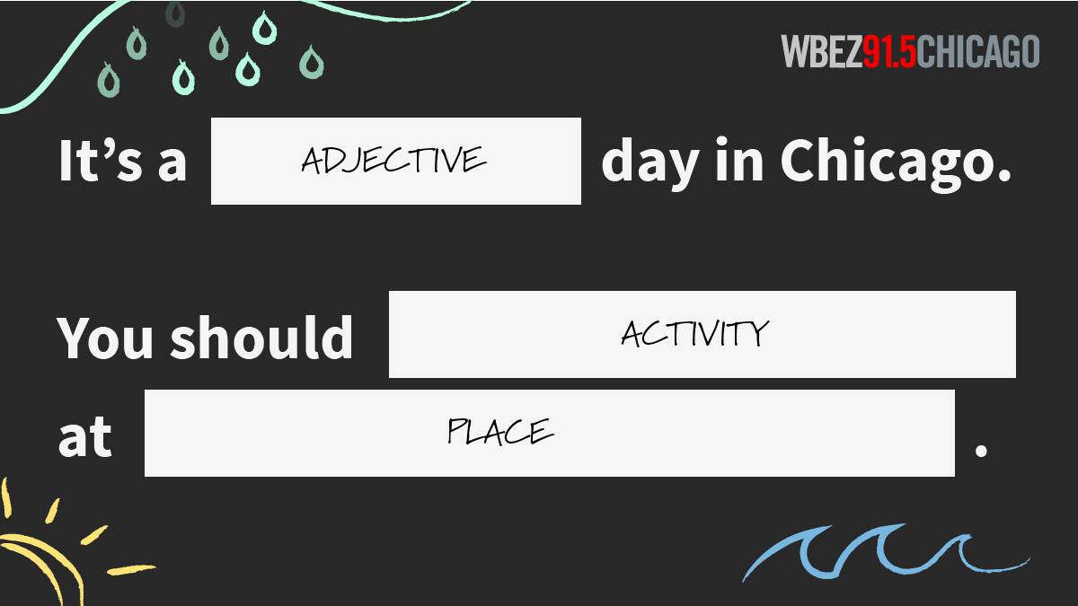
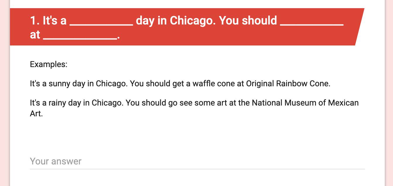
A small group of reporters, producers and editors from across the organization helped me come up with a prompt that would make the act of contributing interesting and delightful: Mad Libs style fill in the blanks.
I used Google Forms to collect submissions because it’s free and because it automatically dumps your responses into a Google Sheet. The latter is important because it’s ultimately how I would end up pulling the submissions into the app, thanks to functionality built into NPR Visuals’ Interactive Template. (The Interactive Template is a tool that neatly sets up the foundation of an interactive project, a common workflow in newsrooms.)
However, Google Forms also offered an architectural challenge, because it doesn’t offer the kind of Mad Libs, multiple fill-in-the-blank answer option I needed. In order to make sure I’d get the kind of answers we wanted, I recruited some members of WBEZ’s Sounding Board — a group of audience members who volunteer to give us feedback on our work — to test a few different iterations of the form. This helped me figure out how best to set it up, taking the form from something like this:
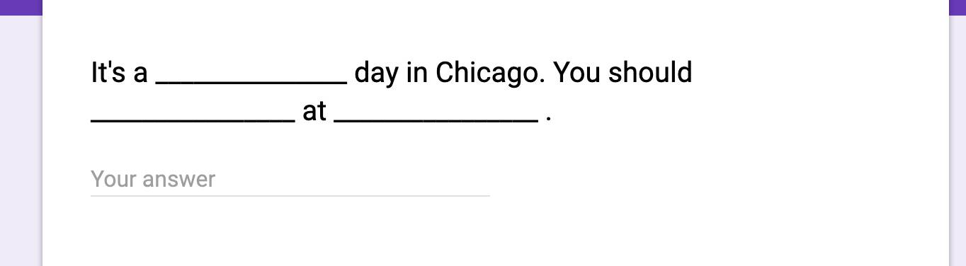
To this:
I used a Google’s header module for the question and left the actual question space blank. This allowed me to offer examples in a way that wasn’t visually confusing and didn’t leave users thinking they could click into the blanks.
Here’s a template you can use if you’d like to do a similar fill-in-the-blank project
(That said, if I were to do this project again, I’d probably make a few changes, for reasons I’ll get into below.)
Step Two: Decide how to present the data
We got responses from some 300 people, each of whom responded to 3 prompts, totalling about 900 submissions.
Given the large number, we knew we wanted to design a way for our audience a way to explore the submissions on their own. I looked at a few different ways others had approached this concept, including NPR’s Book Concierge and Eater’s maps. I also paid close attention to the filtering on shopping sites and read a few blog posts about design patterns for filtering.
These are some of the design ideas we decided against:
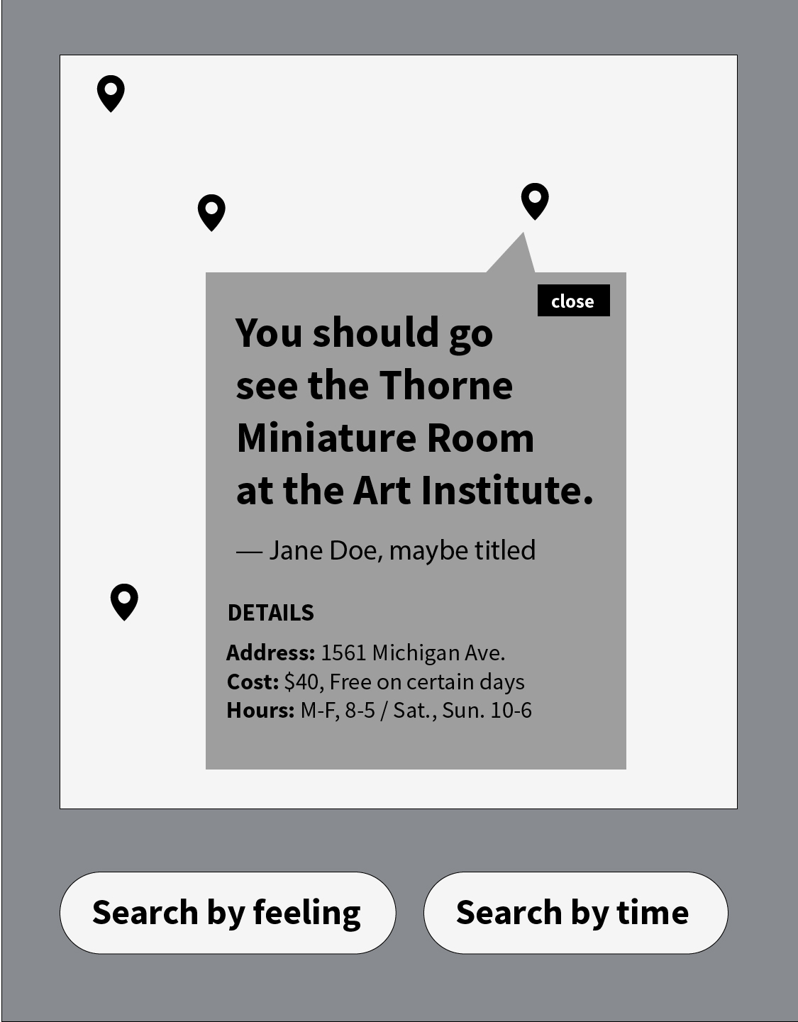
Using a map as the main UI. It was important to showcase the goofy, sometimes poetic human nature of what we had to offer rather than hide it behind a map marker.
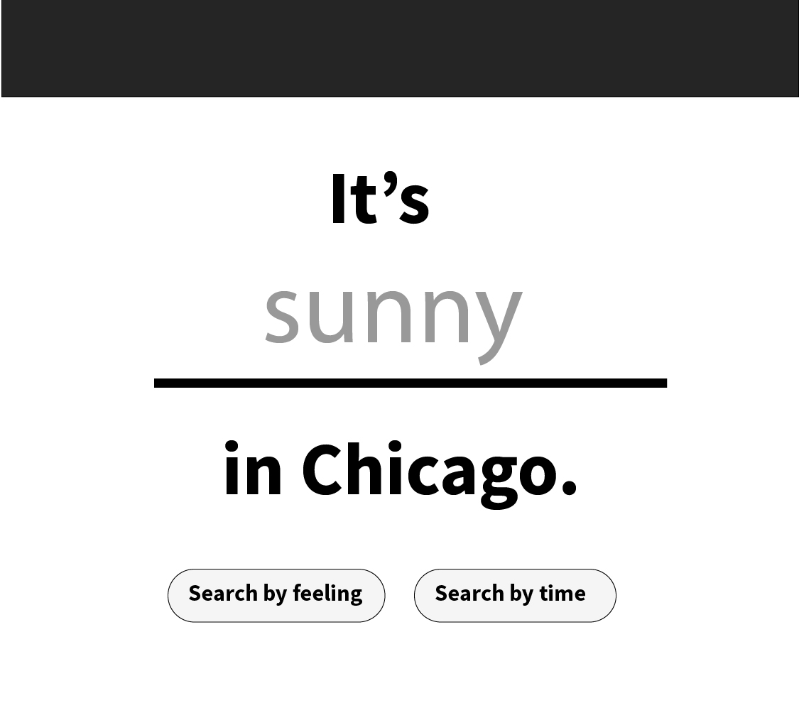
Using the “It’s a _____ day in Chicago” piece of the prompt as a search mechanism. There was no guarantee that someone who found this page would be familiar with our original crowdsourcing campaign, which would make this concept difficult to understand and use. Additionally, we wanted users to be able to see all their filtering options, rather than having to take a stab in the dark. These parts of the submissions ended up informing the filters we added in the final iteration.
Step Three: Prepare the user-generated data publication
Editing and cleaning up these responses was the most labor-intensive part of the process.
There were three prompts, meaning we got up to three responses from each person. Each response filled in three blanks: the adjective blank, the activity blank and the place blank. Each submission needed to be its own row and each blank needed to be in its own column.
To start, all three responses were in one row per person. Despite my best efforts, some responses came in as full sentences, while others came in as lists separated by semicolons or commas.
Since most responses were in sentence format, I used regex formulas to split up each responses.
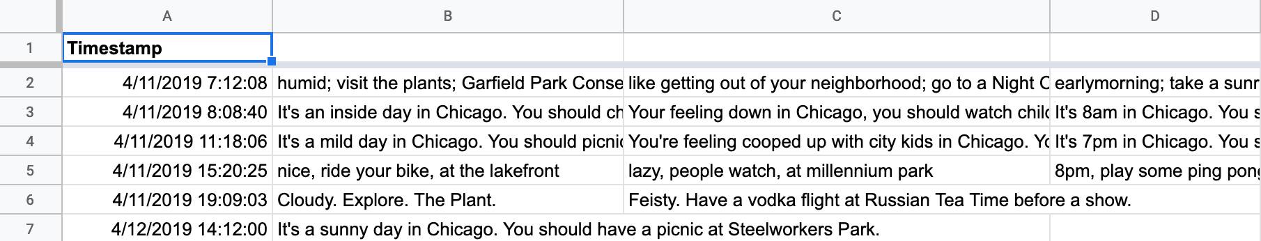
I made three new sheets, each containing the responses to one of the prompts. From there, regex formulas split each response into three columns: adjective, activity and place. Here’s an example:

The formula in column H (=regexextract(B1, "It's(.*)in Chicago")) isolates the adjectives. The “activity” and “place” columns contain similar formulas which isolate the activity and the place from the sentence.
This got most of the responses into the correct columns. For submissions that were separated by commas or semicolons, I manually added the correct language so that the formula would split them up correctly. Some other hiccups: curly quotes and words with “at” in the middle, like “Garfield Park Conservatory.”
Since we had three different prompts, this process was repeated in a separate sheet for each prompt. Once each sheet was cleaned, I combined those into once more sheet called “all_recs”.
It was important to keep all these steps in separate sheets so I could always refer back to the original sheet with original responses, in case I made a mistake somewhere down the line.
Step Four: Lots and lots of manual editing
Once everything was split up into different columns and rows, I made one last sheet to start editing out:
- Duplicates
- Suggestions that were amazing but that we probably shouldn’t actually encourage anyone to do, like: ‘You should hop the fence at the Grant Park Band Shell, focus and give your best “I’m off the deep eeeend..watch as I dive in… I’ll never reach the grooooound…”’
- Anything that seemed too self-promotional or like obvious advertising
- One-time events
Once we decided which ones to use, I added columns for addresses and latitude and longitude to power a map component in the design.
And then finally: copy edit and fact check every entry.
Step Five: Putting it all together with Vue
At this point, I had worked through a few edits on wireframes, done some very basic user testing with members of our Sounding Board, and had a pretty good idea how the final product would look. On projects like this, I’m far more confident when I’m designing the thing than when I’m writing the code that’ll make it function. Tools like the Interactive Template are a big help when it comes to understanding how to set up and deploy a project. Another tool that helped ease the development of this project was Vue, a component framework.
The basic concept of a framework like Vue: You describe how you want your page to look once, including variables for elements that may change, and then your page will update when you update variables in your JavaScript code.
With Vue, developing a filterable list felt magically fast, because I didn’t have to worry about getting user input or hiding cards — Vue took care of that for me. I just had to write my template and a little bit of logic to filter my list.
Step Six: Next steps and more platforms
The response from our audience has been pretty good: Engaged time on Chartbeat is more than double that of our average story and we’re getting double the typical conversion rate for newsletter subscribers on this story.
There’s a lot of ways to improve and iterate on this project. While we got submissions from all over the city, certain areas were still underrepresented. With a few tweaks, the code for the presentation becomes a pretty solid template, so if we were to do this again, I’d be able to spend less time on the mechanics and design and spend more effort and attention on gathering and categorizing submissions. For example, I’d consider spending some time asking for recommendations in person in the areas that were underrepresented in this iteration. I’d also include fewer prompts on the initial form, instead asking folks to give us an insider tip to go along with their recommendation.
There are also ways to offer this information to our audience with a less heavy design and development lift, so we’ll be experimenting with different platforms and formats throughout the summer. Some ideas we’re playing with: listicles featuring interesting groupings (all the ice cream spots that were recommended, for example), listicles of submissions we had to edit out of the first piece (like one-time events, Instagram stories and live reads of suggestions on air between newscasts.