 visuals + editorial graphics
How we did it: Heat and income in U.S. cities
You never really know when a seemingly small event can end up a big deal. What could have been a simple request from a producer became a four-month-long, 125-gigabyte saga that combined data analysis, visualization and a trip to Kentucky for my first taste of boots-on-the-ground radio reporting.
[READ THE SERIES: Heat and Health in American Cities]
[VIEW THE ANALYSIS: On Github]
Though the scope of the story isn’t something we can do all the time with the small-ish staff at NPR Viz, I think it ended up as an example of the power of unique data analysis paired with strong investigative reporting, and it’s something I’ll try to learn from and repeat.
Data Incoming
The initial email came in like lots of others do: A reporter has lots of data, doesn’t quite know what to do with it and wants help.
Cool, easy enough. Sometimes it takes a couple days to peg the reporter down on exactly what they want and get the data in a usable format. After that, we make a few charts, calculate some averages, wash our hands and move onto the next story.
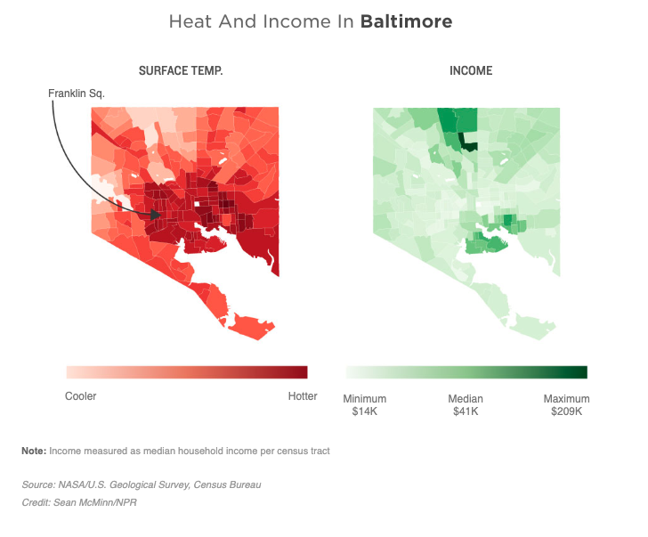
But after meeting with the producer on this one, I could tell something was different. The investigation team’s Meg Anderson had been working with a friend of mine, a University of Maryland journalism professor named Sean Mussenden, who had compiled a ton of data about heat, income and health in Baltimore. Based on researchers’ data, Sean was able to establish a thread through different parts of the city that showed something concerning: The poorer the neighborhoods, the hotter they got. And low-income people in Baltimore’s hottest areas were visiting the hospital more often than low-income people in the city’s coolest areas for several cardiovascular and respiratory conditions.
That was news to me — I didn’t even realize there were major differences in temperature within cities. I thought if it was 80 degrees, it was 80 degrees, period. But even with this, what we had seemed like a very Baltimore-centric story. We are, of course, National Public Radio. Not to say every story we do is a national one, but if we’re going to put significant resources toward a trend in one city, we should at least be able to say whether it holds true for other parts of the country.
So I asked Meg the question: Could we do this analysis for every city in the country? At first it sounded crazy — the researchers in Baltimore literally drove around in station wagons with thermometers to get extremely granular heat data in different parts of the city. As fun as that would be to do in every city in the U.S., I didn’t think the bosses would go for it.
Instead, we started looking for other options. I thought I’d seen detailed temperature maps of the United States before — where did they come from?
Fun With Satellites
As it turns out, that data can come from a number of places, like local surveys, extrapolation from weather stations and satellites. The last one was what really interested me. Satellites don’t cover only limited areas like weather stations do, and they sometimes have enough detail to map relatively granular geographies, like neighborhoods. But could government-run satellites really detect heat on the ground?
Unfortunately for my plans of making this a quick-turn data story, satellite data was something I’d never touched before. In fact, it was something I’d actively avoided — I used to work with a mapping specialist who handled all our geographic data needs, and the idea of touching anything more complicated than a simple shapefile overwhelmed me before I even sat down at the computer.
So I sent out a Bat-Nerd Signal on the News Nerdery Slack channel to people in other newsrooms who do these kinds of things. Someone there pointed me to a former colleague of his who now works with satellite data for a living, and a brief background conversation with that person opened up a box of terms I’d never heard before: Landsat, EarthExplorer, bands, collections and AOIs.
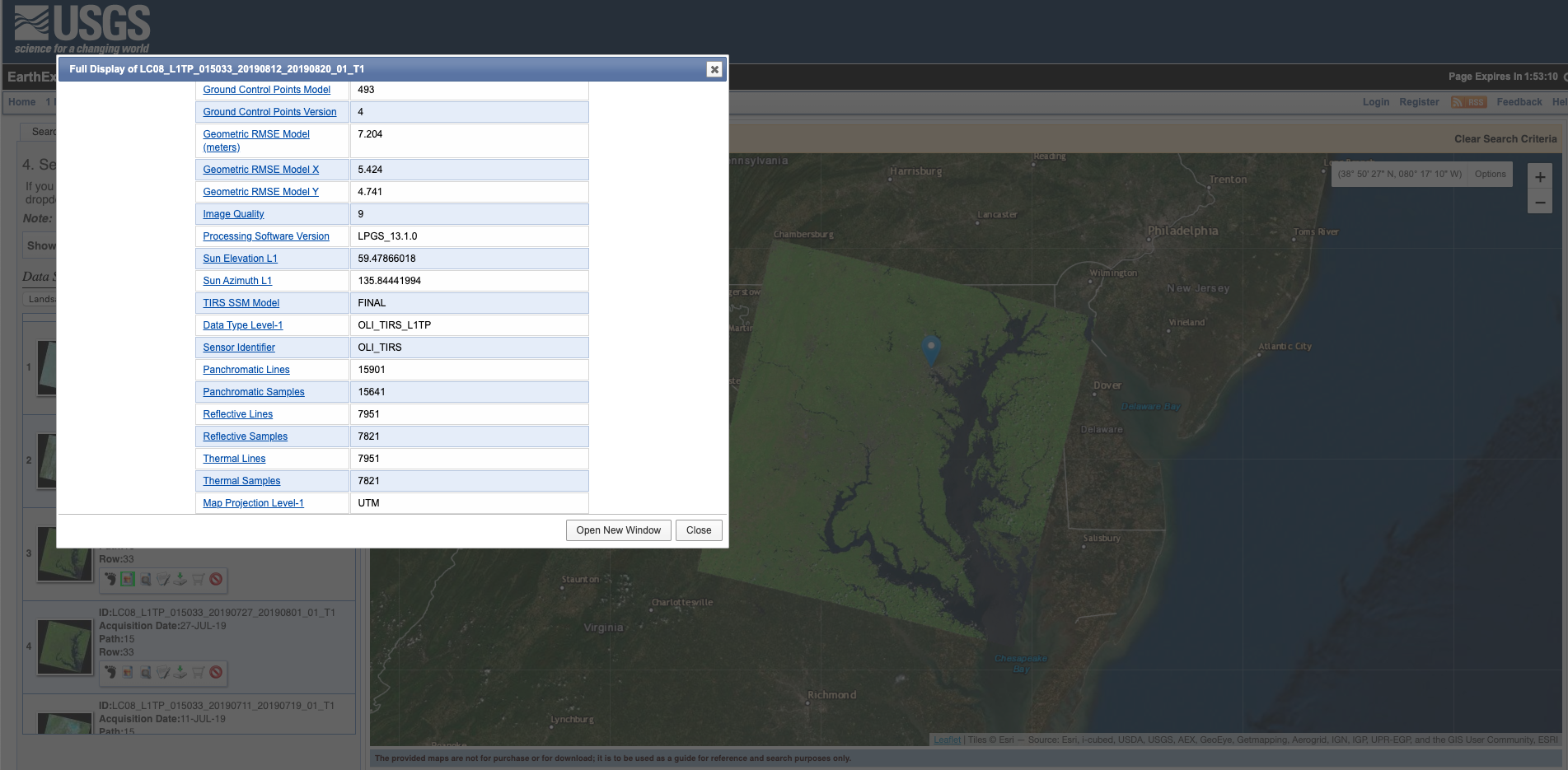
But having someone like that on your side when you’re digging through complex data for the first time is invaluable. As it turned out, these NASA/USGS satellites do measure heat through thermal sensors, roughly twice a month at every point in the U.S.
This meant that, in theory, we would be able to automate what those researchers did in Baltimore for anywhere in the country we wanted to. Instead of using stations wagons, we’d use satellites.
For a given city, the process would look something like this:
- Download the thermal image
- Overlay the image with the city’s census tracts
- Calculate a median heat reading for each census tract
- Associate the census tracts with their median income levels
- Calculate a correlation coefficient between heat and income for the city
Before spending who-knows-how-long writing code to do all that, I wanted to test it by hand on a few cities to make sure this was really going to work.
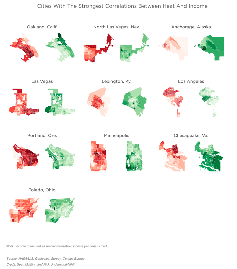
For a handful of cities that Meg had heard about in her reporting, I downloaded the data and used an open-source tool called QGIS to map it. In each of these cities, we saw the same trend: The hottest areas of a city were generally the poorest, and the coolest were often wealthy.
It looked like we had ourselves a story.
To show our editors, these were some of the first maps we made for this project, of the counties that contain San Antonio, Sacramento and Miami:
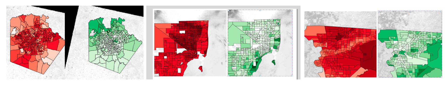
That idea of putting heat maps next to income maps stayed with us all the way through publication.
Real Data, Real People
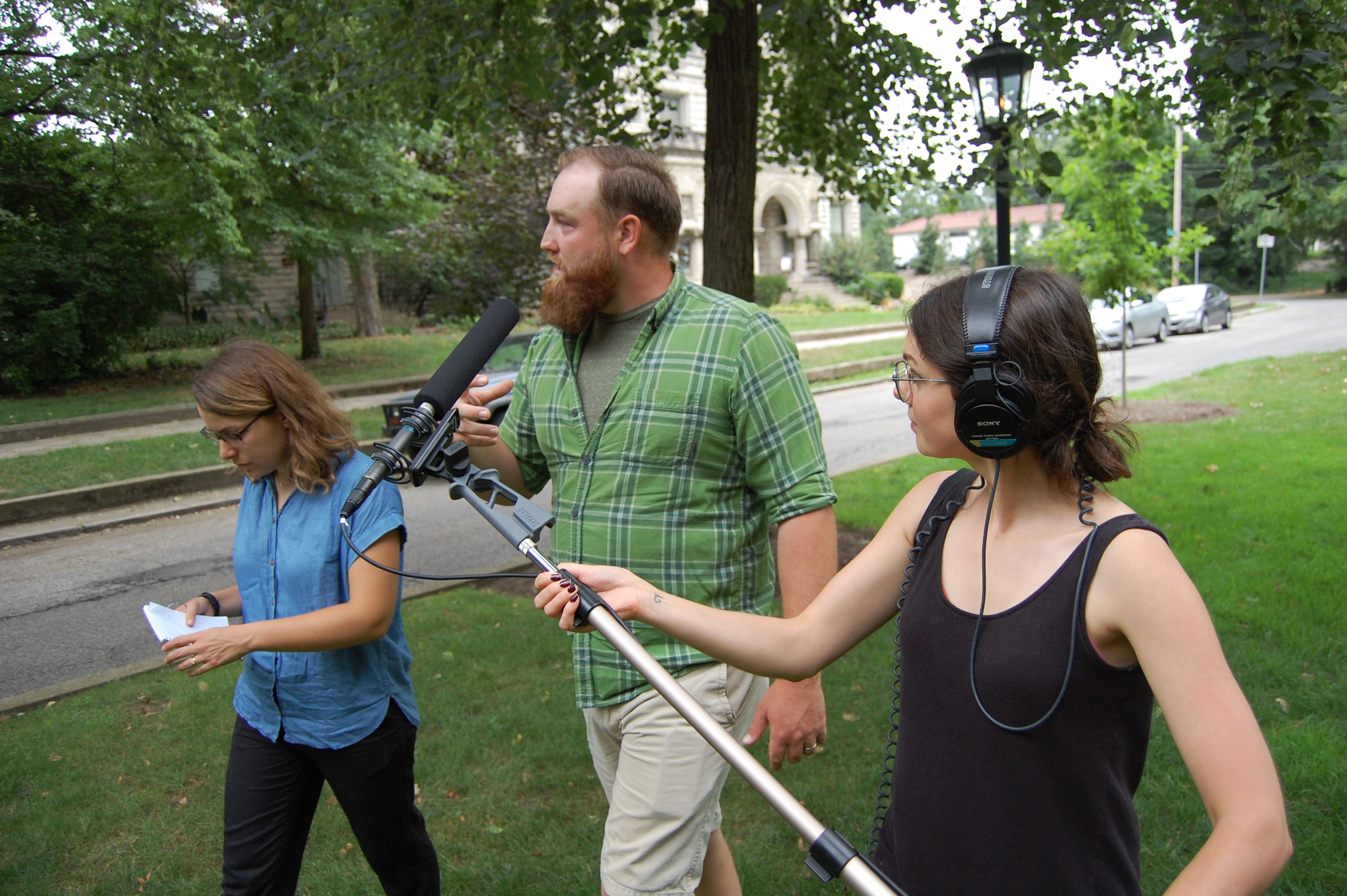
Meg, along with our reporting intern Nora Eckert, made sure to confirm what we were finding in the data was reflected by real people on the ground. They spent hours on the streets of Baltimore, and in hospital emergency rooms there, interviewing people who lived in this heat and sometimes felt they couldn’t escape it. They also talked to climate experts and historians who traced back the causes of this heat problem to decades of government policies and inequities when it came to investment in low-income neighborhoods.
But we knew from the beginning that we didn’t want this to be just a doom-and-gloom story. We were hoping to find places that were aware of this issue and were taking meaningful steps to address it.
Meg, Nora and I made plenty of phone calls to try to find these places. It was harder than I thought it would be (something that seemed to be becoming a theme) to find places that were aware of this issue and actively addressing it.
Then we came across Louisville. Though it seemed to be more of the same there — with people acknowledging that the poor areas west of 9th Street probably were probably hotter — the sheer number of people worried about tree loss there surprised us for a town of its size. Trees, which are generally regarded as one of the most effective ways to cool down hot pockets of a city, were disappearing from Louisville — about 50,000 each year. That contributed to the city being named the fastest growing urban heat island in the country, according to an oft-cited study in the urban-heat world.
Soon we had plane tickets booked and interviews lined up with different environmental groups there: TreesLouisville, Louisville Grows, the city’s sustainability director (who, by the time we arrived, would be the former director because of city budget cuts) and others. We even got a driving tour of the city from a self-styled local historian who had recorded a four-hour documentary series recounting the city’s history.
I’ll spare you all the details of how that trip went, but just briefly acknowledge how cool it is to be able to take off your data-reporting hat and put on your real-person reporting hat every once in a while. I forget who said this, but all data are about people. We do ourselves a disservice by taking the comfortable path of writing about those people from behind a computer, thinking we know everything we need to because we have a spreadsheet, or a map. Meeting the people who live in the heat of Louisville, and their grandchildren, and their friends and neighbors brought the whole story to life for me. A number of storylines that showed up in the published story, as well as some that didn’t, simply couldn’t be found in a spreadsheet.
As this was my first radio reporting trip, I also learned a number of things that you don’t have to worry about working at a newspaper. I put those in a Twitter thread when I got back to D.C.
Back in the office after my first reporting trip with NPR. Here are some lessons I learned working with ~radio people~.
— Sean McMinn (@shmcminn) July 18, 2019
2: Leave the headphones/recording equipment off when first meeting a nervous source. The giant fishpole microphone can be intimidating.
— Sean McMinn (@shmcminn) July 18, 2019
4: There’s a thing called “ambi” (ambient sound) where the producer has to record a minute of silence wherever you’re doing an interview, and that is also guaranteed to be awkward af.
— Sean McMinn (@shmcminn) July 18, 2019
6: Radio people still call it tape. Don’t ask me why.
— Sean McMinn (@shmcminn) July 18, 2019
7: Producers want to record the darnedest things: Door knocks, seatbelt buckles clicking, highway noise, fountains in a park …. if it makes noise, you betcha they’re recording it.
— Sean McMinn (@shmcminn) July 18, 2019
Real Data, Real Problems
Once I got back from Kentucky, it was time to really get at the heavy programming for the story. It was also, as luck would have it, less than a week before my wedding and honeymoon, which meant that our mapping intern Nick Underwood was bound by destiny to put in some major hours on this project.
The pipeline I originally came up with — download the satellite images, put the census data on top of it and calculate a correlation score for each city – seemed like it would be relatively straightforward. But problems came when we tried to scale it to the 100 largest U.S. cities, a number that we thought seemed manageable …
Clouds
- The problem: Satellites can’t see through clouds. Pretty straightforward.
- The solution: The API we were using had an indicator for each satellite image that marks the percentage of the image obscured by cloud cover. I thought we could just use that to find good images. But I realized even if there weren’t many clouds, they could make the whole image unusable if they were sitting over the city you wanted to get data for. Instead, a team of us manually reviewed several hundred images and made a spreadsheet of the ones that were cloudless, or at least didn’t have clouds over the city we were looking at. There were three cities — Hialeah and Miami, Fla., and Honolulu — where we couldn’t find a single summertime image without clouds.
API Reliability
- The problem: Sometimes, in one of the universe’s grand mysteries, an image couldn’t be found by the API that accessed satellite images. As helpful as the API was for getting the images we wanted, it seemed to sometimes cause more headaches than it solved.
- The solution: For a handful of cities, we had to download the images by hand, and then note that in the documentation. I really didn’t want to do this, since it made it virtually impossible to run the full analysis from a single command-line script, which was a goal of mine. But when the deadline came around, I still hadn’t debugged this particular problem.
City Boundaries
- The problem: The most accurate city geographies are held by local governments. To access them, we would need to go to 100 different city websites and find their shapefiles.
- The solution: At first I tried OpenStreetMap, which gave us a good start. But when Nick realized he was looking at Henderson County, Ill., when he should have been looking at Henderson, Nev., he made the smart decision to pull out census boundaries instead. Those files had some of their own issues, but between the two sources we were able to get accurate shapefiles for each city.
Speed
- The problem: Using the code Nick wrote to calculate median heat readings for each census tract, and my code to download several gigabytes of heat images, you could say it took … a while … to run.
- The solution: In general, I ran the code in small chunks as to not wait hours before finding out if everything broke. But I also left my computer running overnight a couple times to make sure I could run the whole analysis at once. Our team’s journo-developer Thomas Wilburn gently suggested that in the future we could do this on an AWS cloud server so everything wasn’t tied to my temperamental Macbook (fair point). He also came to the rescue before publication and showed me how to run parallel processes on my computer. This allowed us to do the heat analysis, though not the file downloads, about four times faster.
Dumb Statistics …
- The problem: P-values. It’s always p-values.
- The solution: For once, it wasn’t p-value interpretation — a notoriously sticky topic — that made this difficult. It was whether we should be calculating p-values at all. For the statistically uninitiated, p-values, in layperson’s terms, tell you the likelihood that your study’s observations are just random chance. This is incredibly useful if you’re looking at a small sample of, say, patients given a drug, and you want to find out if your findings would hold true to the broader population of patients in the world. The thing is, we weren’t trying to make any broader judgements about cities or census tracts outside the scope of our analysis. That’s why I decided, after talking to a handful of other stats-minded people, to not calculate p-values for our findings. This is something that we heard about from multiple confused readers after publication, but I believe we made the right call since we already had data for the entire population we wanted to study — not just a sample of it.
… And Dumb Humans (OK, Just Me)
- The problem: I knew that higher pixel values in the satellite images meant hotter spots on the map, but I didn’t stop to ask how much hotter.
- The solution: The week before we published — and just hours before we showed our work to a few dozen NPR member stations — I called NASA to make sure my analysis made sense to them. Researchers there pointed out that the pixel values in their images actually have a logarithmic relationship to heat, not a linear one. So, technically speaking, all our numbers were wrong. I think I nearly gave our producer Meg a heart attack when I used those exact words — ”all our numbers are wrong” — to tell her what was going on. But it ended up being relatively straightforward to change everything to a linear scale, and it actually made the correlations stronger than we thought they were before.
After dealing with those big issues, as well as so many smaller ones I wouldn’t be able to remember them all today, we were ready to publish the story and code.
I was what you might call “nervous,” sitting on a plane without Internet when the first story in our series published at 5 a.m. the day after Labor Day. But when I landed and was able to get on WiFi, there weren’t any angry emails in my inbox demanding a correction. It was a good feeling.
I took a nap.
Followup
Already I’ve heard since these stories published that Louisville is voting on an ordinance for stronger tree preservation, and Chesapeake, Va., is considering hiring a city arborist. Local blog Denverite also wrote its own take on the heat-income story, pointing out some gaps in our analysis of Denver that a local publication is well positioned to dive deeper into.
If you know of other work happening in this field, I’d love to hear about it — get in touch at smcminn@npr.org.