 visuals + editorial graphics
Flow control: Building accessible video for ‘After the Water’
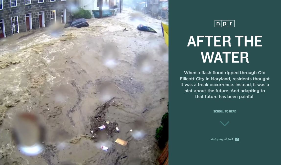
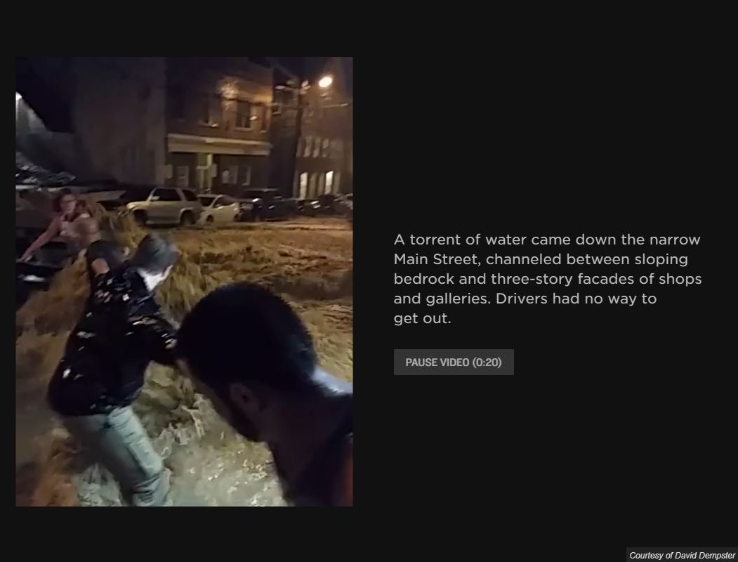
Our recent project — the video-heavy “After the Water” — posed an interesting challenge: Was it possible to make the story accessible without sacrificing the stunning visual media that reporter Ryan Kellman had gathered?
It’s fashionable for web storytelling, both inside and outside of journalism, to open with large, captivating video sequences. But the Web Content Accessibility Guidelines serve as a good reminder that for users with vestibular disorders, attention issues, or even just normal motion sensitivity, these videos are less “captivating” and more “disorienting.” From WCAG success criterion 2.2.2:
For any moving, blinking or scrolling information that (1) starts automatically, (2) lasts more than five seconds, and (3) is presented in parallel with other content, there is a mechanism for the user to pause, stop, or hide it unless the movement, blinking, or scrolling is part of an activity where it is essential.
To return to our question: Yes, it’s very possible to make large-format video accessible. Here’s how we designed our scrolling video experience, optimizing for control, user preference and bandwidth.
Control
To start, it’s relatively easy to offer users a checkbox at the top of the story so that they can turn off autoplay.
var autoplayers = $("video[autoplay]");
var autoplayCheck = $.one("#autoplay-video")

var toggleAutoplay = function(enable) {
  autoplayCheck.checked = enable;
  if (enable) {
    autoplayers.forEach(function(video) {
      video.setAttribute("autoplay", "");
      var promised = video.play()
      // ignore DOMExceptions for playback, they can get tripped up by the lazy load
      if (promised) promised.catch(err => err);
    });
  } else {
    autoplayers.forEach(function(video) {
      video.removeAttribute("autoplay");
      video.pause();
    });
  }
}

autoplayCheck.addEventListener("change", e => toggleAutoplay(e.target.checked));
All ambient video in the presentation starts with an autoplay attribute, so we can find it in the document, and then remove (or add) that attribute based on the checkbox state. If the box is unchecked, we also halt all running videos. And in a separate function, we set up buttons on all video sections that let users individually start or stop the media for that block, regardless of autoplay.
Preference
You’ll note that the toggleAutoplay function doesn’t just update the video state; it also sets the checkbox on or off. When called in response to clicking on that checkbox, this doesn’t do anything, since we’re just re-applying the current value. Why the redundancy?
To answer that question, we need to go back to 2013, when Apple released iOS 7. As a broad visual revamp of Apple’s design language on mobile, iOS 7 incorporated a lot of translucent layers over moving backdrops, to the degree where it made many people (particularly those with motion sensitivity) feel a little queasy. In response, Apple added a “reduce motion” checkbox to turn these effects down across the entire operating system, and a CSS media query was introduced to let that option apply to web content as well.
With the release of Chrome 74 this year, support for reduced motion finally is available in every major operating system and browser. We can use a media query to address it in our CSS, and we can use JavaScript to react to that same media query on pageload–which is where our checkbox comes in. Based on prefers-reduced-motion, we set or unset the checkbox, so that users who may have forgotten they set the OS preference aren’t confused.
var reducedMotion = window.matchMedia("(prefers-reduced-motion)");
// set on page load
toggleAutoplay(!reducedMotion.matches && autoplayCheck.checked);
// update if it changes
reducedMotion.addListener(() => toggleAutoplay(!reducedMotion.matches));
For this approach, I’m working closely from Scott O’Hara’s post on reduced motion and video. We create a media query DOM object (reducedMotion) and then check it immediately when the page starts up. We also attach a listener for when it changes, in case someone changes the preference at the OS level while the web page is open.
Between the checkbox and the media query, the user is always in control of how video playback occurs in the page — within the confines what browsers currently allow for autoplay (namely, that the video must be muted and include a playsinline attribute). Other factors may apply that we can’t control. For example, in low-power mode, Safari may decide to disable autoplay even if all the other conditions are met, which is a “fun” source of confusion when testing.
Bandwidth
The movement for inclusive design has widened the definition and application of accessibility in software. But when building video presentations, it’s worth remembering that access is not just about the user, but also their device. Immersive presentations like “After The Water” incorporate a lot of imagery, and require a corresponding amount of bandwidth. For users on pay-as-you-go data plans, these pages can be literally expensive to read.
It’s also worth remembering that just as accessibility (in the disability sense) is contextual, not intrinsic or permanent, technological capability may vary even for users with expensive devices or connections. For example, at NPR’s DC headquarters there are a number of places where the wifi signal isn’t great (and I think we somehow found every single one of them during user testing). It doesn’t matter how nice someone’s phone or cell plan is if they’re in a subway tunnel or a wifi dead zone.
To some extent, we can only mitigate these concerns so far: Visual stories are necessarily heavier (in kilobytes, at least) than text journalism. But we certainly try to make sure that we keep people from paying for content they never see: Audio and video are lazy-loaded based on scroll position (one block back and two blocks forward).
We also automated the optimization of images, videos, and video posters whenever possible, using shell scripts running FFMPEG and ImageMagick. For example, this Bash loop will generate a thumbnail for every video in a folder, so that we can automatically show a static image to users with autoplay disabled or on low-bandwidth connections:
for f in *.mp4; do
  ffmpeg -i $f -ss 0 -vframes 1 $f.jpg
done
One struggle of lazy-loading is that the browser only allows roughly six connections to a given domain, so people on slow connections who scrolled quickly were able to saturate and block the requests for further down the page. We’re still working on solving that problem in a more elegant way. If you have any suggestions, feel free to reach out!
Results
This was the first time we took this approach with our big story pages, so we added some tracking to see how common their usage actually was. We found that about 1 in 30 users has the reduced motion option set in their browser. A similar share of users turned off autoplay from the checkbox, or used the play/pause buttons on individual videos.
Regardless of the numbers, creating accessible experiences is the right thing to do for our audience. But it is interesting — and gratifying — to see that these engagement numbers are as high as they are, especially in comparison to the low difficulty of their implementation.