 visuals + editorial graphics
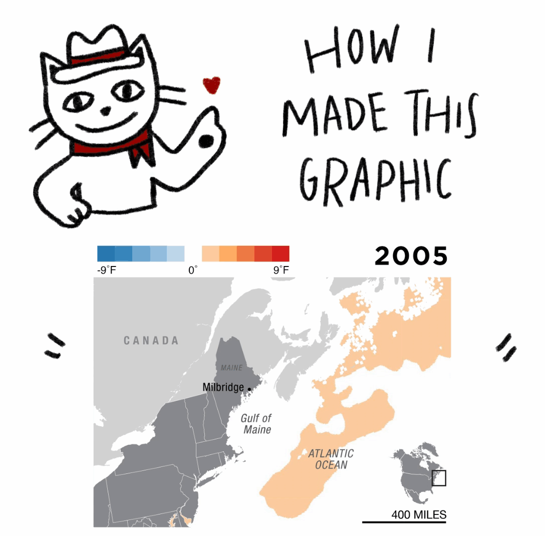
How I made this graphic: a comic
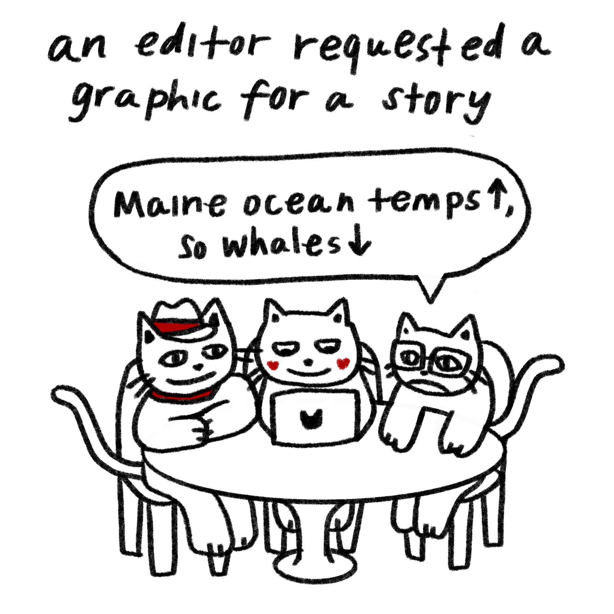
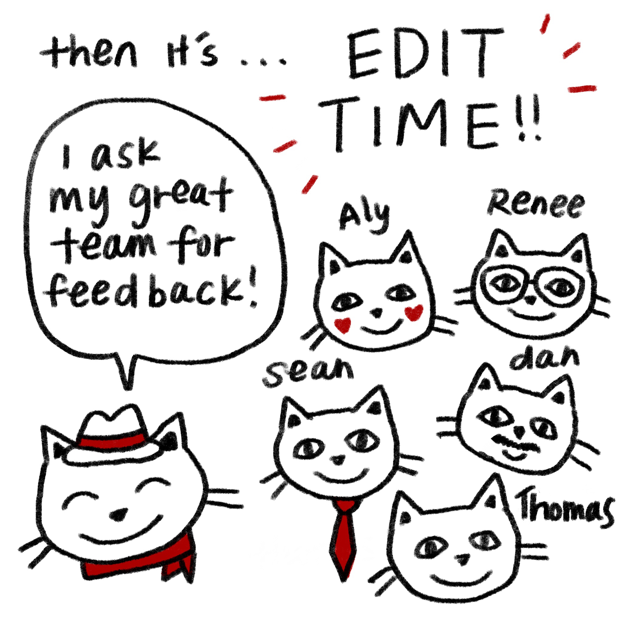
For my first published graphic for NPR, I worked with digital editor Jason Breslow and fellow intern Avery Ellfeldt to create a graphic for a story about the impact that warming waters off the coast of Maine are having on the local whale population.
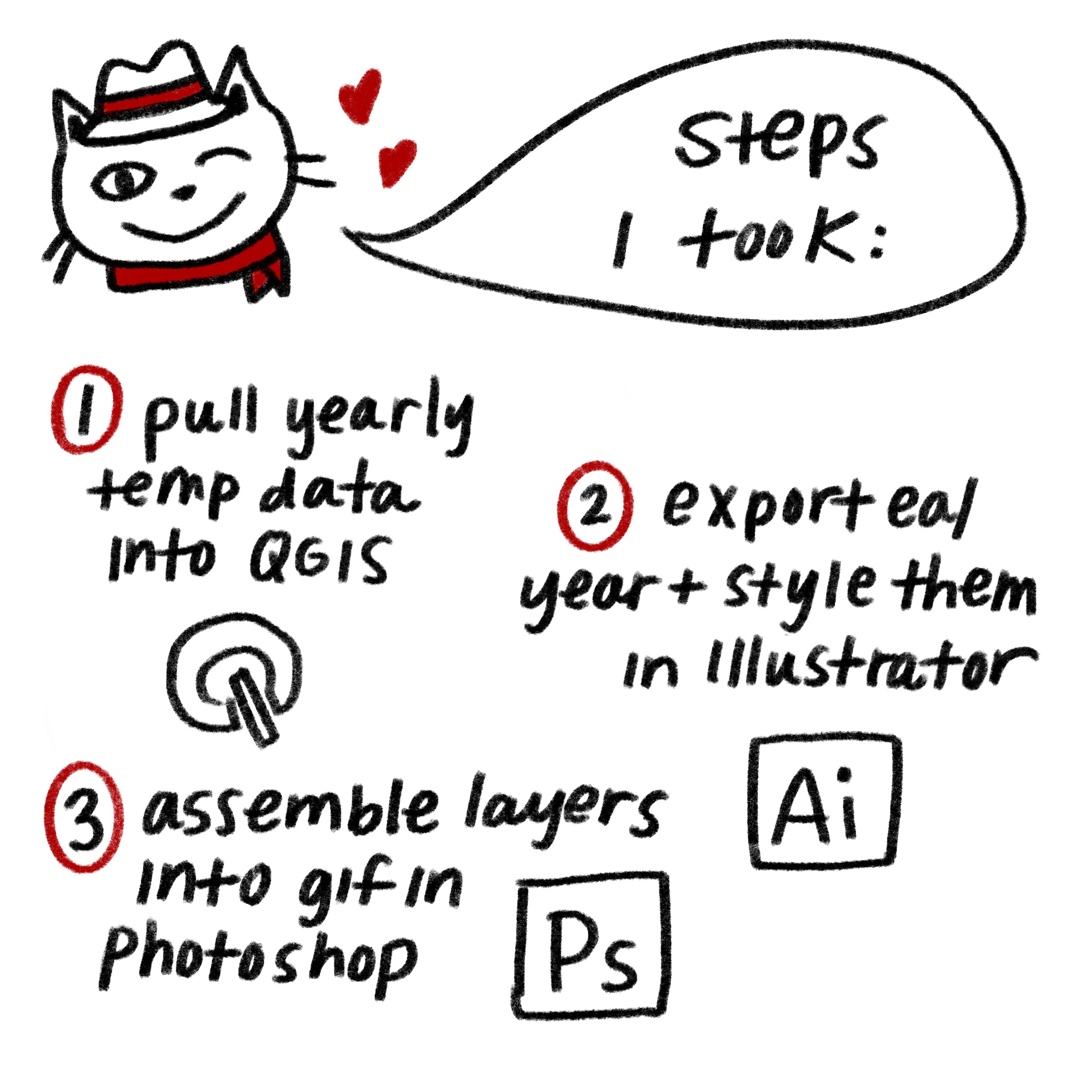
Here’s how I did it, in comic form:
Details And Caveats
While I love making maps, I feel I am unqualified to call myself a cartographer. I owe much of my training to fellow news map-makers, and I look forward to learning more about map-making in the future! Also, the final product would not have been possible without heavy research, design and judgement input from colleagues and from subject matter experts at NOAA.
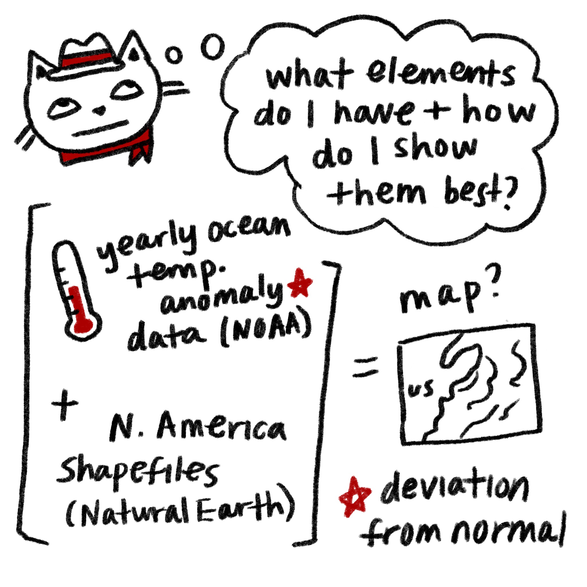
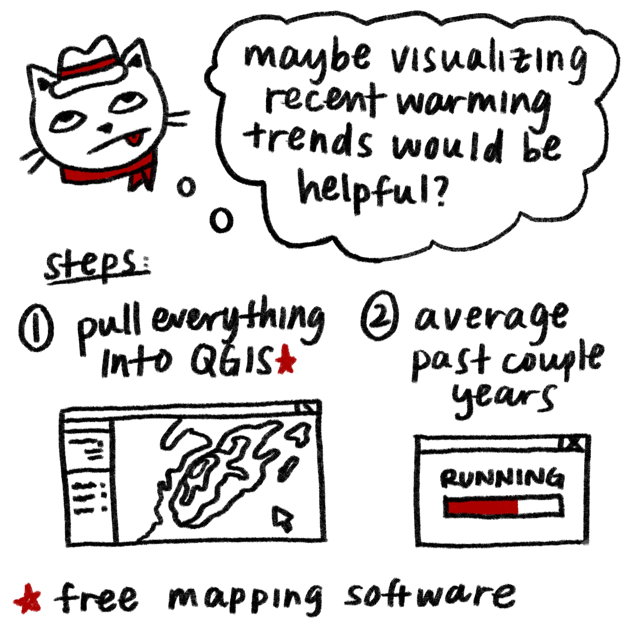
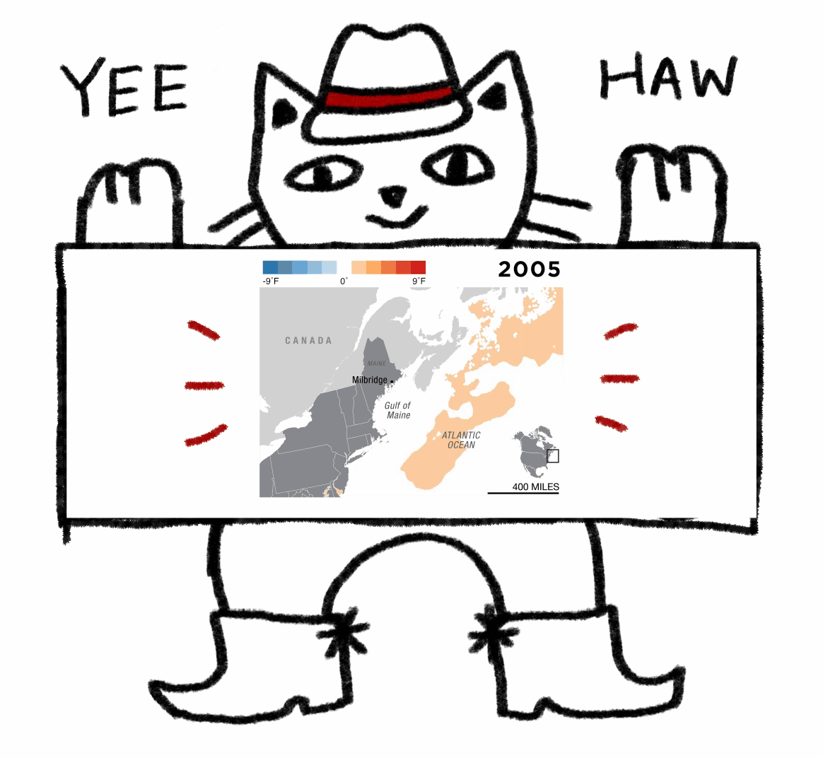
I used yearly composite sea surface temperature anomaly data from NOAA Coral Reef Watch. This dataset compares measurements of ocean surface temperature against long-term averages from 1985-1993. The values shown are the deviations (anomalies) from those averages. Areas in purple to blue represent negative anomalies, or water temperature cooler than the mean. Areas in orange to red represent positive anomalies, or water temperature warmer than the mean. NOAA releases anomaly data for different time intervals, and I used the average annual anomaly composites for the years 2005-2018. I also used shapefiles from Natural Earth for my base map.
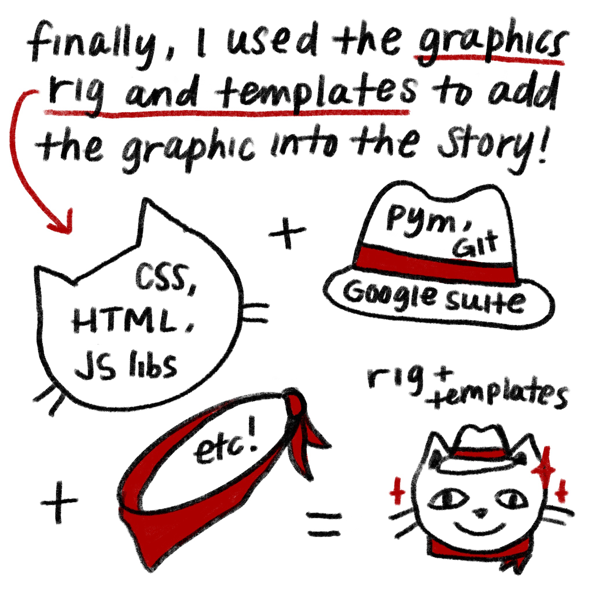
I created the maps using QGIS, then styled and animated using Adobe Illustrator and Photoshop. I embedded the final product on a NPR story page using our dailygraphics-next rig. (The map also made a guest appearance on the NPR home page!)
Takeaways
If I had to make a similar animated map again, I would definitely find a way to automate the process to make the edit process less painful. Every time I got an edit, I had to tweak all the individual Illustrator map layers, reexport them to Photoshop and, finally, reexport the animated GIF. In the timeframe I had, I wanted to work with the skills and tools I found familiar, but this workflow is unsustainable long-term. Other challenges with this workflow included:
-
The GIF had small but definite jitters from manually aligning the layers in Photoshop.
-
The final product is a static GIF, which means that text won’t always scale readably between desktop and mobile.
-
SVG and PDF exports from QGIS are frequently unreliable in how they preserve layers and image resolution. That wasn’t as much of a problem with this graphic, but in the past I’ve often had to reexport map layers in different file formats and combine them for maps with greater raster detail.
Next time, I could try a couple different approaches to improve my workflow. For example, I could continue with my QGIS and Illustrator workflow, but instead have one base map layer and switch out the individual temperature image layers on top. That approach would likely remove obvious jitters in an animation, since I wouldn’t be manually aligning the base map on each layer. More consolidated layers would also mean a more streamlined edit process: If I needed to edit a feature on the base map, I could do that without touching the temperature layers.
I could also try writing scripts to generate maps. There are many workflow tutorials to experiment with, including Dylan Moriarty’s command line mapping tutorial with mapshaper and makefiles and Mike Bostock’s command line cartography tutorial using D3 and TopoJSON. This scripted approach is especially useful for projects like this one that rely on a consistent, repeated series of steps.