 visuals + editorial graphics
Responsive Charts With D3 And Pym.js
Infographics are a challenge to present in a responsive website (or, really, any context where the container could be any width).
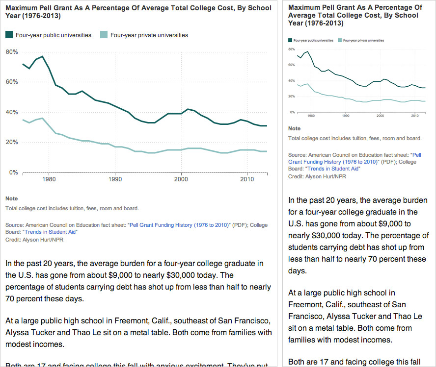
Left: A chart designed for the website at desktop size, saved as a flat image.
Right: The same image scaled down for mobile. Note that as the image has resized, the text inside it (axis labels and key) has scaled down as well, making it much harder to read.
If you render your graphics in code — perhaps using something like D3 or Raphael — you can make design judgements based on the overall context and maintain some measure of consistency in type size and legibility regardless of the graphic’s width.
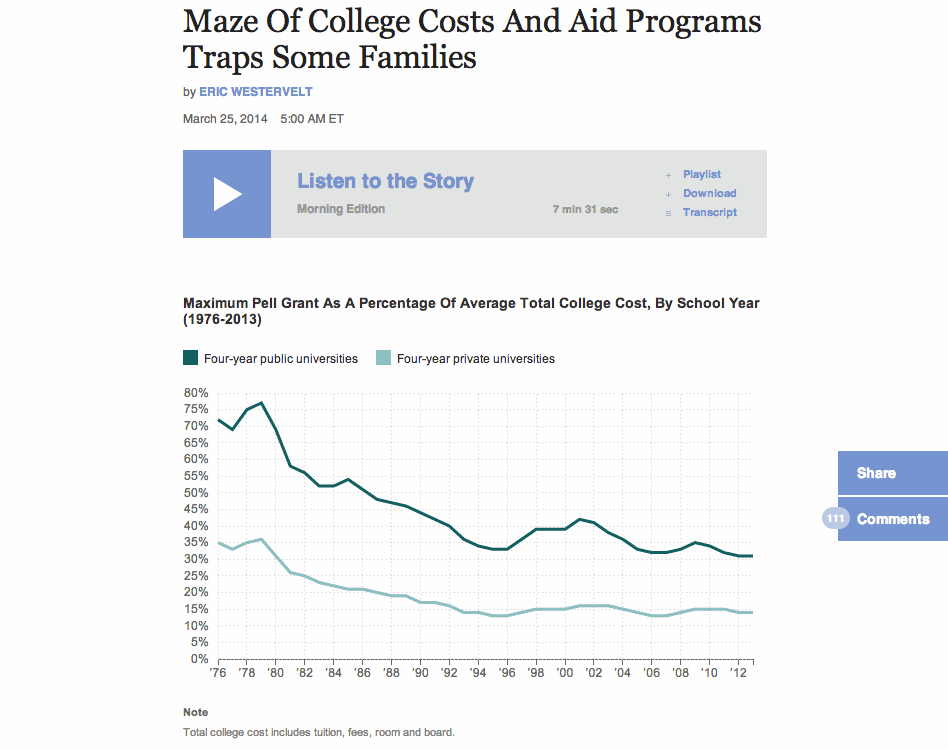
A dynamically-rendered chart that sizes depending on its container.
Case Study: Make A Simple Line Graph Work Responsively
You can find all the files here. I won’t get into how to draw the graph itself, but I’ll explain how to make it responsive. The general idea:
- Calculate the graph’s dimensions based on the width of its container (rather than fixed numbers)
- If the page is resized, destroy the graph, check for new dimensions and redraw the graph.
Structure Of The HTML File:
- CSS styles
- A container div (
#graphic) for the line graph (including a static fallback image for browsers that don’t support SVG) - Footnotes and credits
- JavaScript libraries and the JavaScript file for this graphic
The JavaScript File
Set Global Variables:
var $graphic = $('#graphic');
var graphic_data_url = 'data.csv';
var graphic_data;
var graphic_aspect_width = 16;
var graphic_aspect_height = 9;
var mobile_threshold = 500;
$graphic— caches the reference to#graphic, where the graph will livegraphic_data_url— URL for your datafile. I store it up top to make it a little easier to copy/paste code from project to project.graphic_data— An object to store the data loaded from the datafile. Ideally, I’ll only load the data onto the page once.graphic_aspect_widthandgraphic_aspect_height— I will refer to these to constrain the aspect ratio of my graphicmobile_threshold— The breakpoint at which your graphic needs to be optimized for a smaller screen
Function: Draw The Graphic
Separate out the code that renders the graphic into its own function, drawGraphic.
function drawGraphic() {
    var margin = { top: 10, right: 15, bottom: 25, left: 35 };
    var width = $graphic.width() - margin.left - margin.right;
First, rather than use a fixed width, check the width of the graphic’s container on the page and use that instead.
var height = Math.ceil((width * graphic_aspect_height) / graphic_aspect_width) - margin.top - margin.bottom;
Based on that width, use the aspect ratio values to calculate what the graphic’s height should be.
    var num_ticks = 13;
    if (width < mobile_threshold) {
        num_ticks = 5;
    }
On a large chart, you might want lots of granularity with your y-axis tick marks. But on a smaller screen, that might be excessive.
    // clear out existing graphics
    $graphic.empty();
You don’t need the fallback image (or whatever else is in your container div). Destroy it.
    var x = d3.time.scale()
        .range([0, width]);

    var y = d3.scale.linear()
        .range([height, 0]);

    var xAxis = d3.svg.axis()
        .scale(x)
        .orient("bottom")
        .tickFormat(function(d,i) {
            if (width <= mobile_threshold) {
                var fmt = d3.time.format('%y');
                return '\u2019' + fmt(d);
            } else {
                var fmt = d3.time.format('%Y');
                return fmt(d);
            }
        });
Another small bit of responsiveness: use tickFormat to conditionally display dates along the x-axis (e.g., “2008” when the graph is rendered large and “‘08” when it is rendered small).
Then set up and draw the rest of the chart.
Load The Data And Actually Draw The Graphic
if (Modernizr.svg) {
    d3.csv(graphic_data_url, function(error, data) {
        graphic_data = data;

        graphic_data.forEach(function(d) {
            d.date = d3.time.format('%Y-%m').parse(d.date);
            d.jobs = d.jobs / 1000;
        });

        drawGraphic();
    });
}
How this works:
- Since D3 draws graphics using SVG, we use a limited build of Modernizr to check if the user’s browser supports it.
- If so, it loads in the datafile, formats particular data columns as dates or fractions of numbers, and calls a function to draw the graphic.
- If not, it does nothing, and the user sees the fallback image instead.
Make It Responsive
Because it’s sensitive to the initial width of its container, the graphic is already somewhat responsive.
To make the graphic self-adjust any time the overall page resizes, add an onresize event to the window. So the code at the bottom would look like:
if (Modernizr.svg) {
    d3.csv(graphic_data_url, function(error, data) {
        graphic_data = data;

        graphic_data.forEach(function(d) {
            d.date = d3.time.format('%Y-%m').parse(d.date);
            d.jobs = d.jobs / 1000;
        });

        drawGraphic();
        window.onresize = drawGraphic;
    });
}
(Note: onresize can be inefficient, constantly firing events as the browser is being resized. If this is a concern, consider wrapping the event in something like debounce or throttle in Underscore.js).
An added bit of fun: Remember this bit of code in drawGraphic() that removes the fallback image for non-SVG users?
// clear out existing graphics
$graphic.empty();
It’ll clear out anything that’s inside $graphic — including previous versions of the graph.
So here’s how the graphic now works:
- On initial load, if the browser supports SVG, D3 loads in the data, checks the width of the containing div
$graphic, destroys the fallback image and renders the graph to the page. - Whenever the page is resized,
drawGraphicis called again. It checks the new width of#graphic, destroys the existing graph and renders a new graph.
(Note: If your graphic has interactivity or otherwise changes state, this may not be the best approach, as the graphic will be redrawn at its initial state, not the state it’s in when the page is resized. The start-from-scratch approach described here is intended more for simple graphics.)
A Responsive Chart In A Responsive iFrame
At NPR, when we do simple charts like these, they’re usually meant to accompany stories in our CMS. To avoid conflicts, we like to keep the code compartmentalized from the CMS — saved in separate files and then added to the CMS via iframes.
iFrames in a responsive site can be tricky, though. It’s easy enough to set the iframe’s width to 100% of its container, but what if the height of the content varies depending on its width (e.g., text wraps, or an image resizes)?
We recently released Pym.js, a JavaScript library that handles communication between an iframe and its parent page. It will size an iframe based on the width of its parent container and the height of its content.
The JavaScript
We’ll need to make a few modifications to the JavaScript for the graphic:
First, declare a null pymChild variable at the top, with all the other variables:
var pymChild = null;
(Declaring all the global variables together at the top is considered good code hygiene in our team best practices.)
Then, at the bottom of the page, initialize pymChild and specify a callback function — drawGraphic. Remove the other calls to drawGraphic because Pym will take care of calling it both onload and onresize.
if (Modernizr.svg) {
    d3.csv(graphic_data_url, function(error, data) {
        graphic_data = data;

        graphic_data.forEach(function(d) {
            d.date = d3.time.format('%Y-%m').parse(d.date);
            d.jobs = d.jobs / 1000;
        });

        // Set up pymChild, with a callback function that will render the graphic
        pymChild = new pym.Child({ renderCallback: drawGraphic });
    });
} else { // If not, rely on static fallback image. No callback needed.
    pymChild = new pym.Child({ });
}
And then a couple tweaks to drawGraphic:
function drawGraphic(container_width) {
    var margin = { top: 10, right: 15, bottom: 25, left: 35 };
    var width = container_width - margin.left - margin.right;
    ...
Pym.js will pass the width of the iframe to drawGraphic. Use that value to calculate width of the graph. (There’s a bug we’ve run into with iframes and iOS where iOS might not correctly calculate the width of content inside an iframe sized to 100%. Passing in the width of the iframe seems to resolve that issue.)
    ...
    // This is calling an updated height.
    if (pymChild) {
        pymChild.sendHeightToParent();
    }
}
After drawGraphic renders the graph, it tells Pym.js to recalculate the page’s height and adjust the height of the iframe.
The HTML Page
Include Pym.js among the libraries you’re loading:
<script src="js/lib/jquery.js" type="text/javascript"></script>
<script src="js/lib/d3.v3.min.js" type="text/javascript"></script>
<script src="js/lib/modernizr.svg.min.js" type="text/javascript"></script>
<script src="js/lib/pym.js" type="text/javascript"></script>
<script src="js/graphic.js" type="text/javascript"></script>
The Parent Page (The CMS)
This is what we’ll paste into our CMS, so the story page can communicate with the graphic:
<div id="line-graph"></div>
<script type="text/javascript" src="path/to/pym.js"></script>
<script>
    var line_graph_parent = new pym.Parent('line-graph', 'path/to/child.html', {});
</script>
#line-graphin this case is the containing div on the parent page.- Sub out all the
path/to/references with the actual published paths to those files.
(Edited Sept. 4, 2014: Thanks to Gerald Rich for spotting a bug in the onresize example code.)