How I make news comics
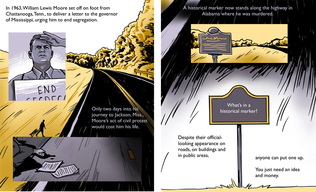
This April, I published a comic with NPR’s Investigations team as part of a larger investigation into the often fractured and confusing landscape of historical markers in the United States.
The comic tells the story of William L. Moore, who was murdered on a civil rights protest walk. The silence around the murder bothered one man for years, until he campaigned to put up a marker about it.
It’s the longest comic I’ve ever made, and involved the most research and reporting. Now that it’s out, I wanted to document my process, in case it’s helpful for future me or anyone else interested in comics journalism.
Step one: Ideas, research and reporting
In August 2023, Laura Sullivan and Nick McMillan from the Investigations team reached out about potential graphics for their historical markers project. We brainstormed ideas for showing a selection of various interesting markers to readers, which eventually became this.
Reading through the stories behind different markers featured the project, I proposed a comic that would dive deeper into one of them. As a medium, a comic would be uniquely suited to depict the interplay between present and past going on in many of the stories. We had photos of the markers and some of the present-day folks involved, but with a comic I could fully illustrate previous events and how they intersected with the present. I chose Moore’s marker because it centered a specific person’s journey, was an emotionally compelling narrative, and had enough existing historical material to craft a standalone narrative.
I also was inspired by “Searching for Maura,” a Washington Post comic investigation that had recently been published about a Filipino woman whose remains were kept by the Smithsonian.
Before I started writing, I pored through the reporting that Laura had already done, combed through previous coverage of Moore, and read two books: his autobiography A Mind in Chains, and Mary Stanton’s Freedom Walk, a book about his life and death. I also interviewed Stanton.
Step two: Writing
I like to have the words finalized for a comic before I really dig into illustrating it. It helps me focus on the narrative, and make sure it’s strong and cohesive. For me, it’s also easier to edit and potentially restructure text than it is to redraw panels, which is important in a news editing context. (And this went through many layers of edits before I even started drawing.)
I usually draw my comics as a series of images, with each image (or “page”) containing several panels. Many of my previous comics for NPR are exactly 10 pages long, because that’s the limit on how many images you can upload to an Instagram post. Comics do pretty well on social media, so I and other comics journalists at NPR usually try to tailor things to that format.
When I work on a 10-page comic, I usually
- Write a bulleted list of important points
- Spread them out across ten pages
- And then flesh out each point into a couple of sentences.
There’s only so much text that can fit on an image without it becoming unreadable, especially considering how it might size down on a phone. And comics are an interplay between text and images, so there needs to be space for visual information as well. You’d be surprised how much information you can fit into ten pages though — it’s a lot like a radio story in some ways.
But there was no way this story would fit into 10 pages. After some experimenting, I adapted my writing process:
- I first wrote all the text in paragraph form, as if I was writing a digital story, while trying my best to stay as concise as possible.
- I made notes in the doc about information that I knew I could convey via illustration instead of text.
Step three: Thumbnails
Thumbnails are rough drafts of what I’m thinking of drawing for the final illustrations. They help me conceptualize paneling, composition, pacing, and other important details. They’re also helpful for my editors (who often aren’t used to editing comics) to get a sense of what the comic will look like.
They don’t need to be good illustrations, just rough drawings that convey a visual concept. To minimize any confusion in editing, I’ll also write image descriptions next to each thumb after collecting them in Google docs.
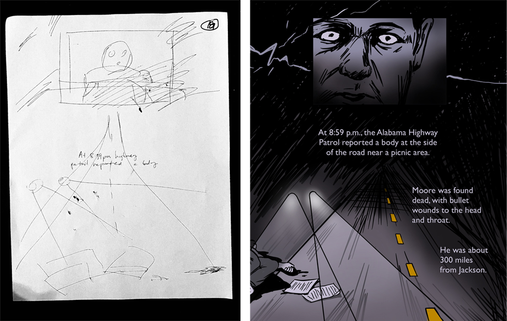 An example of my initial thumbnail vs. the final page
I usually draw my comics using the program Procreate on my iPad. However, since this comic was longer and would be mainly read on a story page instead of Instagram, I wanted to play with the flow between images more, like a scrolling webcomic. This proved hard to do in Procreate, so I switched to pen and paper, lining up each page on top of each other on my floor.
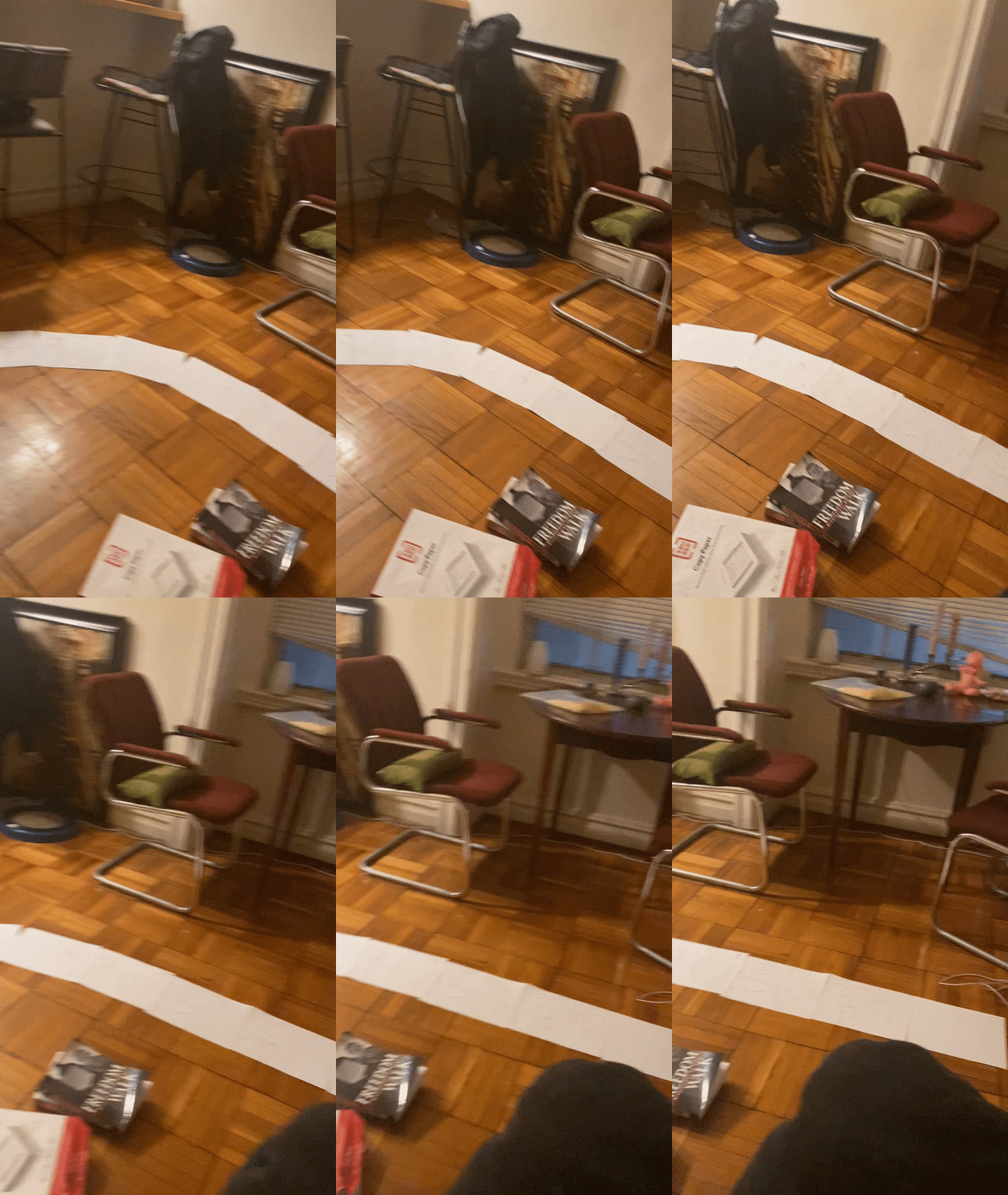 Thumbnails spread across my floor
This is my favorite part of the process, because this is where it starts to feel like a comic! I’m making decisions about what to draw and how to split up the written draft into pages and panels, and everything feels shiny and full of possibility.
Once I had a finished draft, I shared it with my editors and other colleagues for rounds of feedback and edits. I’m super grateful to the reporters, editors and fact-checkers who caught errors and/or made helpful suggestions.
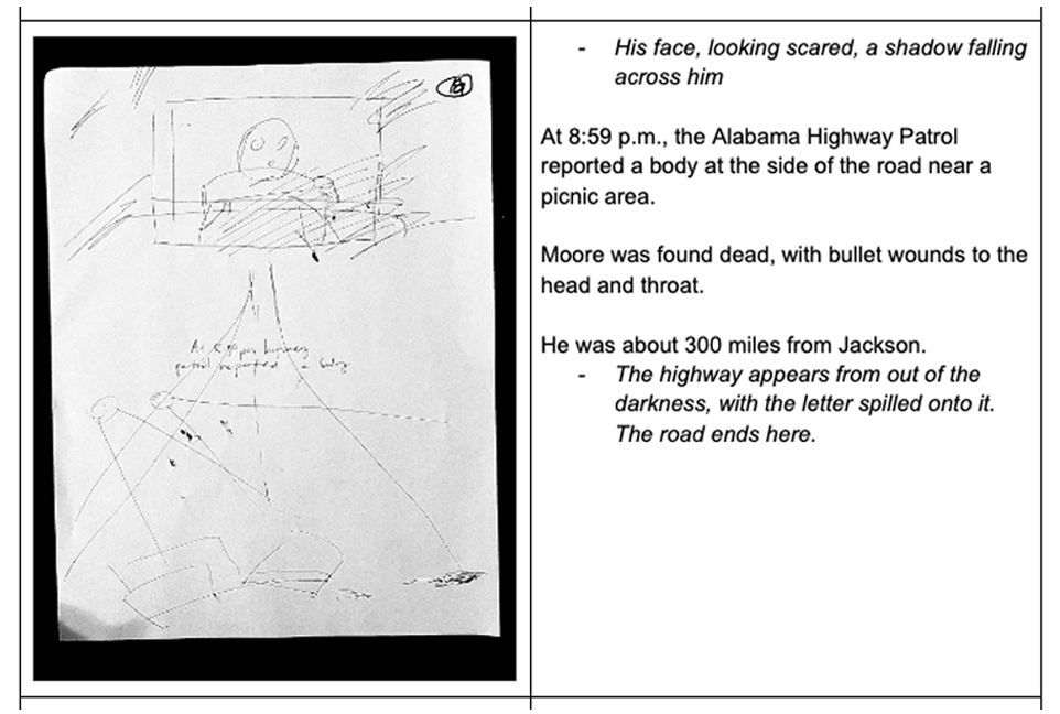 A section of my draft
Step four: Drawing
After finishing these edits, I moved on to drawing the comic.
First, I pulled photos of my thumbnails into Procreate and added text to each page. This way, I know early if I need to cut or change text based on what fits on a page. If I was unsure, I exported the page and looked at it on my phone.
Then I spent some time collecting additional reference pictures of people and locations. I ended up tracing several historical photos, so I also worked with our photo team to license those images.
Finally, then it was time to draw! For shorter comics, sometimes I ink all the pages first before going back and doing colors. For this one I finished each page (inks, color and text) before moving onto the next. Working this way, especially with the first couple pages, enabled me to make decisions early, like:
- Figuring out the color palette and illustration style: I decided to use a limited palette with a realistic inking style to keep things simple.
- Panel outlines: I decided I wanted to play with panel outlines as a visual nod to how we construct history. In the final comic, the only panels that are outlined in black ink are either historical markers or preserved historical documents – definitive physical evidence of the past, compared to my illustrated recreations of scenes.
Step five: Finishing touches
I did the bulk of the final drawings in a week, and then sent off the draft for another edit, including more fact-checking. (I want to give a special shoutout to copy editor Preeti Aroon.)
As part of the final draft, I also wrote alternative text for each page. Alt text is a text description of visual details in an image, written for visually impaired people. It’s usually a part of image metadata or added to a specific box prior to posting on social media. On a published image or social post, it isn’t visible to the naked eye, but a screen reader program can read it out loud or display it in an alternate format. (This blog post from Veroniiiica is a great resource for those interested in learning more.)
Since each one of my comic pages gets published online as a flat image, it’s crucial to write alt text so that low vision or blind readers can also understand the comic. Here’s an example:
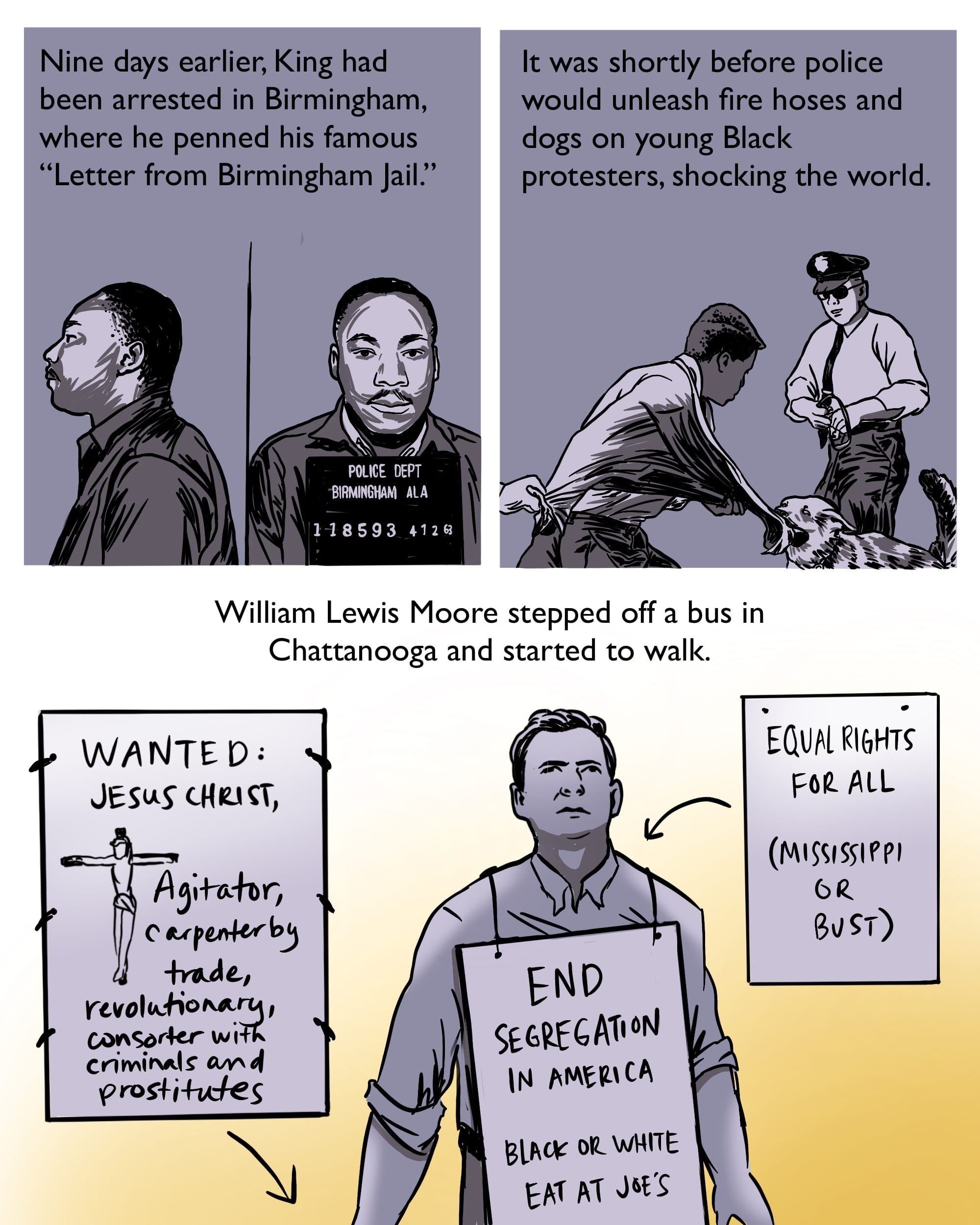 Alt text: Days earlier, King had been arrested and had penned his famous “Letter from Birmingham Jail.” Soon, police would unleash fire hoses and dogs on young Black protesters, shocking the world. Moore stepped off a bus in Chattanooga and started to walk. He wore a sign with anti-segregation slogans and carried a sign calling Jesus a “revolutionary, consorter with criminals and prostitutes.”
As you can see, replicating all the information in the page above is difficult, since our CMS has a 400 character limit for alt text. I welcome any ideas for how to make our comics more accessible.
As a final finishing step before publishing, I typically flatten and compress all my comic pages to help minimize the file size for a shorter load time.
And that’s it! You can read the final comic here.
Here are some other comics I’ve made:
 visuals + editorial graphics

