 visuals + editorial graphics
A better way to track listening
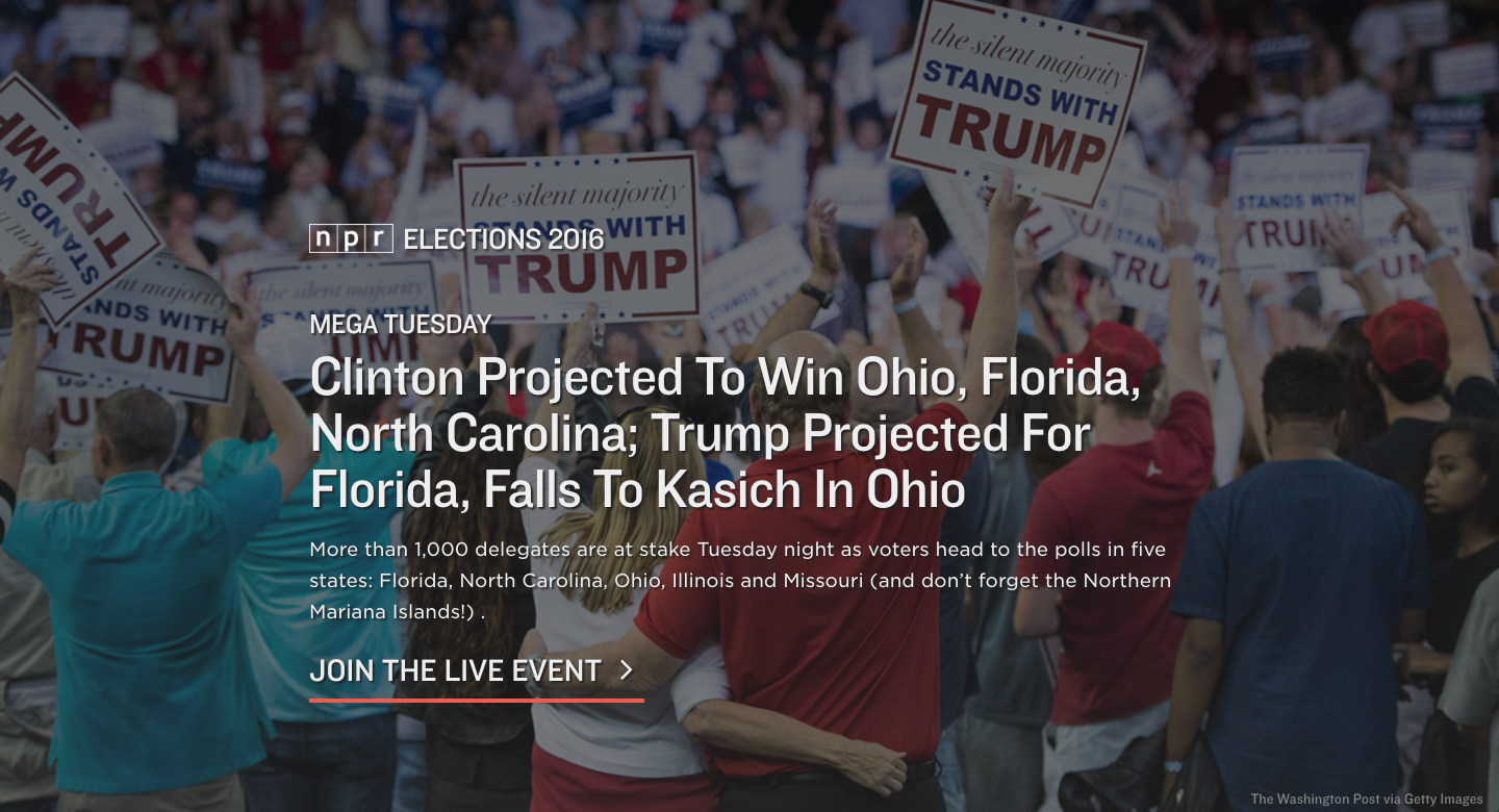 A screenshot of our elections app titlecard during Mega Tuesday on March 15, 2016.
For the entirety of the primary season, we have been running our elections app at elections.npr.org, focusing both on live event coverage during primary nights and updated content between events to keep users up-to-date on the events taking place each day.
A major component of our election coverage is audio-driven, whether through our live event coverage during primary nights or the NPR Politics Podcast in between events. Part of our decision to focus our app around audio stemmed from our newsroom putting a significant effort behind the audio coverage, but we also wanted to learn more about how our audience engages with audio on the internet. We treated our election app as a huge opportunity to do so.
We wanted to be fair to ourselves and treat our audio online like we treat audio on the radio. That means placing much more difficult restrictions on what we call a “listener.” In the calculations to follow, we treat listeners as those who listened to at least five minutes of audio, which is how we count listeners in our radio ratings.
Given this calculation, just 10% of our total user base are what we would consider “listeners”. That being said, we haven’t had audio in the experience 24/7, and sometimes we haven’t had audio during high-traffic primary events.
For the purposes of this analysis, I am going to focus on times when we were broadcasting a live election night special, as those are the moments throughout the primary season that we have gotten a significant amount of traffic and we have consistently had audio to work with.
Overall performance
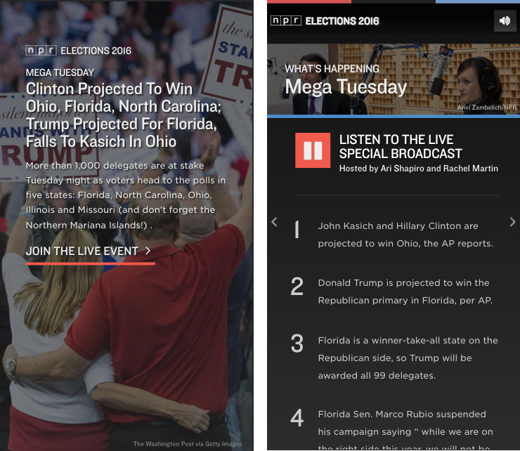 Screenshots of the first two cards of our app during our live broadcast on Mega Tuesday, March 15, 2016.
As of writing, NPR has broadcast 11 election night specials, and we have carried all of them inside of the app. If a user arrived at the app, the special would autoplay upon swiping or clicking past the titlecard.
During times the broadcast was live, we served over 475,000 sessions, and over 100,000 of those sessions were listeners. In other words, 22.4% of live event sessions became listening sessions by listening to at least five minutes of audio. If we look at listen rates across npr.org or consider five minutes as a “view” on a Facebook or YouTube videos, that’s a pretty good number. We’re happy with that number.
But it is a sobering reality: even when we advertise our app as a listening experience (as we often did on social media) and autoplay the content, only 22% of our users stick around for more than five minutes. Of course, our election app is not exclusively an audio app, and the other 78% of sessions still may have gotten what they needed out of the app, like a quick checkup on the results.
On a given night, our live specials would run anywhere from one hour to four hours. I have data at the hourly level, which means I can analyze the performance of the special hour by hour. Aggregating all of our sessions into hourly blocks, it is clear that performance of our live specials degrades the longer we go on. 26% of our sessions that began in the first hour became listening sessions, while just 18% of the sessions that began in the fourth hour became listening sessions.
What do we know about our listeners?
We know a whole bunch of other things about our app, most of which are out of scope for this blog post. But since we know which sessions were listening sessions, we can examine the behavior of our listeners as compared to our non-listeners.
The first, most obvious thing we can determine is that our listeners spend more time total on the app than non-listeners. This is not surprising – after all, they spent at least five minutes listening to audio. However, the proportion is surprising.
The average user overall spent an average of about eight minutes on the app, while listeners spent an average of 44 minutes on the app, whether they were listening for all 44 minutes or not.
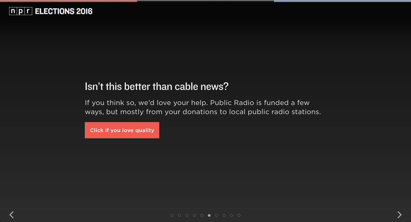
At the end of February, we added a new type of card to our app: a card that asked users to donate to their local member station. We tested a few different prompts throughout the duration of the primary, but no matter what test we were running, we consistently found that listeners were more likely to click the button than non-listeners.
A simple statistical test evaluation shows that we can say that listeners are 93.9% more likely to click the donate button than non-listeners, and we can say this with 99% confidence.
That being said, because we had far more non-listeners than listeners, we actually got more total clicks from non-listeners. This is worth taking into account.
Finally, we know that our listeners are far more likely to be desktop users than non-listeners. 65% of our listeners were desktop users, compared to just 40% of non-listeners.
What have we learned?
By limiting our definition of who a listener is, we can know much more about our most engaged users, and we can adjust for the future knowing these new things. While this analysis does not necessarily provide answers, it provokes questions to ask about next steps.
We know that the majority of our users, despite autoplaying the content for them, will not listen long enough to be considered listeners. We also know that the beginnings of our broadcasts perform much better than the end of our broadcasts. How can we make our content more accessible for people jumping in in the middle?
We know that engaging users with our audio makes them more likely to click a donate button. How can we optimize the donation experience for people who are listening to our audio?
At the same time, we have a majority of users who are not listening to our audio. How can we make donation seem more compelling to them?
We know that users engaged with our audio spend a lot more time in general on our app than users who do not. How can we take better advantage of the 44 minutes listeners spend on our app? Again, are there better ways to use that time to prompt them for donations? Can we surface more information in a compelling way to keep them better informed?
We know that listeners are more likely to be desktop users, while nonlisteners are more likely to be mobile users. Knowing from the other data that listeners take more desirable actions, like clicking donate buttons, how can we convert more of our mobile users into listeners?
Why definitions matter
Of course, you can do this type of deep analysis with numbers from Facebook or YouTube or SoundCloud or wherever you use your timed media. But definitions matter. Facebook infamously counts three watched seconds as a view, even though they autoplay videos in a user’s timeline. If we went by their lead and defined the baseline metric as three seconds listened, then we would learn to read those numbers first. And then we would optimize content to make that number perform better. Facebook, YouTube, and all the others make it too easy to see their shallow definitions of engagement to ignore it.
The cynical way to interpret this is that timed media platforms are goosing their metrics so that they compete with TV and charge higher advertising rates. It might even be the correct way of interpreting it. What I know is that it doesn’t serve our audience to assume that such a low rate of engagement says anything about what our audience actually values.
With a tougher, better definition of a listener, we can learn more about our audience’s needs and desires. Instead of learning how to hook someone to a page with a headline, or how to catch more people’s eyes in a timeline of autoplaying videos, we will learn what keeps an audience engaged, what makes them share, what makes them learn.
So get out in front of it and define what listenership or viewership means for you. Learn what resonates with your audience at a deeper level and optimize for that. I guarantee you will ask better questions of your content strategy and will come up with better answers.