 visuals + editorial graphics
Blue and Red America: How we built it
This story started, as many do, with a tweet.
Just ran the numbers: of the 46 GOP-held House seats in the deepest trouble (Toss Up or Lean/Likely D at @CookPolitical), 63% contain a Whole Foods Market (vs. 38% of all 194 other GOP-held seats). https://t.co/pF3pt9mrbS
— Dave Wasserman (@Redistrict) October 21, 2018
Fast forward a few weeks, and we’ve published a series of maps with the headline “What Do Blue And Red America Have In Common? Craft Breweries — And More”.
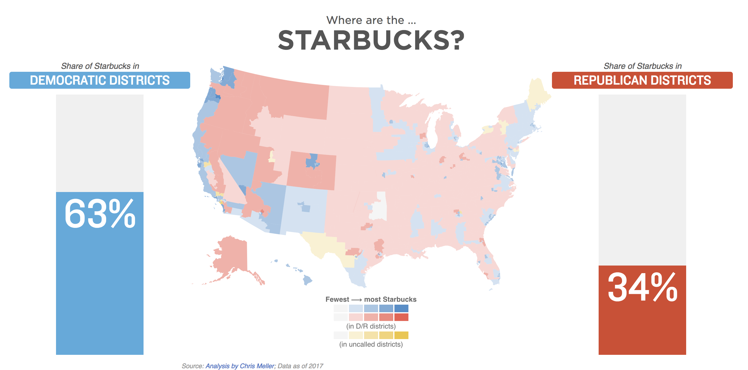
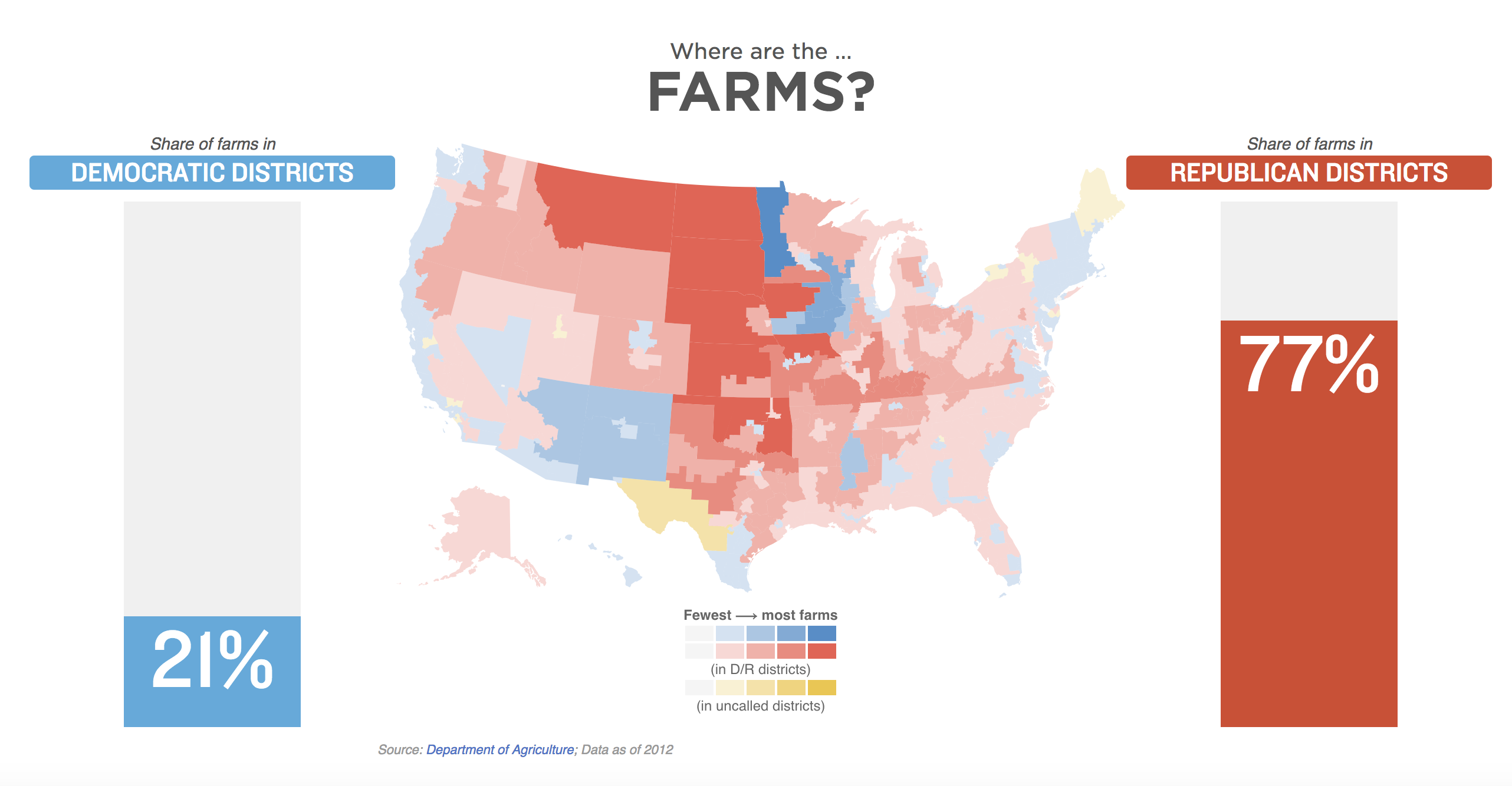
Everyone talks about how divided the country is, especially after elections, so I thought it would be interesting to show what kinds of things Americans have in common, as well as what we don’t. I think we were all surprised that small breweries were almost as common in red districts as they were in blue ones, and I personally wasn’t expecting the gap in farming districts to be quite as big as it was.
This was my first map-heavy project for NPR, and my first time doing shapefile analysis on congressional districts. Though it involved at least a dozen data sources, it wasn’t really as hard as it might sound.
Step 1: Figure out what what’s worth mapping
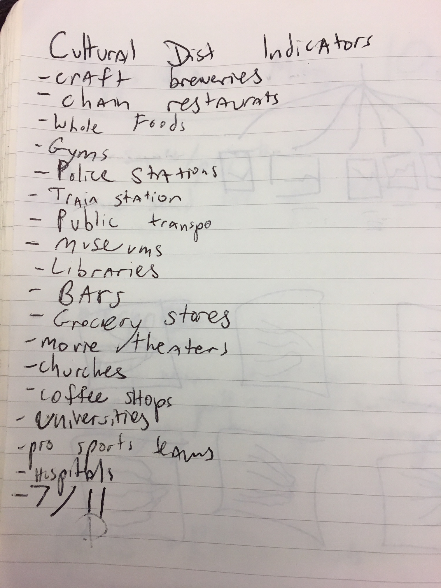
I wanted this to show the kinds of things that are important to lots and lots of Americans. I still don’t think I have a perfect single word that describes these kinds of locations — I toyed with “cultural indicators”, and in the story we went with “touchstones of American life.”
I did an everything-even-your-bad-ideas brainstorm to come up with an initial list of things I might find data for.
Step 2: Get the data
For each of those, I did some variation of Googling “X locations in United States data.” For some it was easy — Amtrak publishes a list of their train stations with latitudes and longitudes for anyone to download. Others I realized would be impossible to do in a timely way — the list of all U.S. gyms, for example, isn’t something that anyone tracks publicly.
What was important during this process was getting the precise latitude and longitude for each location we would be including. Since most data sources don’t group their records by congressional district, (shoutout to USDA, which actually does) we would need to do our own analysis of which congressional district they fall in.
That congressional district boundary data is provided as a shapefile from the Census Bureau, and is updated with the most recent redistricted boundaries in Pennsylvania.
Step 3: Load the data with the most recent congressional district maps
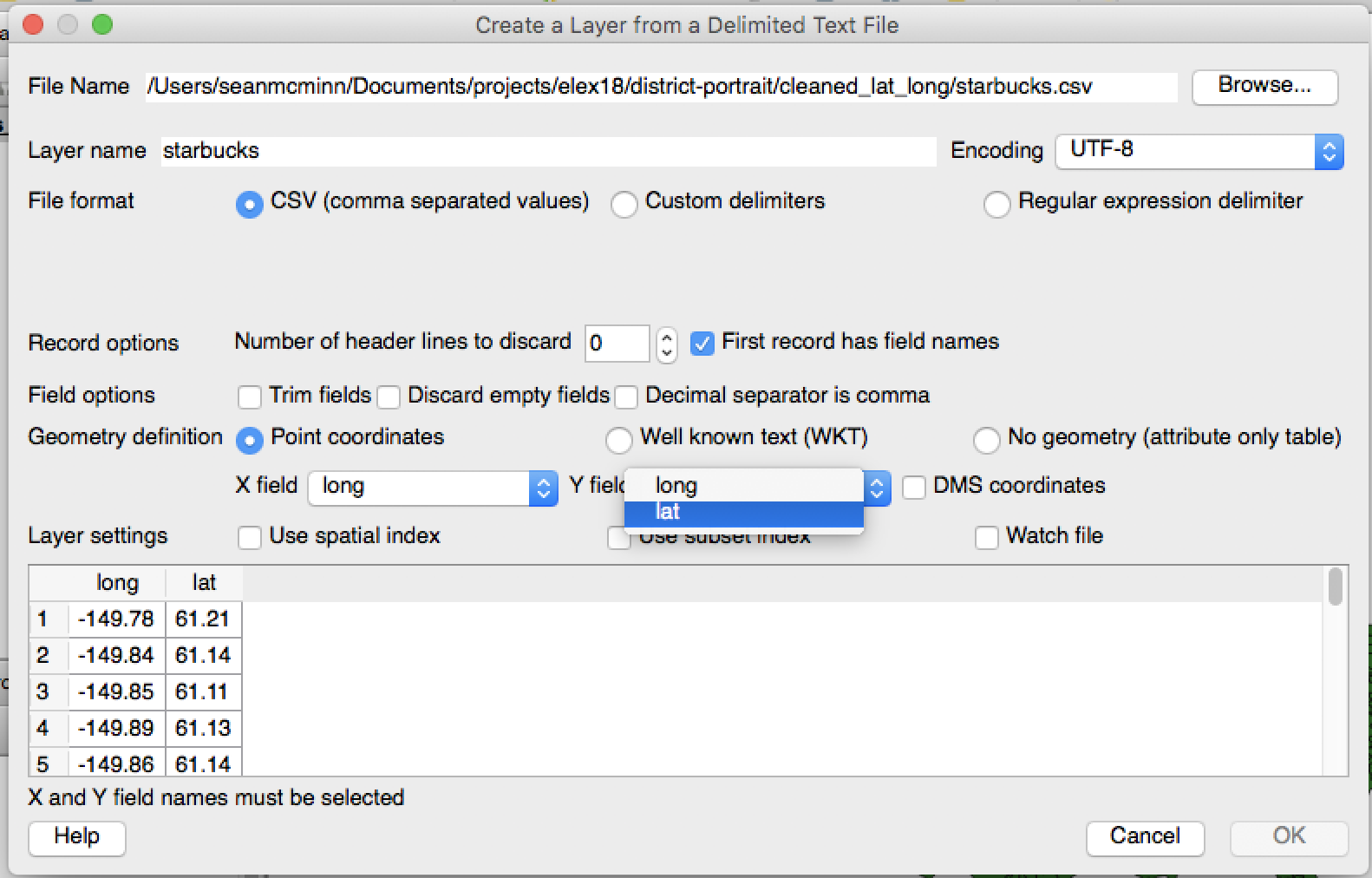
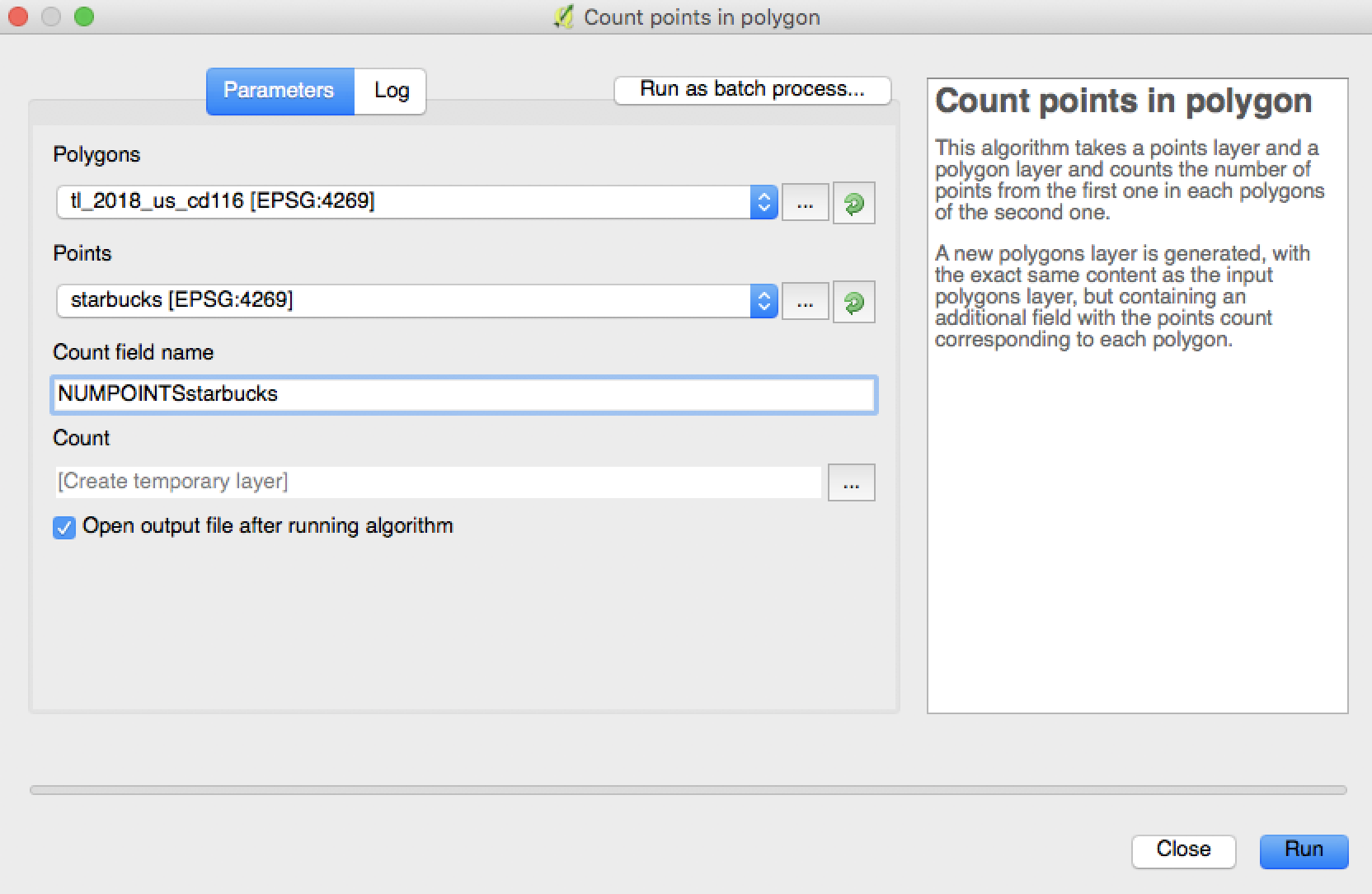
To analyze which districts the locations fall in, I used open-source software called QGIS. If you want to do a similar analysis, here are the steps:
- Add vector layer, using the district
.shpfile from the Census Bureau. - Add delimited text layer for each
CSVfile containing locations you want to analyze.- When adding the layer, specify the
X fieldas your longitude column name, and theY fieldas your latitude column name.
- When adding the layer, specify the
- In the
Vectormenu, selectAnalysis Tools => Count points in polygon.- For the
polygonoption, use the congressional districts shapefile layer. - For the
pointsoption, use the location layer with data points you want to analyze - NOTE: If the two coordinate systems do not align, hit
Closeand reproject the points location layer by right-clicking on it in the Layers Panel and selectingSet Layer CRS. Then choose the sameCRSas the congressional district layer. - Change the
Count field nameto something descriptive, such asNUMPOINTSstarbucks. - Click
Run.
- For the
- Right-click on the new layer called
Countand clickSave As. Save it as aCSVto your computer. That new file should have a column withGEOIDwith the FIPS I.D. for each district, as well as a new column calledNUMPOINTSstarbuckswith the count of Starbucks — for example — in each district. - Repeat steps 2-4 for each location
CSVyou want to analyze.
Step 4: Combine with election results
I put each of those new files in a folder and ran a Python script to combine them with district data showing who had won each district in the 2018 general election.
What I could have done differently
Though this whole process wasn’t really that hard, it did involve a lot of steps. That means there was more room for error — whoops, didn’t really mean to click that Delete button — and less of an automated process to follow for next time we want to do something like this.
Our new team developer Thomas Wilburn told me that we could have used PostGIS, which I’ve never touched before, to script much of this process. If we didn’t want to add another tool, we could have probably used QGIS to merge the winners for each district with the district location information, cutting the extra Python script out of the process.
Once I had all the data, I opened up a d3.js-based U.S. map template that my colleague Alyson Hurt developed. I passed the data to Javascript to color each congressional district based on its GEOID and the count of locations inside in it.
The graphic you see repeated 11 times on the story page is actually the same static file iFramed in each time, but with an added parameter of chartdata=XYZ. The Javascript reads that parameter then displays the appropriate data. That code is available here.
Complete data (excluding the Brewers Association’s proprietary they gave us to use for this piece) is available here.