 visuals + editorial graphics
Outside of a dog: Rebuilding the NPR Book Concierge

“Outside of a dog, a book is man’s best friend. Inside of a dog, it’s too dark to read.” – Groucho Marx
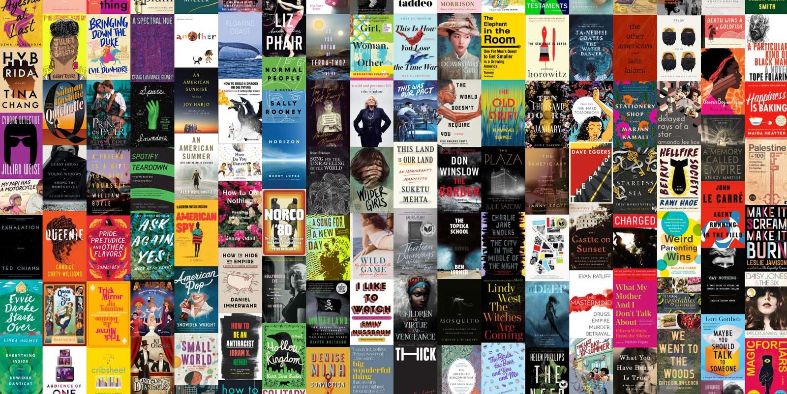
In 2013, NPR Books and the Visuals team published the first Book Concierge as a way for listeners to find all of NPR’s favorite titles for the year in one place. Every year since then, we’ve published another set of 300 to 400 books, each as its own separate page. That’s great if you live in the moment — but what if you want to leisurely flip through recommendations from the past and present in one easy place?
For this iteration of the Book Concierge, we’ve rewritten the project from the ground up to include every book recommendation from its seven-year history (and more, going forward). It’s now built on our interactive template, and as always we’ve open-sourced the core application code. Here’s a quick tour of the work we did to modernize the app, from data to front-end and more.
Stocking the shelves
The first, and probably biggest step, was to figure out how to classify more than 2,000 books. Although many of the tags used to filter recommendations have remained current over the lifespan of the concierge, there are still some variations. For example, “Science & Society,” one of the original categories, vanished in 2015 and returned in 2016 as the more effusive “Science!” Deciding on a common set of tags and then retagging six years’ worth of recommendations was no small task, one the Books team tackled over the course of several months.
The result of all this data cleaning is that you can activate a set of filters — say, “Kids’ Books” that are also “Historical Fiction” — then flip between years to see other books that met those same criteria.
We also unified reviewers across all years, instead of maintaining repetitive columns in the Google Sheets that power the concierge. And, moving away from hand-edited HTML lists in individual table cells, we shifted related links to their own sheet. These changes should make it easier to update the backing data from now on, since there’s less repetition or nested formatting.
Of course, even once the data is clean, there’s the problem of loading it quickly. Past versions simply embedded the data at the bottom of the page, but that’s untenable for multiple years: The data for 2013 through 2019 weighs in at almost 3MB of JSON! To keep things fast, the build process splits each year into two lazy-loadable files: One index containing only the information needed to show and filter the cover view (roughly 100KB), and then a second “detail” lookup file with the full review text, links, reviewer data and external service IDs. Our page technically takes a little longer to load, but since it’s split into smaller chunks, users shouldn’t notice.
Making a hash of it
One of the beloved features of past concierge pages was the ability to link and share filter settings via the URL: I might want to send a friend a link to all the science fiction cookbooks, for example. In the past, I’ve used a library like Scrapple to map hash fragments to application routes, but the concierge requires a bit more flexibility. It took a bit of exploratory coding to figure out how to wire things up so that we could have multiple URL parameters (year, tags, view mode, and book ID) without losing sync across different parts of the page (say, filters that are visibly checked but not reflected in the results shown or the address bar).
Ultimately, the key was creating a strong conceptual framework for how configuration flows through the page. In the final version, the URL hash is always the source of truth for application state, and other components listen over a shared event channel to be notified about changes. Input element values are never read directly: They send their own message to the URL module, which updates accordingly, then pushes changes back out. As much as possible, we don’t maintain any persistent state outside of the hash, to keep this flow “pure.”
The advantage of centralizing on the URL for application state like this is that we get a lot of functionality from the browser for free. For example, after changing filters or viewing the details for a book, you can click a “return to list” link, but you can also just press the browser’s built-in back button to go back to the previous view. We also need fewer event listeners in the DOM, since most of our interactive elements are just standard links in our templates. To our code, all navigation appears exactly the same, and is handled through a single common path.
Finally, with this application, we went all-in on fetch and async/await in our JavaScript code. These new browser features let us write easier-to-read code for loading data files or waiting for animations to finish. It also made it easier to cache requests, and to preload data for speed: when a year’s index file is loaded, we also request the detail file and place it in an in-memory cache, so that users don’t have to wait when they click on an individual book. Extensive caching makes the 2019 concierge very tolerant of poor network connections, and in future versions, I’d like to add a Service Worker so that it’s capable of running entirely offline or as a standalone app on your smartphone home screen.
Novels, graphic
Modern front-end development is often focused on JavaScript to the exclusion of other platform features. Frameworks like React move markup and styling into script files, rejecting the traditional idea of separation of concerns. But by using modern CSS and working with the browser, instead of trying to move everything into the main script thread, we can see returns in performance and maintainability. The rewritten concierge is a great example of this dynamic at work.
One strong visual signature of the page has always been its masonry layout, with each book fitted into a seamless waterfall of irregularly-sized covers. Instead of loading jQuery and the Isotope layout script, this year we used CSS multi-column layout to stack books into columns, the same way text flows across columns in a newspaper page. There’s some additional performance cost during the initial layout, but browsers can optimize for that in the future, and then we’ll receive those benefits for free.
Eliminating Isotope means we do need to write our own “shuffle” animation, but here as well we rely on CSS transitions by using Paul Lewis’ FLIP technique. When a tag is changed, we check the position of every book, apply the filter, and check their position again. A CSS transform is then used to move the book back to the original offset, and a transition slides it into its new place with a smooth, hardware-accelerated GPU animation. We save a little time by only animating books that start or end in the viewport: anything that moves around outside of the visible frame is ignored. In the future, the Web Animations API may let us significantly simplify this code.
Even after writing custom animation scripts and new services for fetching and filtering data, eliminating the jQuery and Isotope dependencies cut the script payload size by 60% compared to previous years. Our performance metrics from Lighthouse improved by more than 25 points in the process.
One fun touch for this year’s multi-year concierge is that we kept the accent color from each past year and used it to theme all the interactive elements in the page, like hover outlines, buttons, and links. CSS Custom Properties make it easy to propagate the colors through the page without writing individual classes for each year, and we still use the LESS preprocessor to create those initial CSS variable values — the best of both worlds.
Making it work everywhere
Presenting more than 300 books on a small screen has been, and remains, a challenge for the Book Concierge. Historically, we’ve somewhat dodged the question, hiding filters in a drawer on small screens. This year, since we were rewriting everything anyway, we decided to experiment with some unconventional choices for our mobile views.
Since the earliest days of touch UI, select boxes on smartphones have been a fundamentally different beast from the simple drop-down interface on desktop. Instead, iPhone and Android devices show these widgets as a scrolling modal dialog that’s easier to read and update. What if we embraced that native UI, instead of writing a lot of custom code to adapt our long filter sidebar for a handheld display?
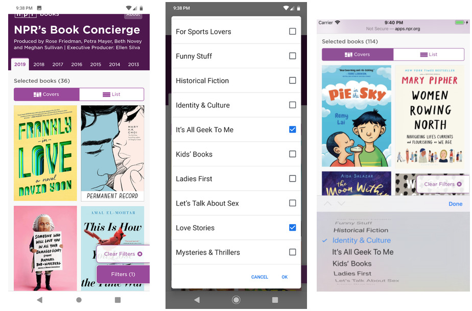 Mobile selection UI on Android and iOS
For this year’s edition, filters on mobile persist in the bottom right, in a “floating action button.” However, this UI is actually just the backdrop for an invisible <select multiple> element stretched over top. Clicking the “button” triggers the select box. Essentially, we rely on the mobile browser’s native modal UI for an accessible, easier-to-use filter. Selecting items from this dialog proxies them into the regular filter inputs, and from there they flow into the URL hash as standard.
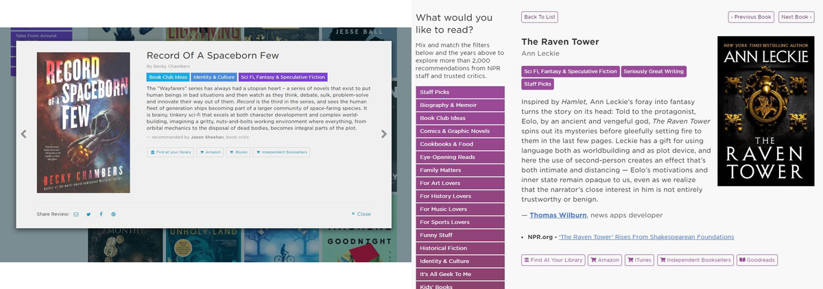 Before/after screenshots of the book detail view
It was also important to make it easier to use the concierge this year with assistive technology, like screen readers, keyboard-only navigation, or switch access. To that end, we ditched the jQuery-based detail pop-over (which was marked as aria-hidden and had additional accessibility problems) in favor of taking over the catalog section with book information. We also wrote code that manages and sends focus to different panels when internal links are clicked, and added aria-live to the filtered book count so that blind users can hear the results of various filter settings without having to move their cursor around the page. Although automated tests are no replacement for manual testing and experience, our Lighthouse score for accessibility with these changes is a perfect 100.
The new UI is not perfect. I’m a little worried about using screen size as a proxy for “has a modal select button UI,” and we can always improve our inclusive design. But it is a noticeable improvement, and as with the other changes, it sets a foundation for a stronger “forever concierge” going forward. I’m happy with how it turned out, and thankful to the Books team for supporting these changes.