Custom elements in NPR's primary coverage
It’s election season! For many news nerds, this is the busiest time of the year, as we try to keep up with current events and get ready to ship results data out to our audience as efficiently and quickly as possible. It’s important work, but (given the relatively long timeframe and solid deadlines) it’s also a good chance to innovate and experiment.
This year, our team built a new version of our well-loved liveblog rig, as well as displays for primary election results. In both cases, we’re using custom elements (of which I’m a long-time advocate) as a key technology. Given the relatively rare usage of this browser API, I’d like to talk a little bit about how we’re making them work for us in these two projects.
What are custom elements?
To understand the ideal use of custom elements, let’s look back at the <canvas> tag. For younger developers, it may be hard to remember that there was a time that you could not easily create dynamic images in the browser. You could include a pre-made image from a server using an image tag, or you could possibly create a data URI (a process that in the JavaScript engines of the time would be slow and painful). But the potential for games or interactive graphics was severely limited (SVG was also poorly-supported).
In 2004, Apple created a new tag called “canvas” that let you draw dynamic shapes and image content using JavaScript. Standards groups were not happy about this, which seems funny now: the idea that a browser could unilaterally introduce new tags was (and is) contentious. On the other hand, <canvas> was a huge hit, and filled a huge gap in the platform. Being able to introduce new features via HTML (see also: <audio> and <video>) is a really powerful tool.
Around the same time, premade widget toolkits were becoming more common for use on the web, since the built-in form inputs were often clumsy or slow to evolve. If you wanted a visual date picker, or a modal dialog box, jQuery UI or YUI could make that happen, but the ergonomics were awkward: you needed to add special classes to generic elements in the document, then call a function to upgrade those elements (which would sometimes change the structure of the page in multiple places), and manage their lifecycle manually when they were configured, updated, or removed from the page. These toolkits were useful and often necessary, but they weren’t expressive or easy to mix with other libraries.
As part of the Web Components spec, custom elements are meant to address both innovation and expressiveness. By letting developers create their own tags, with lifecycle callbacks when they were added/removed/changed, these APIs let people create new kinds of functionality that look and feel just like any other HTML element.
Unfortunately, it took a long time for the specification to settle, and during that time the size and complexity of typical front-end code increased dramatically (some might say excessively so). As a result, this API was underwhelming to people who had been led to expect that it would be a full-service application framework. If you’ve heard of web components, it’s often through articles or blog posts that talk about how they fall short of that mark. But the ideal case for custom elements is something like HTML’s date inputs: self-contained pieces of UI that quietly manage themselves without a lot of developer involvement or framework lock-in. That’s generally how we aimed to use them in our election-season projects.
It’s a live (blog)!
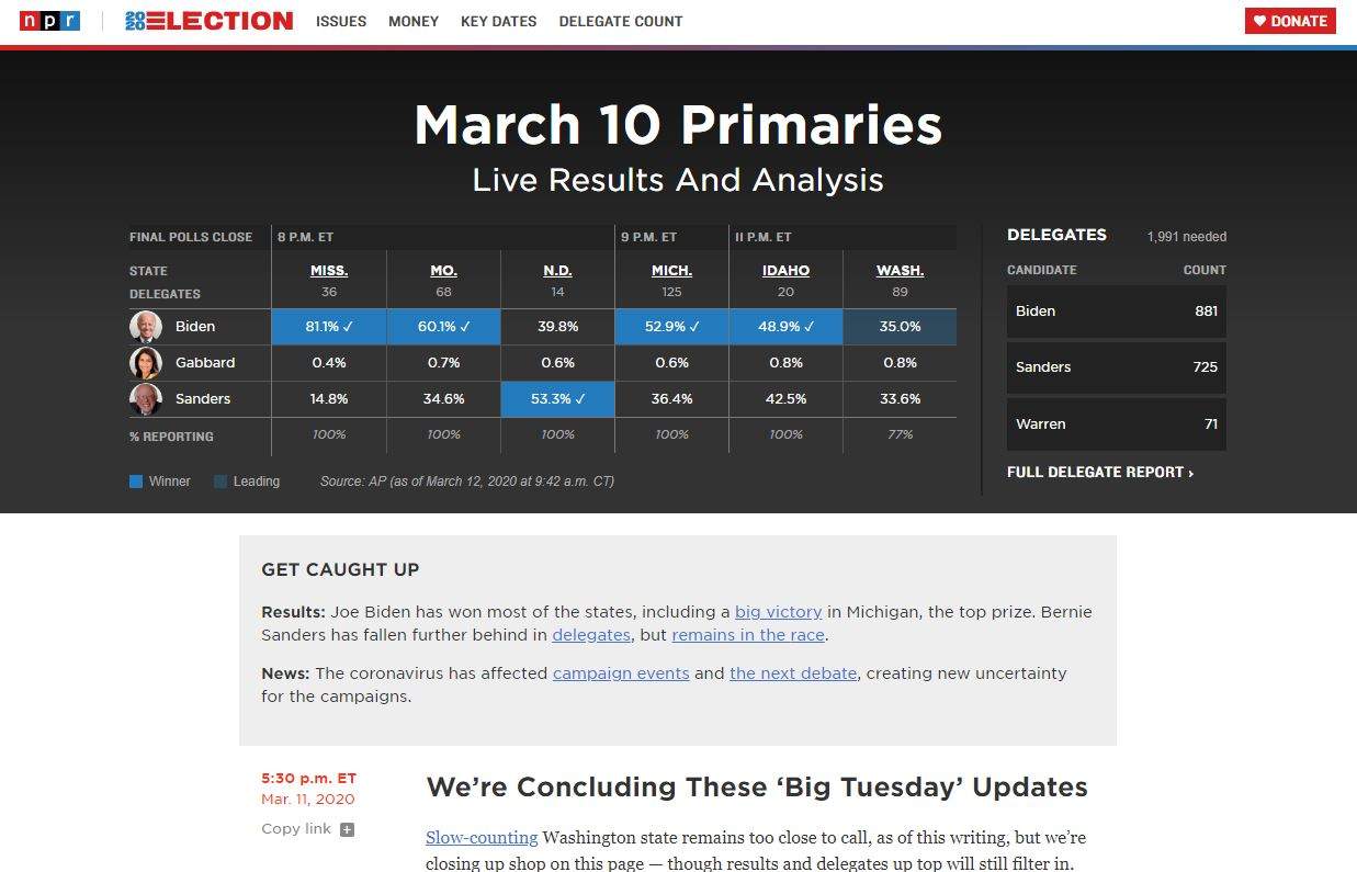
When we rewrote the liveblog rig this year, the core concept of the application stayed pretty much the same. It still reads from a Google Doc, bakes that out into HTML, and then a client-side script periodically pulls the page from the server and selectively updates it. For reporters and editors, the experience has hardly changed. Many users, especially those seeing the blog through an embed on their local station’s site, will not even notice we did anything.
Behind the scenes, almost everything is new. The new liveblog application code is based on our interactive template, which meant the source document can now be written in CommonMark and ArchieML instead of a bespoke format. That also means we can consolidate a lot of configuration into that document, instead of spreading it across a separate spreadsheet and a number of script files. And we wrote our own parser for ArchieML to make it less error-prone during heated news periods.
Outputting HTML directly to the page during the build process means that the blog is faster and more SEO-friendly. Adding timestamps and other metadata in the source document directly made it possible for us to schedule posts for future publication, and eliminated conflicts that cropped up if we moved between server instances.
This new document format wasn’t compatible with the old template shortcodes, so I rebuilt them as custom elements, which gives us several advantages:
- Since browsers require all custom tag names to contain a dash character (preventing collisions with future built-in elements), the tag forms a nice isolation barrier between the parts of the page that we update via a DOM diff (like text and new posts) and the insides of embeds (which should retain dynamic state).
- Each element can manage its own lazy-loading, instead of needing a central script to keep track of any new additions.
- If the element is removed from the page, it can clean up after itself automatically.
- It’s easy to add new embed types, since each tag definition is a self-contained unit (including template markup and styles).
- Since the embed “shortcode” is HTML, it looks familiar to web-savvy people and is easier for them to troubleshoot.
Perhaps most importantly, because a liveblog is basically just a simple document with freeform markup, loading a full application framework like React to render it feels like overkill. In that environment, the fact that custom elements are framework-agnostic and self-organizing makes it easy to mix them into the CommonMark formatting of the source document.
Primary season
NPR has always run results for the general election and for presidential primaries, but this is the first year where we’re producing extensive election displays for other primary races (such as governor, House, and Senate). Doing so poses some new difficulties, since it’s no longer a small number of (relatively isolated) events, but a constant stream of updates over many months. Managing our interactions with the AP’s election results API becomes much more complex as different races start and end, often overlapping with each other.
Complicating matters further, our team’s habitual build process for projects (whether Python or Node) has been almost entirely stateless, since we’re baking out static files for S3. We wanted to retain that design philosophy, since it makes these projects cheaper and more reliable. But it was hard to square that with the need to store and render months of election data.
And of course, we weren’t just building results for NPR.org, but also for any of our Member stations. Anything we built needed to be sufficiently decoupled that it could be broken apart or embedded in pieces, with customization for links and theming. Our design needed to be able to grow and scale across the entire primary season, to make distribution as routine as possible for our local partners. And we needed to be able to do it with relatively little staff: I was the only full-time developer on the team when the election season started.
Our solution is to decentralize and distribute application state into the cloud. Rather than try to load and retain the whole season’s data locally (in a database or flat files), we treat our S3 bucket as our “memory.” Each race gets defined as a spreadsheet row (by state, office, and/or race ID), pulled from the API, and uploaded as its own JSON file, which is never deleted (only overwritten, when new updates come in). Locally, we may only have a day of data at any given time, but the live app has all the results that have ever been published, and a proxy layer in our dev server means we can still access those remote files during development.
This approach is fashionably known in front-end circles as the “JAMstack,” but it’s really just an extension of our team’s historical reliance on static site generators. Within each page, we use web components as our fundamental building blocks: the rendered HTML loads and displays a given result file via markup that looks something like this:
<standard-primary live src="NH_S_2_11_2020.json"></standard-primary>
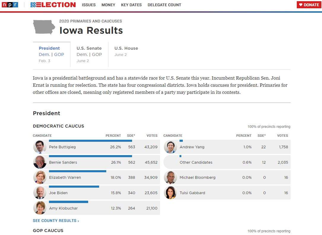
This particular custom element doesn’t actually display anything directly–it just monitors a JSON file for updates. When data comes in, it uses a utility function to create <results-table> elements for each race, passing results to them for display. This pattern of “abstract wrapper around display views” is common in React as well, which just goes to show that lessons from JavaScript frameworks can still apply to a web component model. We have a small library of elements that compose this way, depending on how the tables are organized (say, by house district or by county) and displayed (<results-table> vs <president-results> — the latter offers portraits of individual candidates).
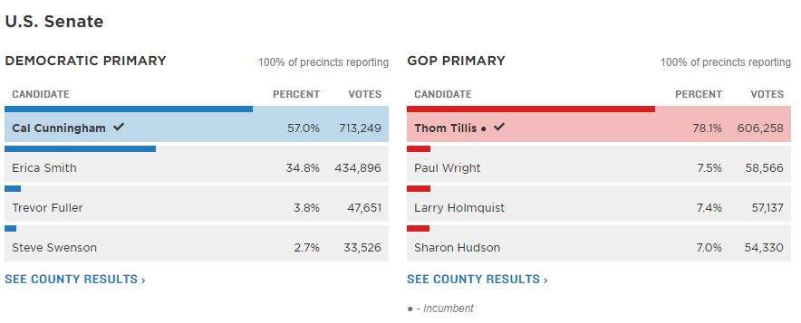
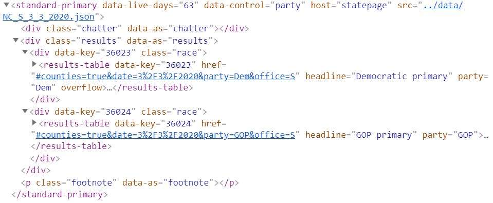
Above: Results as rendered on the page. Below: Structure of the nested elements in the DOM, with individual results keyed by AP race ID
Normally, custom elements inherit directly from the HTMLElement browser object, but for these tables we’ve created an intermediate class, ElementBase that everything extends from instead. Our goal with this class was to smooth out many of the common code patterns for writing a useful element definition, and bring the experience closer to that of a traditional front-end framework. You can see some demo code for writing a basic component using this class if you want to know more.
Components extending the ElementBase class automatically create getters and setters for properties and attributes, so that tag.href = X and tag.setAttribute("href", X) work the same way. They can dispatch and intercept events, when they need to communicate with each other and with the rest of the page. They also provide some simple templating through the illuminate() method, which makes it easy to quickly fill and update an element’s static markup (headlines, footnotes, timestamps, etc.). For templating of more complicated structures, like tables or lists, we used the same EJS templating that we use for our server-side code, so there’s no context-switching during development.
Throughout all our components, we tried to stick to common patterns for inputs and outputs. For example, all our data-oriented elements get their source file location from their src attribute, and observe when that attribute changes. From there, it’s easy to write a general-purpose lazy-load script, or use standard dev tools to tweak different inputs, the same way that we can adjust a built-in tag. Personally, I feel like this is transparent in ways that many modern toolkits are not.
A key feature that’s often paired with custom elements is the dramatically-named Shadow DOM, which allows developers to isolate the inside of an element from the rest of the page. (For example, the controls of the built-in <video> element live in the Shadow DOM–they’re built in HTML, but you can’t style or programmatically interact with them.) We chose not to turn this on for our components, because that isolation would actually only cause problems: we want styles to cascade into our elements, and we would need to jump through additional hoops to query elements or dispatch events across the shadow root.
In contrast to the liveblog’s unstructured markup style, for election results it was tempting to use a traditional front-end framework like React or Vue. Ultimately, however, I tend to feel strongly that it’s worth a little bit more work on the developer side if the result is a smaller, faster-loading bundle that loads faster and uses less power and bandwidth. I never felt like we were struggling to express ourselves without a framework. And the savings were real: the complete JS bundle for our state page displays is around 90KB uncompressed — 20KB after gzip is applied. As a result, NPR’s pages were among the fastest results in the country.
Wrapping it all up
NPR has used Pym.js to create responsive iframe elements since 2014. It’s a bedrock library for much of the journalism industry, letting interactive graphics live in unfriendly content management systems all over the world.
What would Pym look like if it were written today, for modern browsers, using new JavaScript features? Sidechain is our attempt to answer that question. It’s a library that provides a custom element (<side-chain>) for placing the embed on the host page. It speaks JSON by default, with Google AMP-compatible height messages, but it can also interoperate with Pym on both the guest and host sides.
For the primaries, we’re taking full advantage of that compatibility. Our embed codes for stations are using Pym, but the embedded liveblog and results widgets are Sidechain guests. However, within the liveblog, any interactive graphics loaded from our dailygraphics rig are built using Pym, but hosted in a Sidechain element. In the case of the results embedded in the blog, we have the new library on both sides. Although it’s a high-pressure environment, elections are actually a surprisingly good time to test features like this, because we know that someone on our team will always be watching during the roll-out.
So far, Sidechain has been reliable, but we’re not deprecating Pym just yet. Many content management systems across our network still dislike any non-paragraph HTML tags (including <div>), much less an unspecified custom element. We also need to create a wrapper (along the lines of npr-pym-loader) that recreates some legacy Pym features we can’t ignore on NPR.org, like PJAX navigation and scrolling the host page. If you don’t need those features, however, you may want to check it out: In systems that support them, Sidechain’s custom elements are much more pleasant to work with than their predecessor.
 visuals + editorial graphics
