 visuals + editorial graphics
How we did it: The 2020 general election rig
 Screenshots of the new general election rig
In March of 2020, I came to NPR from big tech, where deadlines were more guidelines than rules, and landed in a mid-pandemic world of two-day turnarounds. By September, I’d mostly adjusted to the stress of non-negotiable deadlines. But there was something different about the fear I felt when our developer Thomas Wilburn casually said “most elections teams I know have been working on their platforms for months.”
We’d also wanted to start work earlier, but COVID-19 had other plans. It wasn’t until late August that I began studying our 2018 elections code, weaving my way through Hyperscript template syntax and Fabric commands. By September, we’d decided to re-write and re-design the front end, from scratch. A day of swearing at Docker and Postgres later, we decided to re-write the back end too.
What followed was six weeks of constant design conversations and refactoring refactors. Going state-by-state, checking and double checking test results, edge cases and extra small screen displays. The only thing that made this timeline feel manageable was my colleagues – Thomas Wilburn, Audrey Carlsen and Alyson Hurt – and their attention to detail, knowledge of news tech and dedication to carefully presenting information.
Designing for Unknown Threats
This year, the team knew this election would be prone to delayed counts, misinformation, and hyper-focus on certain races. Inspired by the concept of “threat modeling,” we spent time early on brainstorming the cleanest ways to display results and prevent those displays from being misinterpreted. These conversations led to an almost complete overhaul of our display styles, as well as feature additions to improve user experience, such as county maps and demographic trend scatterplots.
To avoid small early leads causing unnecessary concern or drama, we set a high threshold – 50 percent of expected vote counts or precincts reporting – to begin shading a candidate as “leading” across all our tables, maps and charts. To reinforce that delayed vote counts were expected, Audrey proposed an explainer note at the top of the page to flag that delayed results wouldn’t necessarily indicate a problem with the vote.
Previously, the national results displays were organized by poll closing times – helpful for on-air radio hosts, but challenging for average readers looking to quickly find results for a particular candidate or state. Audrey also overhauled our national results pages to focus on critical races, organizing presidential, Senate and House races by competitiveness.
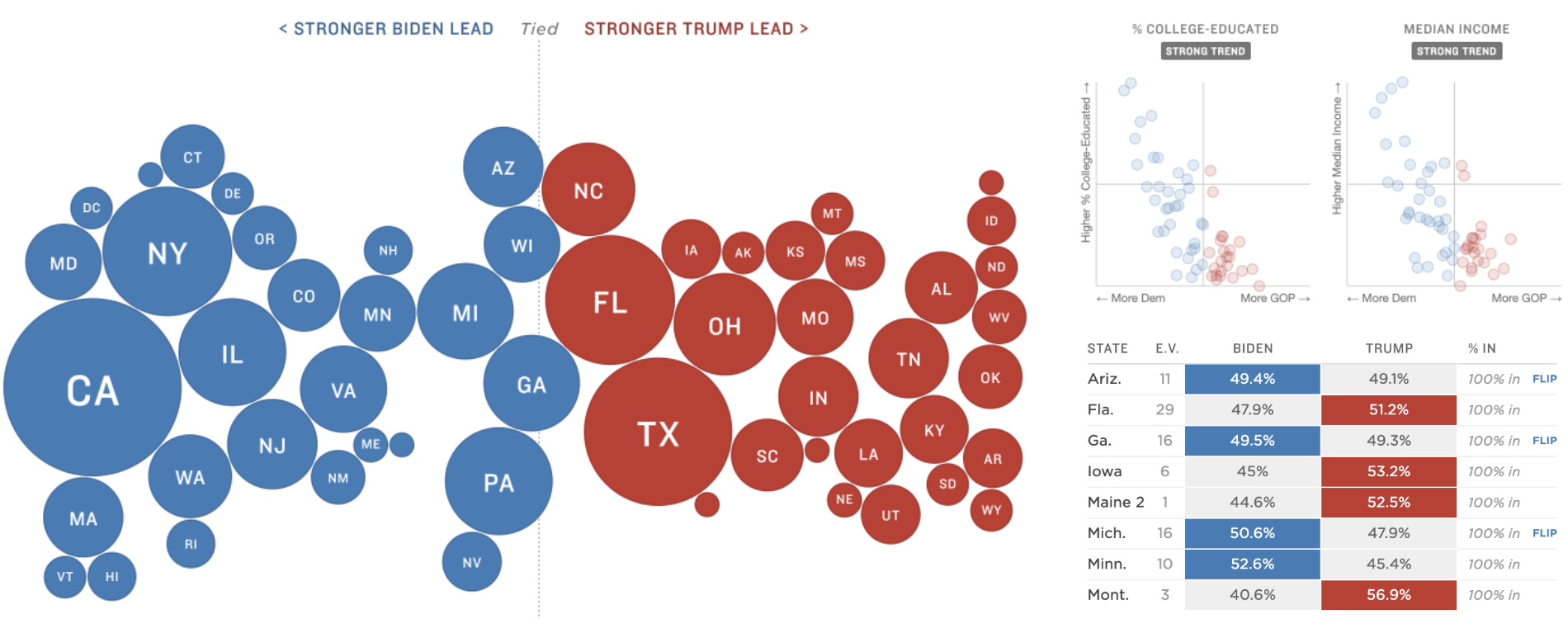
It was also important to us to offer readers alternative displays of the presidential results. While most readers are familiar with geographic maps, the disconnect between geographic size of states and their electoral weight makes misinterpreting a geographic map easy, as this team has written about previously. So in mid-October, we began brainstorming other ways to emphasize electoral weight and significance. One Google Doc full of bizarre cartograms, snake charts, bee swarms, balloons, donuts and state Tetris later, we landed on a “bubble chart,” meant to emphasize the electoral weight and vote margin.
A little over a week before election night, the bubbles were born.
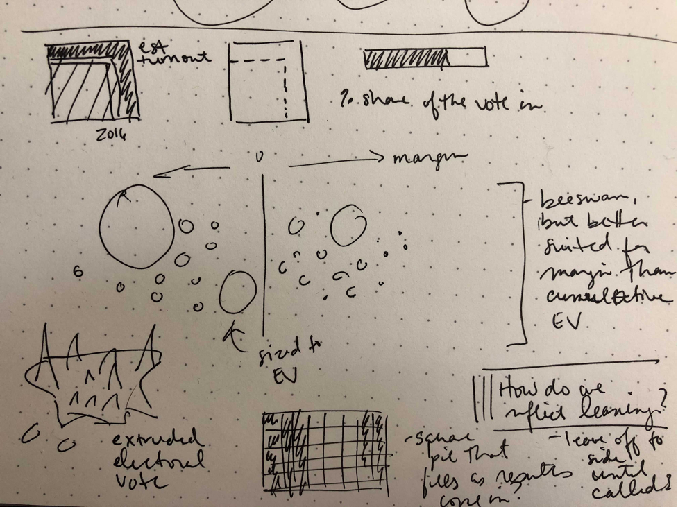 Aly’s original sketch
The Data Pipeline
The old elections app consisted of two separate Python repos, with code dating back to 2016. The data pipeline downloaded results from the AP as CSVs, used the PostgreSQL shell to load those results into a database, and then dumped the results as JSON to an S3 bucket. A separate graphics rig parsed that JSON and used it to display a “big board” of national results and state pages.
Part of the reason for this design was to provide a friendly web UI that editors could use to override race calls, but that UI was rarely used, and locking it down when all of NPR was remote was a daunting prospect. It also meant working on results locally required juggling both halves of the application. Finally, the Elex library that our Python code used didn’t support some of the new AP features we wanted for this election, like EEVP.
We decided it would be faster and simpler to reuse our code from the primaries rig. That meant switching to a unified project, where one step in the build process parsed data from the AP directly into JSON files for graphics in the same project. Having the pipeline and the displays in the same codebase also made it easier to align the JSON output with front-end needs, such as sorting results by vote counts and breaking results into national, state and county race files.
Instead of using a web server for overriding race calls and setting configuration, we relied heavily on a Google Sheets workbook. The resulting interface was a little more obtuse–we needed to look up ID codes for candidates and races to set an override–but it put all our configuration in a single place, and came with access control for free (all of NPR is in a single Google Suite organization).
The Front End
When switching to the NPR interactive template, we optimized for speed, ease of development, and low-friction navigation. We chose Preact as a lightweight alternative to React (at 3KB, it’s about 20% as big). Like React, it offers a basic architecture for rendering via a Virtual DOM and a designer-friendly templating language (JSX). It also provides ways to pass data up and down the page hierarchy, so we could separate processing and display logic–crucial when managing the intense filtering, sorting, and transformation that election results require.
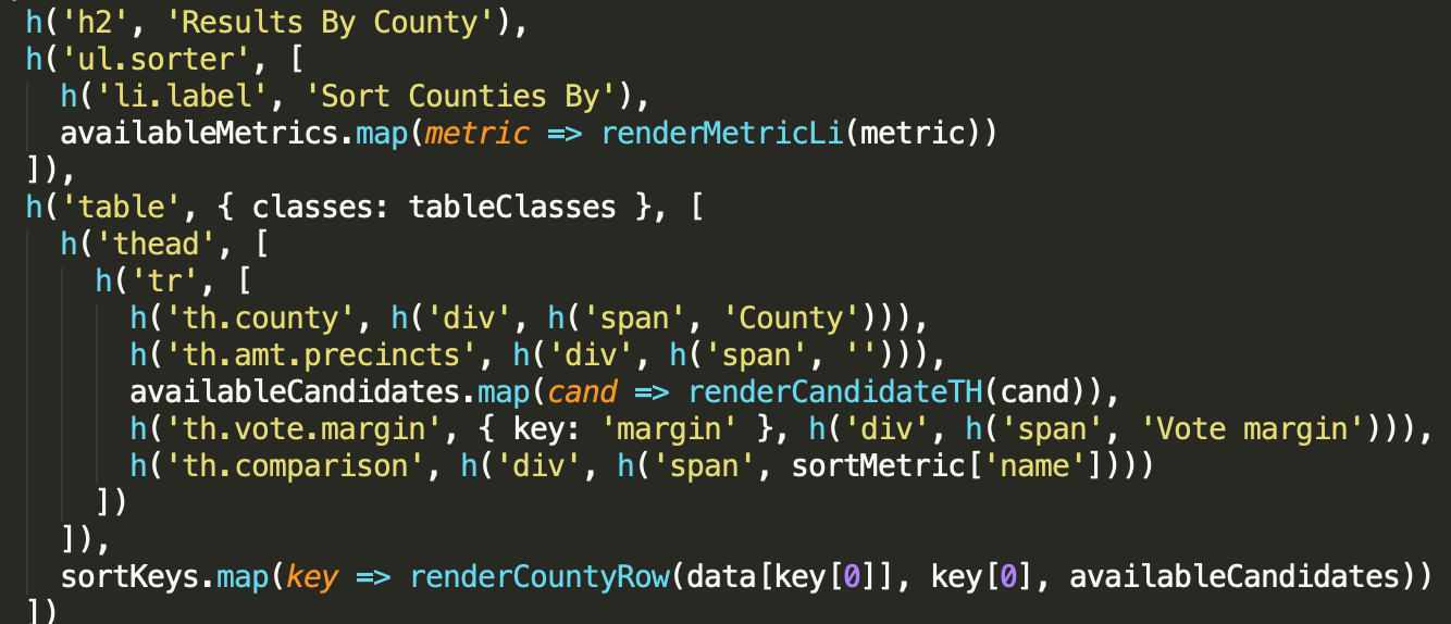 Maquette syntax from the 2018 rig
To illustrate the difference this made, the original 2018 state page script was 900 lines long, containing all logic to display Key Results, House and Senate results, and county result tables. Using Preact made it easier to break these pages into reusable components. The state page, for example, could be broken into chunks of code anywhere from 100-300 lines:
- A page component that loaded data and determined what subviews to show
- A key results view with summary state results
- A “named results” table for statewide displays
- County-level results, which lazy-loaded their own, more detailed data file
Building pages out of nested UI blocks made it much easier to manage when adding county maps and county data visualizations, as well as embeddable and customizable results widgets for the homepage, liveblog, story pages and member station sites–they could just slot right into a host component and receive data from it.
That’s not to say that Preact didn’t require some adjustment. In the primaries, our web components were never re-used for multiple data sources, and the API provides a good model for tracking updates to attributes. React’s hyper-focus on the render loop as the primary lifecycle for components meant that we often accidentally left stale data on the page when attributes changed but the state didn’t. We ended up using list keys to force components to completely re-initialize whenever the data source changed, which is a little like fixing a car by selling it and buying a new one, but the overhead in our particular case was low and it made the architecture much easier to conceptualize.
Similarly, the Preact model assumes that you want to work in JSX templating for most rendering, but we had a number of visualizations in SVG that were loaded from the server. Using refs to get access to the underlying DOM made it possible to load, inject, and paint an arbitrary SVG, but we had to effectively create our own parallel render cycle for these parts of the component. Running update code in a method named “shouldComponentUpdate” never stopped feeling a little gross.
To keep the bundle small, we used micro-libraries like Scrapple for routing and avoided adding unnecessary code to the bundle. For example, in making the county demographic scatterplots, I pulled in d3’s scale module. Thomas suggested instead that we re-write only the parts we needed, so we wrote a simple scaling function, demystifying parts of d3 that I use frequently as a nice side effect. Data for the app went through a unified fetch interface we called the Gopher, which simplified loading and updating data from small, network-friendly JSON files.
Strictly keeping our bundle small, aggressively caching and lazy-loading data, and deferring ads until everything else had a chance to run, meant these pages are extremely fast, earning election night scores in the 80s and 90s on Google’s PageSpeed Insights for mobile and desktop respectively. With a few notable exceptions, these scores are an order of magnitude higher than results pages from most other newsrooms. The single-page architecture also means that once someone is on the page, it’s lightning-quick to switch between different views.
The Final Countdown
The week before the election, we began to test our displays more rigorously. Everyone told me elections were synonymous with “edge cases,” but it took living it to understand. Many days, I felt as though I was playing Whac-A-Mole, squashing one bug, finding two more. These bugs ranged from ones as important as handling the “uncall race” flag from the AP correctly to properly displaying long candidate names on tiny screen sizes. I began to dream about the Georgia and Louisiana Senate race displays.
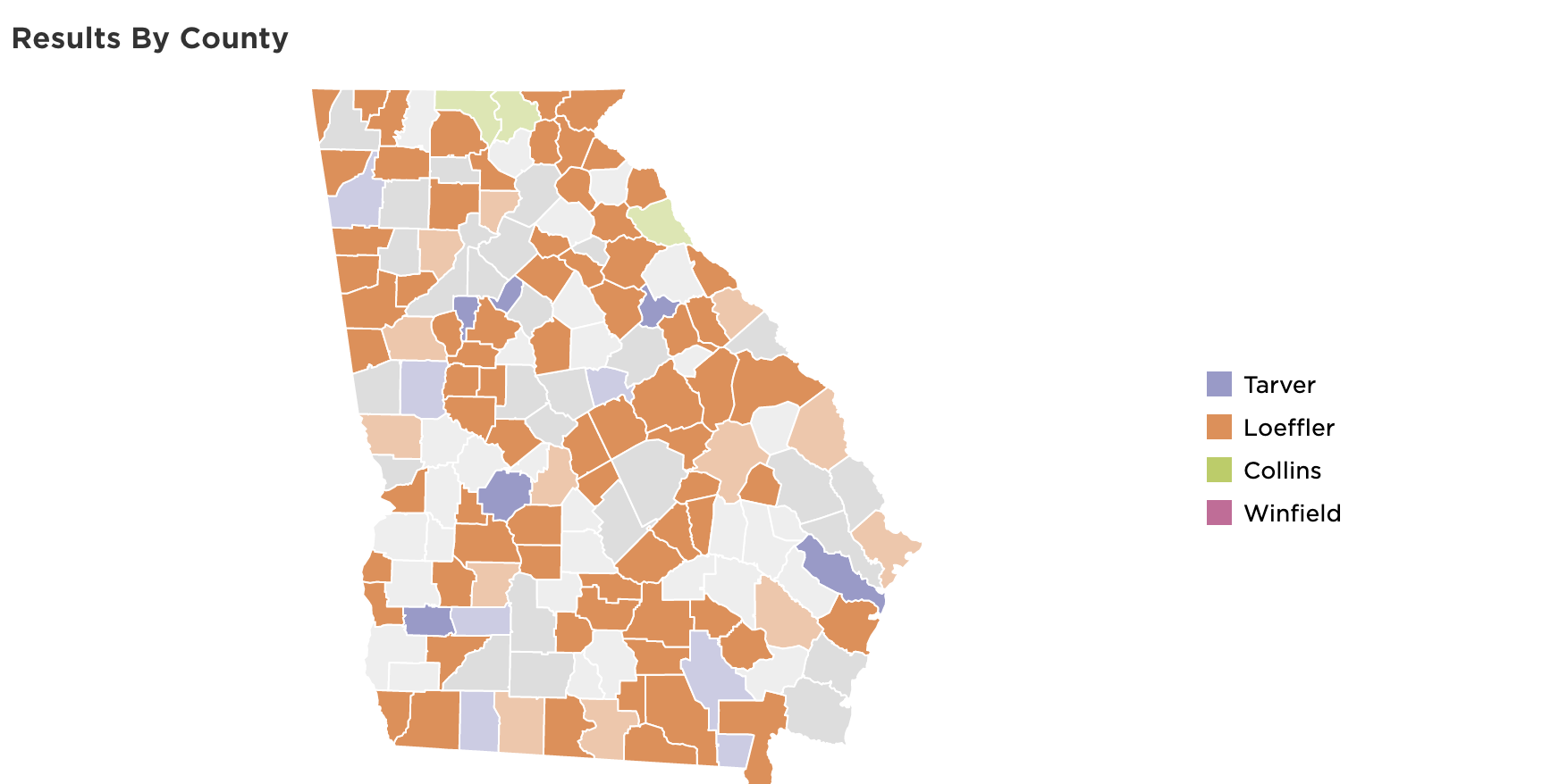 Early attempt at handling the many Georgia Senate candidates
Monday night, I was on call as the first results came in from Dixville and Millsfield townships in New Hampshire. It was both thrilling and nerve-wracking to see the displays populate with real data, realizing that what we’d been working towards was starting. Based on the previous weeks, I expected election week to be a fraught with unanticipated bugs. There were a few, notably confusion with the bubble display, as the AP called Virginia for Biden, despite Trump leading by a significant vote margin due to incomplete results.
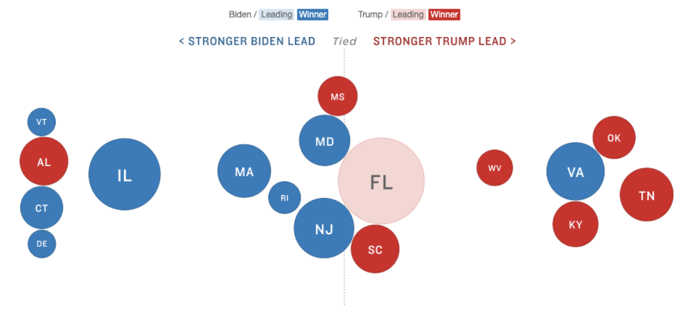 Screenshot of when the AP called Virginia for Biden
But for the most part, the day went smoothly–the biggest potential issue, a problem with the AP data for the split electoral votes in Maine and Nebraska, turned out to be easy to fix with a couple of overrides in the control spreadsheet.
As a news nerd and software engineer, I thought I had a good understanding of an election’s moving parts and what building a platform for it might require. But this experience felt akin to being on Jeopardy after only ever doing bar trivia.
It was humbling seeing the ways in which development here diverged from my previous experiences. Some aspects, like writing reusable components and prioritizing performance, were constants, even if the methods to achieve them were unfamiliar. Others, like re-writing an app from scratch and using whatever code, library, or structure best suited our needs, less so.
In previous roles, I’ve worked with codebases that haven’t fundamentally altered since their initialization, where much of your time goes into understanding the old code, learning to work around it, and keeping it functional as platforms and requirements change. Despite my initial fear, it was exciting to rebuild the elections platform, and do it not because the old platform was unusable, but because we had the time, resources, and tech to modernize it.
I look forward to seeing how future designers and developers on the team improve, update, and someday, after a day of swearing at JSX, entirely overhaul the new app.