 visuals + editorial graphics
Building a beautiful and clear map from massive, complex data
In early August, we were tying up loose ends on our visual narrative about wildfire risk around the country. I had just put the finishing touches on my fire return interval maps (more on this shortly) when I noticed a slight color discrepancy in the map. And then this happened.
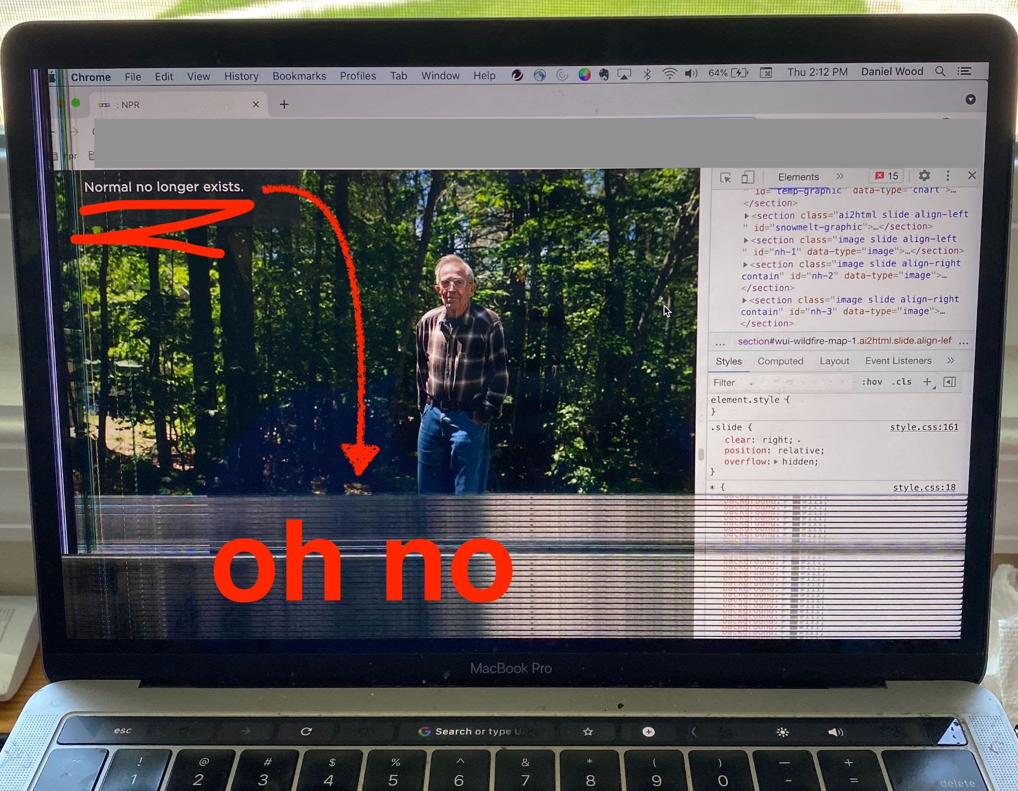 Normal no longer exists — nor do several weeks of work.
I tried to reboot, but my computer never turned back on. And I lost a considerable amount of raw data that I hadn’t yet synced to the cloud. [facepalm] Luckily, my colleague Connie Hanzhang Jin was able to clean up the maps without the raw files and the project turned out great.
But now that it’s over, I want to retrace my steps and recreate this map. It might help someone else build beautiful raster base maps — and it will help me when I ask myself, in 6 months, “How did I do that again?”
In this blog, I will walk through my solutions to several vexing problems:
- How can I do any sort of data transformation on a massive raster without overloading my machine?
- How can I join my raster data with a separate CSV?
And as always…
- How do I choose a color palette and legend that is …
- clear without being sensationalized AND
- divergent in color while also being accessible?
In cartography, there are always multiple ways to approach a problem, so if there are skills, tricks, or methods that I overlooked, please let me know by replying to this tweet.
Step 0: Get the data
A cornerstone of our reporting on this story is the idea that, prior to European colonization of the Americas, wildfires were commonplace in many surprising areas of the country. Most midwest grasslands burned at least once every ten years, something we see rarely now. Southeast pine forests burned at least every 50 years, often in the context of controlled burns performed by native tribes. By contrast, some areas that seem more fire-prone to a modern mind — like the area around Yellowstone National Park which famously burned for 5 months in 1988 — only burned every 40-300 years before the settlement of Europeans.
We know this in part thanks to by forensic research done by experts like Randy Swaty and his colleagues that build the LANDFIRE database. Swaty is an expert in understanding the historic, pre-European fire return intervals — the average number of years between wildfires — across the country. This data is not so easy to understand and can be tough to find. Swaty helped demystify it and point us in the right direction.
For those of you playing along at home, our map uses the 2016 Remap (found by clicking the “select a version” option). The fire return interval data — a shapefile showing regions, a csv with the data corresponding to keys, and a massive GeoTIFF raster with keys — is housed in the “Biophysical Settings” layer, so find that and select “CONUS”.
Step 0.1: Learn what the data mean
After some back and forth with Randy, I figured out that the pixel values in the GeoTIFF raster do not refer to the average number of years between fires (i.e., the fire return interval). Instead, they are unique codes for the biophysical setting (BPS) of the area, referring to the very specific vegetation and climate of a particular area before European expansion. All the different possible BPS (1,770 in all) have unique fire return intervals ranging from 1 to 10,000+ years — but those fire return values live in a separate csv that needs to be joined to the raster. For instance, here’s a few different entries in the CSV, and how they correspond on the map:
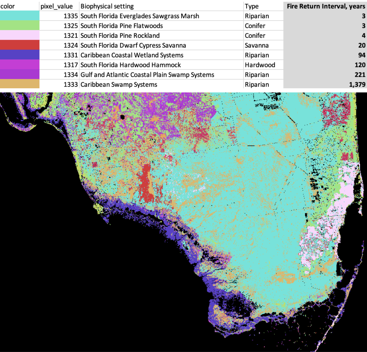 Map of South Florida’s biophysical settings, with a key, and the Keys, out of view.
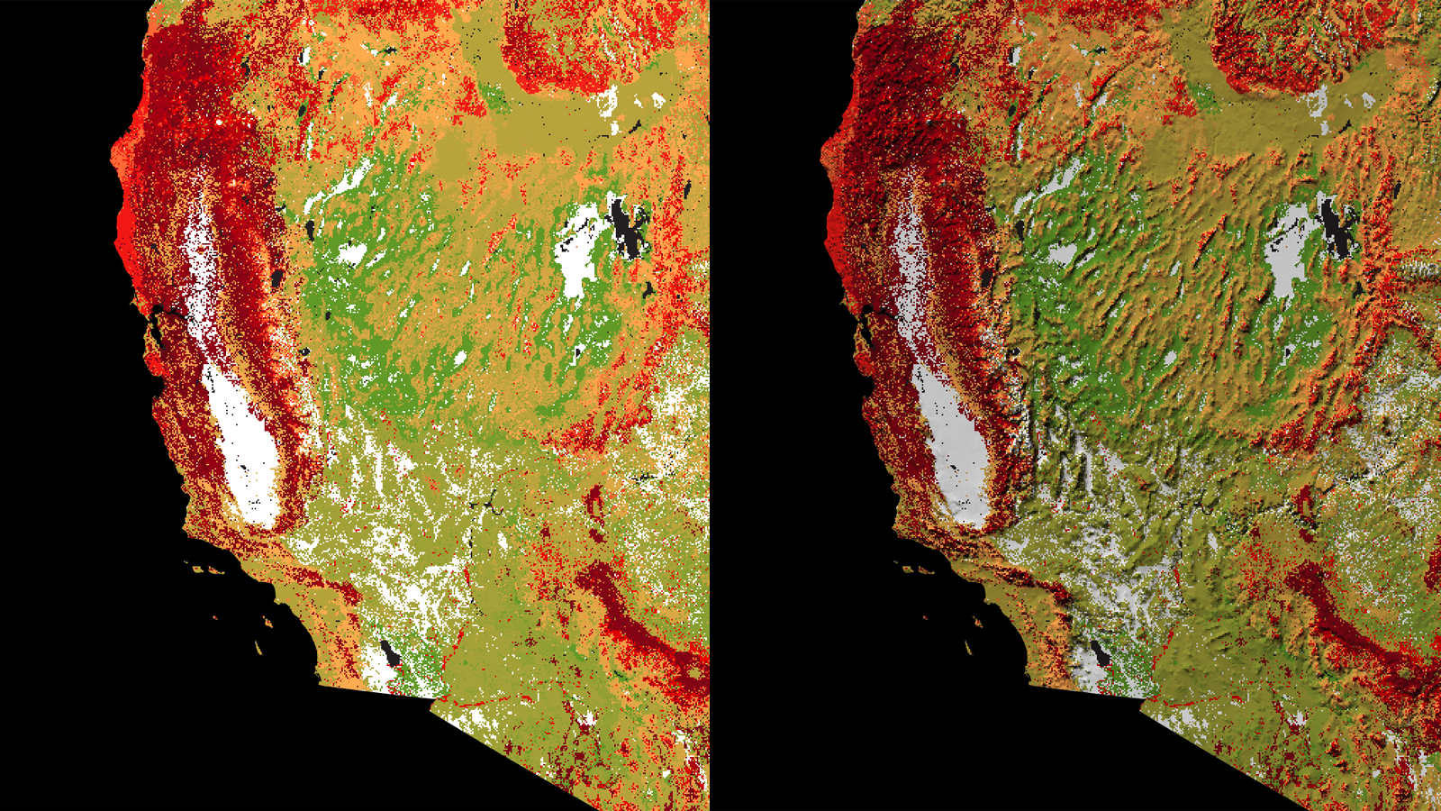
Step 1: Downsample massive raster
Another wrinkle: This dataset is huge (more than 2GB compressed). The data I downloaded could produce a map with a level of detail that is extraordinarily high and unnecessarily sharp for a national view. If I tried to export the whole thing, the full-resolution map would be about 154,000 pixels wide — but I only needed it to be about 1,200 pixels wide for this project. It wasn’t worth all the time and processing required to work with this at its original resolution.
So instead, I needed to downsample the raster to get a more manageable dataset. There are a few ways to do this in QGIS, but the most simple way is to simply right-click on the layer and export your raster with a larger pixel-size, changing it from 30x30 per pixel to 1,000x1,000.
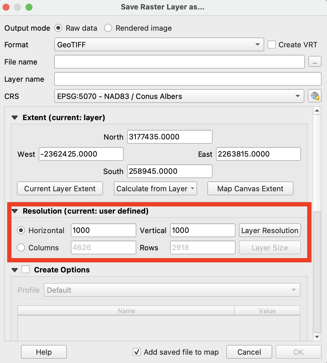
This reduced the width to about 4,600 pixels wide — large enough for any screen size needed. Here’s what the reduction of resolution looks like zoomed in, and out.
Step 2: Join the downsampled raster to the CSV
Next, I had to join the resulting raster to the CSV to get a map of fire regimes, rather than regional biophysical settings. I found the “reclassify raster by table” function in the QGIS Processing Toolbox. Here’s how it works: A table is created, mapping bands of raster values to new values. For instance, here’s what a logarithmic scale would map out to:
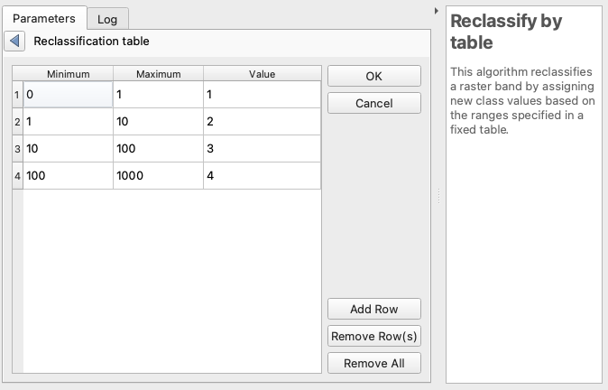
In the above, for instance, line 3 is saying any value greater than 10 and less than or equal to 100 will be reclassified as 3.
This is exactly what I needed! However, that QGIS GUI forces you to enter each row of this table one by one. I had 1,700+ possible values. 🥵 🥵 🥵
Luckily, it’s possible to do this programmatically with python, and the docs show you the syntax for that. If you haven’t used python inside QGIS before, don’t sweat it! There’s a python console you can add to your QGIS window by going to Plugins -> Python Console. The neat thing about QGIS is that each of the commands you choose in the GUI is essentially a python script you could run directly in the Python Console instead.
When you run a command in the GUI, checking the log tab will allow you to see how the parameters are formatted for a custom python script. Here’s how the parameters are organized for this algorithm, using the table example above:
{
 'DATA_TYPE' : 5,
 'INPUT_RASTER' : 'MYPATH/biophysical_settings_input.tif',
 'NODATA_FOR_MISSING' : True,
 'NO_DATA' : -9999,
 'OUTPUT' : 'MYPATH/reclassified_fire_raster.tif',
 'RANGE_BOUNDARIES' : 2,
 'RASTER_BAND' : 1,
 'TABLE' : [0,1,1,1,10,2,10,100,3,100,1000,4]
}
The table variable looks scary and messy, but is simply all the values in the above table concatenated with commas. I took my 1700 values and their corresponding fire return interval, and created this string using excel. The table was huge, but in python, that didn’t really matter. You can find the full table here and the full script here.
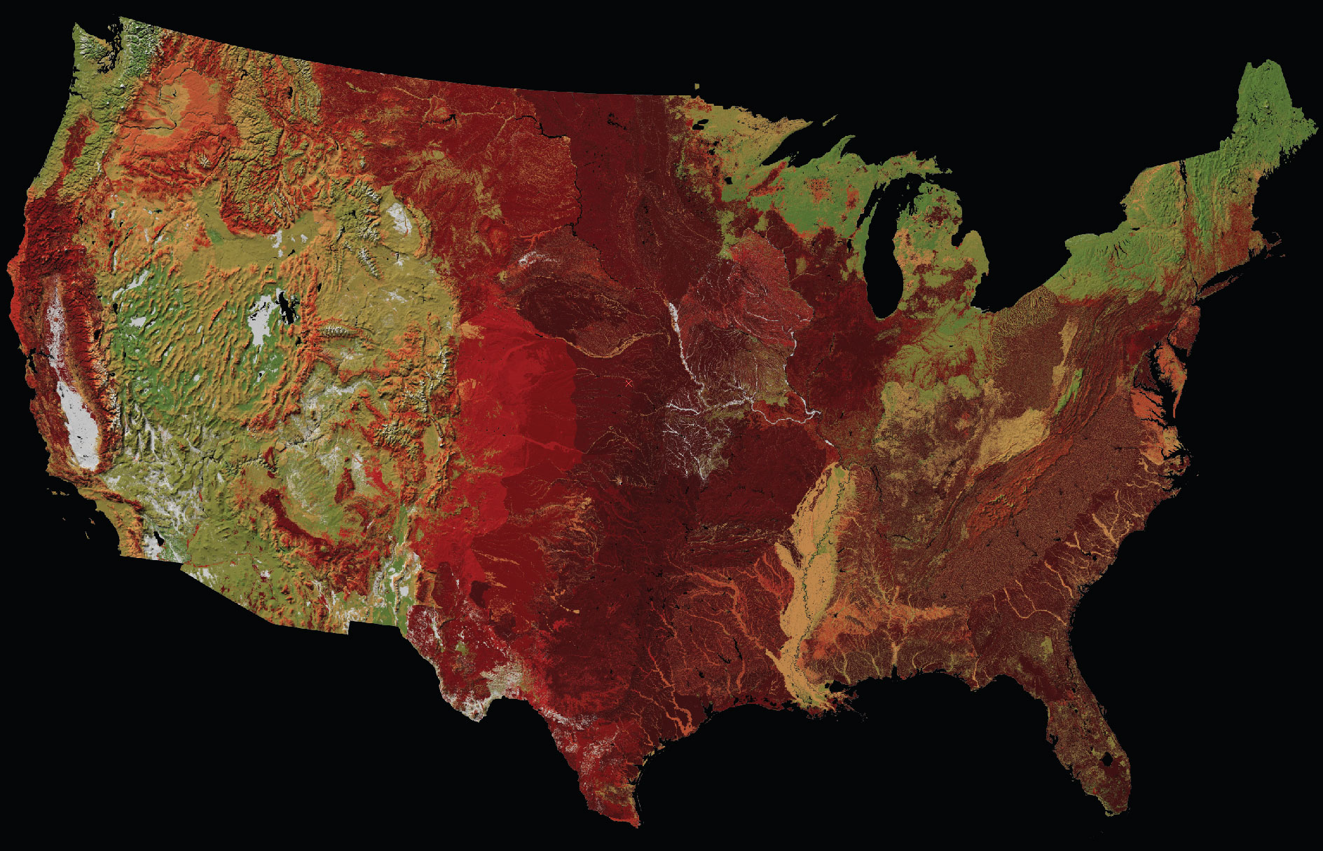
Step 3: Pick an accessible and compelling color ramp
While the range of years between fires in the LANDFIRE model is vast — from 1 (grasslands) to 10,000+ (Pacific Northwest conifer rainforests) — most places had fires at least every 50 years. So while I finally have a raster layer where each pixel is the average number of years between fires, the default visualized output isn’t meaningful yet.
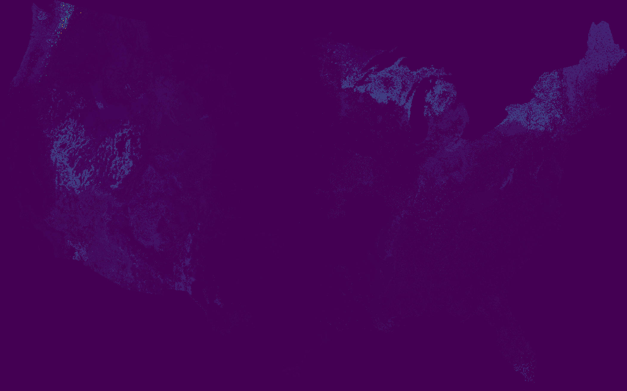 Everything is purple, I guess?
So I got to work trying to create a color ramp. My goal was to make a map that conveys where fires were and were not, drawing your attention especially to how that differs from where you expect and do not expect to see fires.
The data has a tightly grouped distribution, with some extreme outliers, creating a challenge for picking breaks. So I applied a sort of human-centric modified logarithmic scale. 1 year is extremely frequent, a fact of life. 10 years is pretty frequent. 50-100 years means a human would see one fire in their lifetime. 100+ years, for our purposes, corresponds with a “long time.” (For us humans, 100 years isn’t particularly different from 1,000 or 10,000 years.) Anthropocentric? Yes. Clear for our (human) users? I hope so.
After getting a framework for the breaks, I had to pick a color ramp. Intuitively the color ramp of red to green communicates the range of “frequent danger from fire” to “relative safety from fire”. But, I wanted the ramp to be color blind-friendly, which can be a challenge with red-to-green “diverging” ramps. So I tweaked and tweaked and tweaked until I found one I was happy with.
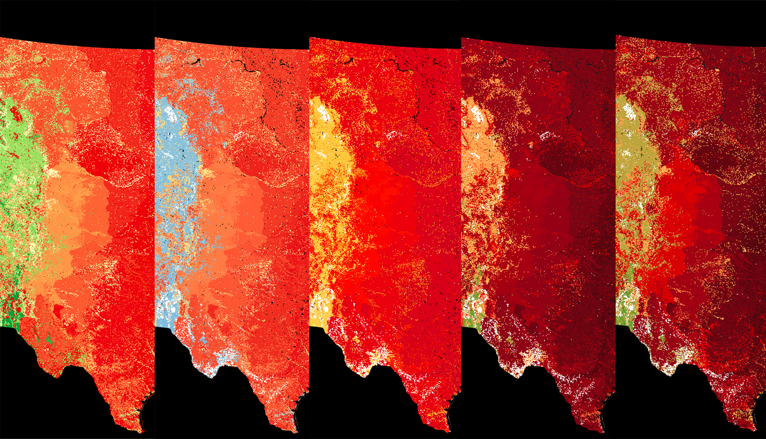 A progression of color ramp iterations
From a colorblind-friendly perspective, the result isn’t perfect, but I hope that it gets it pretty close. Since most of the map’s area falls in the range of 0 to 100 years, I decided to allow the color ramp to return past that point towards a saturated green. Thus, in almost all cases, for someone with color blindness, darker means more fire and lighter means less fire.
Here’s a simulation of what the map looks like for someone experiencing Deuteranopia, the most common form of color blindness.
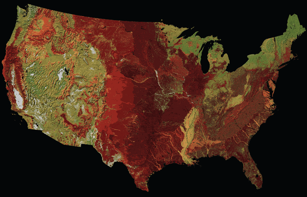
Step 4: Add a hillshade
I also applied a light hillshade. This helps add some context to the map, like how fire patterns follow mountains and rivers. And frankly, it just looks really pretty. There are many ways to do this, from bringing a raw DEM to QGIS (don’t forget about the scale attribute though) to using the more complex but always rich hillshade via Blender.
But since I only needed a fairly coarse continental U.S. map, I could use a premade shaded relief layer — Natural Earth’s 1:10m Shaded Relief — rather than make my own. . (Natural Earth has a server migration in process as I write this, so if that link doesn’t work, the full list of geo files can be found here.)
To get the hillshade to be visible from under the color ramp map, I have to blend the two together in QGIS. In the color ramp map, I set the “blending mode” setting to “multiply” and didn’t change any other settings.
See what a difference this makes:
With this in place, our map is done!
To see how this map fits into the larger narrative of our fire-prone continent, read our story.