 visuals + editorial graphics
How we used gigabytes of shipping data to show risks to endangered whales
Loading...
Hi, I’m Chiara Eisner, an investigative reporter for NPR. In November, NPR published an investigation that revealed the lack of U.S. government and industry protections for Rice’s whales, one of the rarest marine mammals in the Gulf of Mexico, and perhaps the whole ocean. At a known population of just 51 whales, experts calculate that the loss of more than a single whale every 15 years could lead to the extinction of the species.
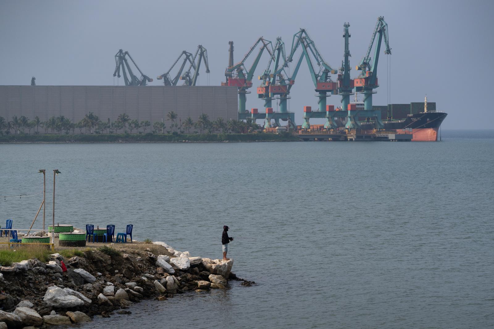
Among the most significant human threats to Rice’s whales is collisions with large ships. But in 2023, the U.S. agency responsible for protecting the whales, the National Oceanic and Atmospheric Administration, or NOAA, declined to put a speed limit in place to force ships to slow down in a part of the whales’ habitat.
A speed limit is already in place in the East Coast, to protect the endangered North Atlantic Right whales, a whale species with about seven times more members alive than Rice’s whales. All vessels over 65 feet long are required to slow down to below 10 knots through certain areas there. Those speed limits have been shown to decrease the chances of large whales dying after being struck by large boats.
Since NOAA did not introduce a similar rule for the Rice’s whale along its narrow habitat, I wanted to find out how many large ships recently traveled at speeds above 10 knots in the Gulf of Mexico — to start to show the extent of the risk for the whales dying or being seriously injured with no speed limit in place.
The question had not been addressed with the most recent publicly available data I found. So I reached out to Nick McMillan, NPR investigation desk’s data producer, to see whether we could perform an analysis on that data to get the answer. Later, we enlisted Daniel Wood to illustrate the findings. Here’s what they did.
Finding and organizing the data
Hey, this is Nick. I started out by breaking the problem into four parts:
Locating Data
Most large ships are required to have Automatic Identification System (AIS) devices that transmit location, speed and identity information. This data is available for download at MarineCadastre.gov, a joint effort between the Bureau of Ocean Energy Management and NOAA, featuring data from the U.S. Coast Guard’s AIS network.
Their dataset provides ship location and speed details in 1-minute intervals within the U.S. exclusive economic zone – including the Gulf of Mexico.
The annual data is organized in an HTML file, linking to a zipped CSV file for each day. To streamline the process, I wrote a script to generate the 365 URLs and then download and unzip each file.
I also had to make sure I had enough disk space: A year’s worth of data is over 300 GB!
Identifying Ships
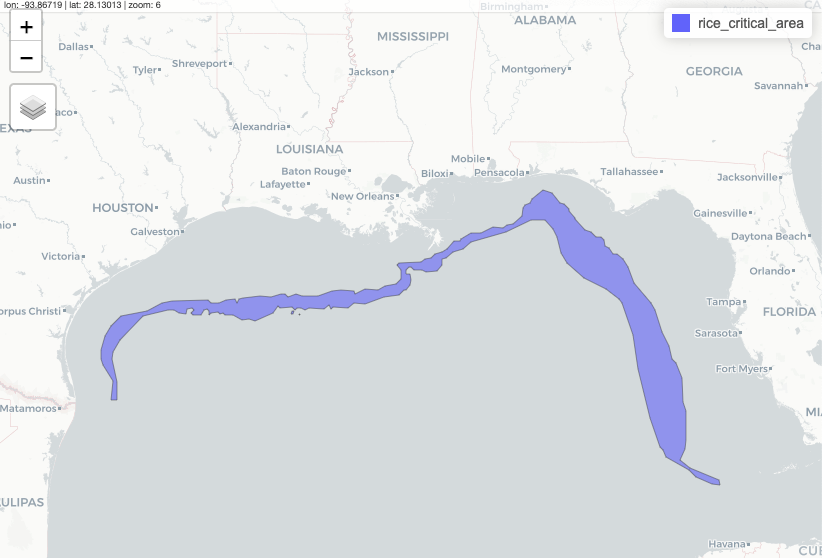
Next, I needed to identify which ships entered the proposed critical habitat area. NOAA provides the boundaries in a shapefile.
While any language works, I chose R and the sf package since it’s what I am most comfortable in.
With 365 files, each containing 6-9 million rows (more than 2 billion total!) reproducibility was essential in processing this data. This vast size also made it impossible to load the entire dataset into memory, so I would need to filter the data in batches.
To tackle this, I looped through all 2 billion points and classified whether they were inside or outside the habitat. I compiled a list of all ships (based on their transponder ID) that entered the habitat on a given date. Then, I extracted all points associated with these ships in order to later identify when a ship entered and exited the habitat.
I repeated this process for each daily file, filtering out any ships that never entered the habitat. Then I combined the results into one dataset of around 50 million points - a significant reduction from the initial 2 billion!
The AIS data from MarineCadastre is collected by land-based receivers, which have a shorter range than satellite receivers and depend on a clear line of sight. Satellite receivers have a larger scale of coverage but when ship density is high, signals can collide with each other. Therefore it made sense to find data from both sources.
It turns out that several companies compile this data. Global Fishing Watch, a group that publishes and analyzes international shipping data, was able to provide satellite-collected AIS data from Spire that they had processed.
This comprehensive approach paid off. In combining data from both land-based and satellite sources, I identified around 300 additional ships that the land-based receivers missed. When I mapped some of these ships, I found that the satellite data aligned seamlessly with the terrestrial data, confirming the effectiveness of this integrated approach.
Classifying a transit
Ships often pass through the Gulf of Mexico multiple times over a year. In light of this, our analysis focused on the number of total transits exceeding 10 knots, rather than simply determining if a particular ship ever traveled into the habitat above 10 knots. This approach allowed us to better understand the frequency and extent of potentially dangerous speeds for the whales.
AIS data isn’t perfect. It’s prone to glitches that can produce inaccurate outputs or can be deliberately altered to spoof locations. Additionally, ship operators might turn off their transponders. In dense shipping lanes, receivers may not catch signals from all ships. These factors (and others too in the weeds for this blog) were crucial considerations in cleaning the data and accurately classifying transits.
I assigned a unique transit ID to a ship’s points each time it entered or exited the habitat. I also initiated a new transit ID if more than 24 hours had elapsed between two AIS points.
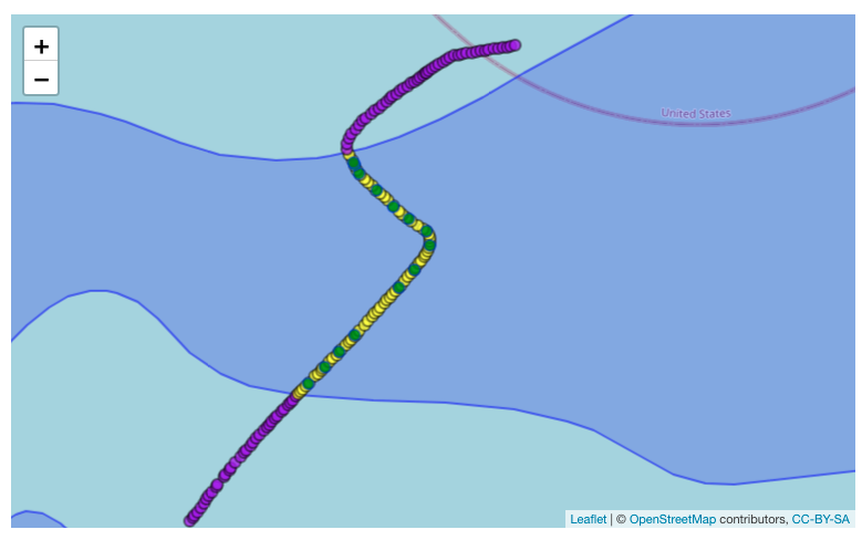 Purple dots = outside habitat, green dots are satellite AIS points, yellow dots are land based receivers
To check the assignment of transit IDs to AIS points, I grouped the number of points per transit. Here, I stumbled upon a curious anomaly: one ‘ship’ logged an extraordinarily high number of AIS calls, far surpassing any other, and it appeared to never leave the habitat. Intrigued, I did a quick Google search and found out that this wasn’t a ship at all – it was an oil platform. Given its stationary nature I removed it from our dataset.
As our focus was on ships that are at least 65 feet long, I needed to filter down the data. However for some ships, the AIS transmissions didn’t include length. Luckily, estimates from Global Fishing Watch helped to fill gaps for ships missing length information.
I could then filter out any ship under 65 feet and exclude specific vessel types like law enforcement, search and rescue, or military vessels (as these would be exempt from any speed restrictions).
Analyzing high speeds
The final piece of the analysis was determining the speed of each transit. I considered two different approaches.
The first methodology categorized a ship as speeding if there were two AIS points above 10 knots. Oceana, an international ocean conservation organization, uses this method in their speed zone compliance analysis for the endangered North Atlantic right whale.
The second method is a distanced weighted average speed for the entire transit and was used in a vessel speed rule assessment published by NOAA. While both are valid techniques to measure speed, I went with this one because it controls for the fact that AIS transmission rates vary based on ships’ speeds. Also, the average speed for a transit was easier to explain than two AIS points above 10 knots. However, I tested both methodologies and arrived at similar results.
For the distance-weighted average speed, I first calculated the distance traveled and speed for each segment between two AIS points. Then I multiplied the segment’s speed by its fraction of the total transit distance. Finally I summed the products to arrive at an average speed for the entire transit.
In our analysis of 2022 data, we examined about 64,000 transits made by more than 6,500 ships crossing the whale habitats. We found that in 80% of journeys, ships were traveling at an average of more than 10 knots — speeds at which crashes with whales are known to lead to whale death or serious injury. This answered Chiara’s original question. It showed that without a speed limit in place, Rice’s whales are at a high risk of death or injury due to ship strikes in the Gulf.
How we animated ship traffic
Hi! Daniel Wood here, a graphics reporter at NPR. After Nick processed the data, I was tasked with making a visualization that adds some visual heft to his data reporting.
Initially, I thought that a heatmap of ship points or line density of the paths would be a good way to visualize the heavy traffic in the Rice’s whale’s habitat. But showing a heat map would essentially just show the different trade routes that transect the whale’s habitat — so what? How does that show ship speed? How does that show the near constant nature of this traffic?
Instead, I wanted something that reflected the kinetic buzz of the hundreds of ships crossing the Rice’s whales’ habitat daily. Not just density, but the constant zipping of fast tankers and container ships through this narrow strip of ocean. Something, essentially, like a game of Frogger for whales.
Settling on an approach
I remembered two talks from NACIS in 2019, one by K.K. Rebecca Lai and Denise Lu and the other by Dylan Moriarty. In both, they discussed several different workflows that pushed cartography out of QGIS and Illustrator and into code and the command line. In the last 4 (!!!) years since these talks, our team has made use of aspects of these workflows to simplify, reclassify, crop and style large amounts of data (examples here, here and here).
For this project, I took inspiration from their examples and tried to utilize code as much as possible. This gave me several advantages over my typical workflow inside the QGIS GUI:
-
Ability to handle large amounts of data: We started with more than 2 billion ship locations from all of 2022 (gigabytes of data) and needed a process that filtered it without breaking anything.
-
Reproducibility: I could tweak upstream analyses or swap out data and propagate the results downstream into the final map without repeating too many steps.
-
Version control and shareability: The work can be easily fact checked, shared, and stored for the future.
Building the animation
In order to shore frenetic ship transits throughout the habitat, I needed to take ship point data and make it into ship line data.
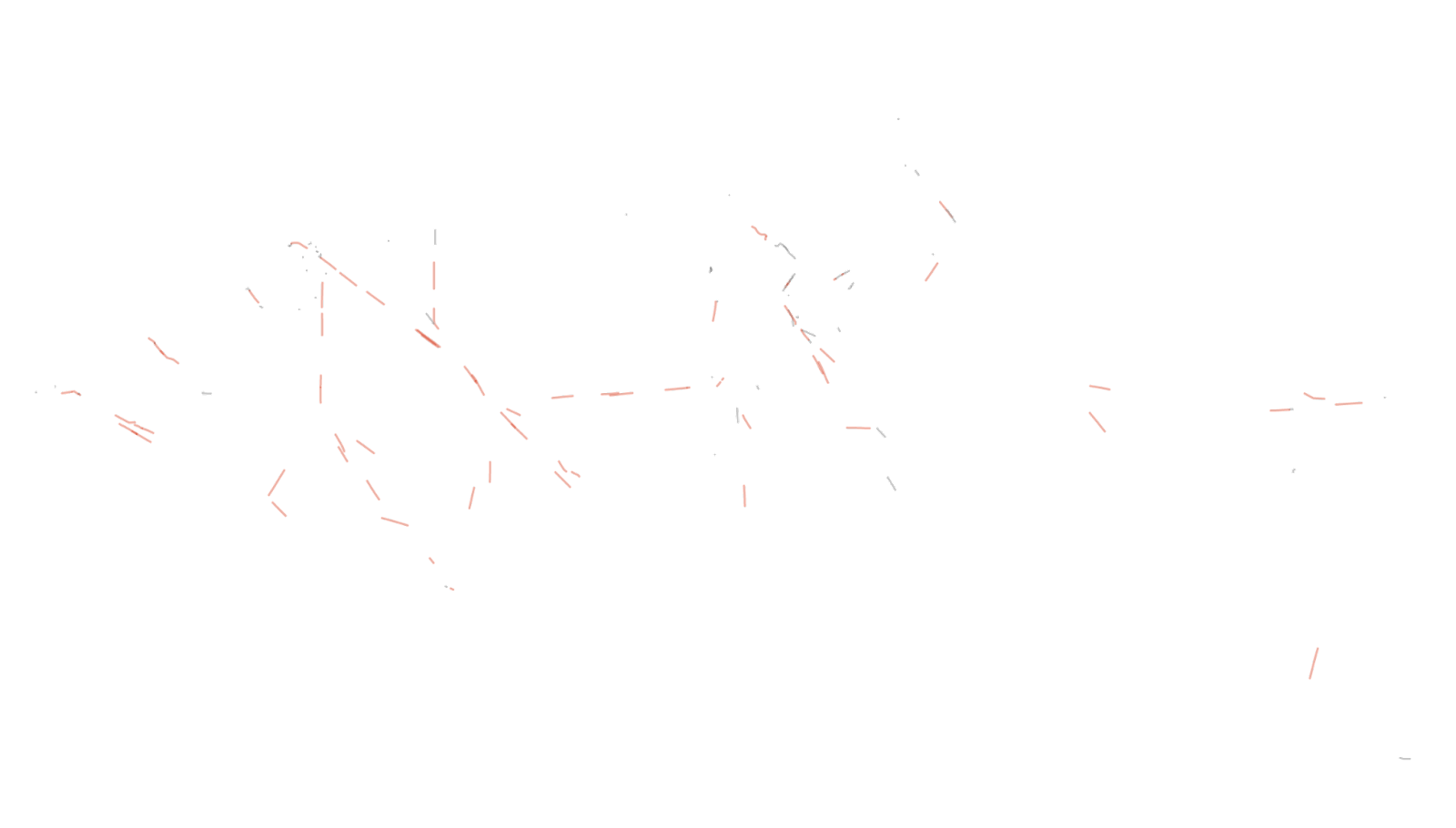
For any duration of a transit that was “speeding,” I wanted the line to be colored red. Thus I needed to take these points, arrange them sequentially, and then split the lines into segments based on whether or not they were speeding.
Looking at an example set of points representing two ships, here’s what I needed:
Luckily, Nick’s transit analysis flagged whether the boat was speeding, and created a unique speeding ID for each time a ship entered or left this speeding threshold. Using this unique ID and the ship’s ID, I was able to group points and then transform them into lines using this nifty bit of geopandas code.
Initially, I thought I’d split the data into daily chunks, and create a gif or looping video, to show the heavy traffic. Here’s what that roughly would have looked like (without the speeding highlighted):
To me, this was too busy, and not intelligible without some serious hand holding.
Instead I decided to split the data into hour by hour chunks. Creating a week of hourly data would generate 168 files (24 hours * 7 days). Nick and I chose a period for our animation, March 1-7, 2022, and extracted this slice from his dataset, creating 168 unique hourly geojson files.
The raw ship data is highly detailed, and it really doesn’t have to be. To simplify each geojson, I used mapshaper (using the subprocess library, which lets you run command line tools in python), creating a further 168 simplified files that were about 50-75% smaller, with virtually no perception of loss at our desired zoom level.
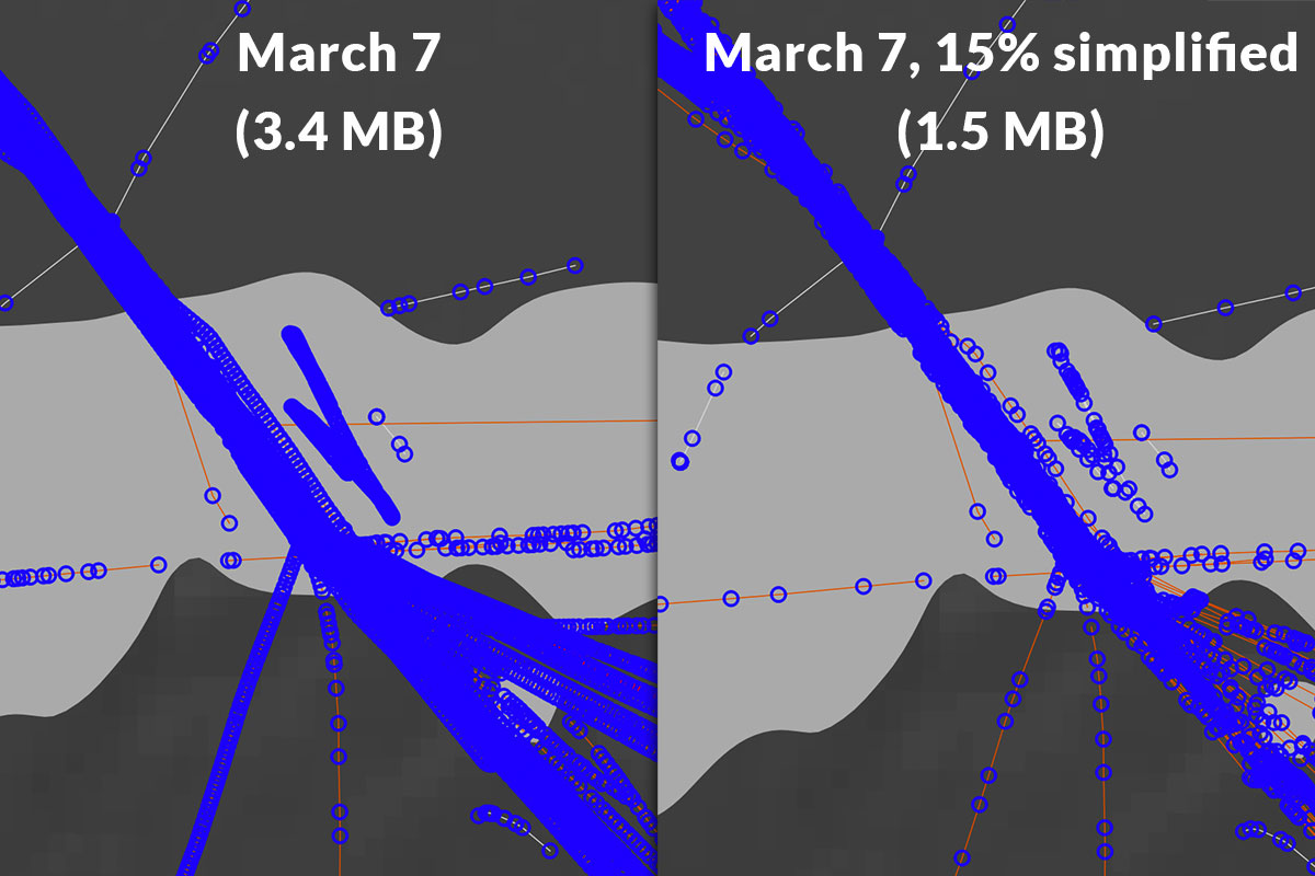
Example of a section of data from March 7, before and after simplification.
Transform 168 geojsons into a looping map
Taking more inspiration from those NACIS presentations, I got to work turning the geojsons into stackable, styled pngs. In order to do this, I had to first convert them into a styled svg. This is possible in mapshaper in one (not so simple) command. One crucial part of this is clipping the resulting file to a bounding box that every file will share, thus making them perfectly stackable. Here’s an example of the command in the command line:
mapshaper geojson/geoPathIn.geojson
-proj '+proj=lcc +lat_0=28.5 +lon_0=-91.3333333333333 +lat_1=29.3 +lat_2=30.7 +x_0=1000000 +y_0=0 +ellps=GRS80 +towgs84=0.9956,-1.9013,-0.5215,-0.025915,-0.009426,-0.011599,0.00062 +units=m +no_defs' \
-style stroke-width=1.25 stroke="#999999" opacity=0.5 \
-style where="is_speeding_10 == true" stroke="#D8472B" \
-o svg/svgOut.svg \
 \
svg-bbox="357381.903,-520316.781,-520316.781,355374.271"
Note, there are two style calls: one for all line segments, and another to further style the “speeding” lines into a red color. I ran the above svg command for every one of the 168 simplified geojson files, using a loop.
From there, I used the npm svgexport module (with subprocess/python) to convert the resulting svg files into semi-transparent png files.
Here’s an example file, but it doesn’t look like much yet.
 Single hour of ship traffic in the gulf, without basemap
Create a basemap (outside of code workflow)
I created an extremely simple basemap, using gray earth from Natural Earth, and some Natural Earth coastlines for added oomph. For the proposed critical habitat of the Rice’s whales, I got the data from NOAA. To line it up, I used the same projection and bounding box that I used in the mapshaper script. Easy peasy.

Combine it all in a video editor
In theory, I could stack these pngs into a gif using code. But with so many frames, I wanted to use an mp4 video instead of a gif, since that would result in a clearer, less lossy image.
After stacking these images on top of the basemap, I added text to indicate the date at any given time.
Refining the finished product
Finally, I decided to add a semi-transparent layer under the “active” hour of ships that shows all the other ship tracks up to that point. I tweaked the script to capture not just the Nth hour’s ship traffic but all ship traffic from hour 0 to hour N.
Placing the resulting data under the “active” data shows the relentless nature of ship traffic in the area where the vulnerable Rice’s Whale lives.
With this, and a nifty legend in place, our map is pretty much done!
To see how the analysis and map fit into the larger piece, read the story here.
Loading...