 visuals + editorial graphics
Making Data Tables Responsive
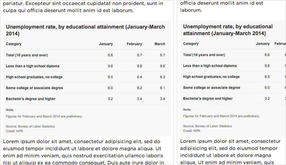
Left: A data table on a desktop-sized screen.
Right: The same table on a small screen, too wide for the viewport.
The Problem
Data tables with multiple columns are great on desktop screens, but don’t work as well at mobile sizes, where the table might be too wide to fit onscreen.
We’ve been experimenting with a technique we read about from Aaron Gustafson, where the display shifts from a data table to something more row-based at smaller screen widths. Each cell has a data-title attribute with the label for that particular column. On small screens, we:
- Set each
<tr>and<td>todisplay: block;to make the table cells display in rows instead of columns - Hide the header row
- Use
:before { content: attr(data-title) ":\00A0";to display a label in front of each table cell
It works well for simple data tables. More complex presentations, like those involving filtering or sorting, would require more consideration.
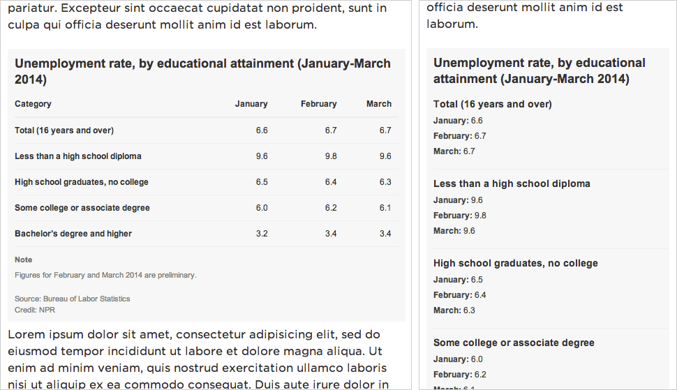
Left: A data table on a desktop-sized screen.
Right: The same table on a small screen, reformatted for the viewport.
The Data
We’ll start with some sample data from the Bureau of Labor Statistics that I’ve dropped into Google Spreadsheets:
The Markup
Use standard HTML table markup. Wrap your header row in a thead tag — it will be simpler to hide later. And in each td, add a data-title attribute that corresponds to its column label (e.g., <td data-title="Category">).
<table>
<thead>
<tr>
<th>Category</th>
<th>January</th>
<th>February</th>
<th>March</th>
</tr>
</thead>
<tr>
<td data-title="Category">Total (16 years and over)</td>
<td data-title="January">6.6</td>
<td data-title="February">6.7</td>
<td data-title="March">6.7</td>
</tr>
<tr>
<td data-title="Category">Less than a high school diploma</td>
<td data-title="January">9.6</td>
<td data-title="February">9.8</td>
<td data-title="March">9.6</td>
</tr>
<tr>
<td data-title="Category">High school graduates, no college</td>
<td data-title="January">6.5</td>
<td data-title="February">6.4</td>
<td data-title="March">6.3</td>
</tr>
<tr>
<td data-title="Category">Some college or associate degree</td>
<td data-title="January">6.0</td>
<td data-title="February">6.2</td>
<td data-title="March">6.1</td>
</tr>
<tr>
<td data-title="Category">Bachelor’s degree and higher</td>
<td data-title="January">3.2</td>
<td data-title="February">3.4</td>
<td data-title="March">3.4</td>
</tr>
</table>
The CSS
<style type="text/css">
    body {
        font: 12px/1.4 Arial, Helvetica, sans-serif;
        color: #333;
        margin: 0;
        padding: 0;
    }

    table {
        border-collapse: collapse;
        padding: 0;
        margin: 0 0 11px 0;
        width: 100%;
    }

    table th {
        text-align: left;
        border-bottom: 2px solid #eee;
        vertical-align: bottom;
        padding: 0 10px 10px 10px;
        text-align: right;
    }

    table td {
        border-bottom: 1px solid #eee;
        vertical-align: top;
        padding: 10px;
        text-align: right;
    }

    table th:nth-child(1),
    table td:nth-child(1) {
        text-align: left;
        padding-left: 0;
        font-weight: bold;
    }
Above, basic CSS styling for the data table, as desktop users would see it.
Below, what the table will look like when it appears in a viewport that is 480px wide or narrower:
/* responsive table */
@media screen and (max-width: 480px) {
    table,
    tbody {
        display: block;
        width: 100%;
    }
Make the table display: block; instead of display: table; and make sure it spans the full width of the content well.
thead { display: none; }
Hide the header row.
    table tr,
    table th,
    table td {
        display: block;
        padding: 0;
        text-align: left;
        white-space: normal;
    }
Make all the <tr>, <th> and <td> tags display as rows rather than columns. (<th> is probably not necessary to include, since we’re hiding the <thead>, but I’m doing so for completeness.)
    table tr {
        border-bottom: 1px solid #eee;
        padding-bottom: 11px;
        margin-bottom: 11px;
    }
Add a dividing line between each row of data.
    table th[data-title]:before,
    table td[data-title]:before {
        content: attr(data-title) ":\00A0";
        font-weight: bold;
    }
If a table cell has a data-table attribute, prepend it to the contents of the table cell. (e.g., <td data-title="January">6.5</td> would display as January: 6.5)
    table td {
        border: none;
        margin-bottom: 6px;
        color: #444;
    }
Table cell style refinements.
table td:empty { display: none; }
Hide empty table cells.
    table td:first-child {
        font-size: 14px;
        font-weight: bold;
        margin-bottom: 6px;
        color: #333;
    }
    table td:first-child:before { content: ''; }
Make the first table cell appear larger than the others — more like a header — and override the display of the data-title attribute.
    }
</style>
And there you go!
Extra: Embed This Table Using Pym.js
At NPR, when we do simple tables like these, they’re usually meant to accompany stories in our CMS. To avoid conflicts, we like to keep the code for mini-projects like this graph compartmentalized from the CMS — saved in separate files and then added to the CMS via an iframe.
Iframes in a responsive site can be tricky, though. It’s easy enough to set the iframe’s width to 100% of its container, but what if the height of the content varies depending on its width (e.g., text wraps, or an image resizes)?
We recently released Pym.js, a JavaScript library that handles communication between an iframe and its parent page. It will size an iframe based on the width of its parent container and the height of its content.
The Table (To Be iFramed In)
At the bottom of your page, add this bit of JavaScript:
<script src="path/to/pym.js" type="text/javascript"></script>
<script>
    var pymChild = new pym.Child();
</script>
- Sub out
path/to/with the actual published path to the file.
The Parent Page (The CMS)
This is what we’ll paste into our CMS, so the story page can communicate with the graphic:
<div id="jobs-table"></div>
<script type="text/javascript" src="http://blog.apps.npr.org/pym.js/src/pym.js"></script>
<script>
    var jobs_table_parent = new pym.Parent('jobs-table', 'http://blog.apps.npr.org/pym.js/examples/table/child.html', {});
</script>
#jobs-tablein this case is the containing div on the parent page.- Sub out all the
path/to/references with the actual published paths to those files.
Advanced: Responsive Data Tables Made Easier With Copytext.py
It’s rather repetitive to write those same data-title attributes over and over. And even all those <tr> and <td> tags.
The standard templates we use for our big projects and for our smaller daily graphics projects rely on Copytext.py, a Python library that lets us use Google Spreadsheets as a kind of lightweight CMS.
In this case, we have a Google Spreadsheet with two sheets in it: one called data for the actual table data, and another called labels for things like verbose column headers.
Once we point the project to my Google Spreadsheet ID, we can supply some basic markup and have Flask + Jinja output the rest of the table for us: