 visuals + editorial graphics
The science of the Science of Joy
Working with the Science desk, we built the Joy Generator to do two things: Teach users about the science of happiness, but also bring them a little burst of good feeling in a pretty grim year. While there are similarities to our older Look At This projects, covering such a wide range of material brought novel challenges.
Design by iteration
Connie:
I made my first design mock-up for this project in December 2020. Six months and many more mock-ups later, some elements of the final project still match those original prototypes. But much of the look of the Joy Generator evolved through a long process of testing and refining, over and over again.
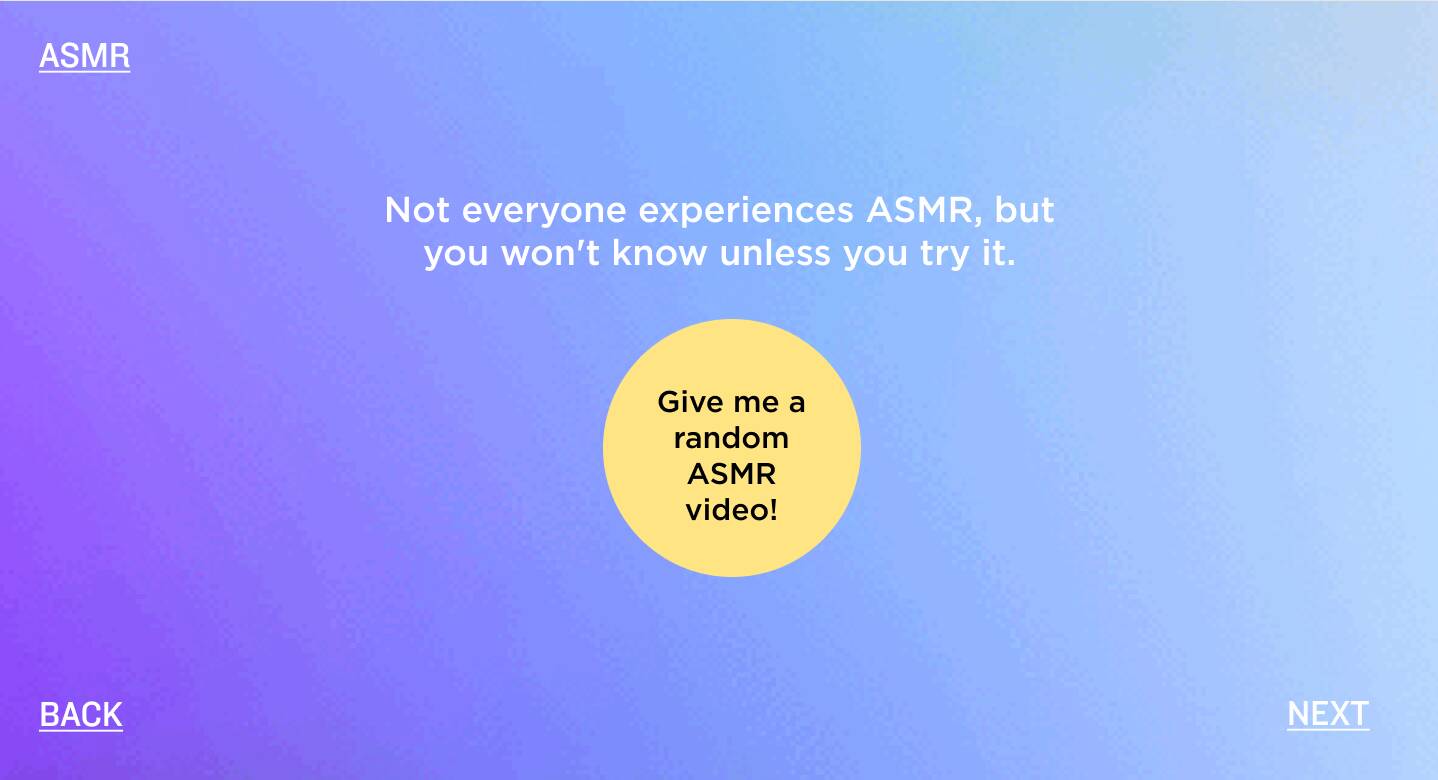 A slide from the first design mock-up of the ASMR chapter in December.
From the start, we had a few goals for the project design:
- With multiple stories and types of interactives, giving consistent visual cues of where to look and click was important, as well as making sure the reader wasn’t lost.
- The variety of stories meant a huge range of visual assets, so finding a way to unify the look of the project — through color, type, art direction, etc. — was key.
- And most critically, we wanted the generator to feel fun. As the pandemic and various other crises unfolded, it felt like a small act of defiance to work on a project so centered around joy. We wanted to inject some of that deliberate happiness into the design, and take the opportunity to do something different from our more typical interactive project design.
The team would work on a couple chapters at a time, splitting up the work. Especially at the beginning, the chapters felt very different from each other. We’d then iterate on those chapters, developing a better sense for what kinds of storytelling felt effective in this context. And the stories, while never becoming cookie-cutter, started to converge around a more consistent aesthetic. Later chapters then became easier to conceptualize and execute.
One specific area of design that underwent a lot of changes was the sketchy, hand-drawn look of the generator. Before we had many visual assets to work with, I had drawn doodles in the initial wireframes to give the impression of backgrounds. They felt fun and joyful, so we decided to incorporate them into the generator somehow.
 My early wireframe doodles that inspired the sketchy style
Initially, we took a direct route – Thomas set up some code to animate SVGs and we tried to directly add small doodles to the project. This style seemed to match what we were doing in the content of the Joy Generator. Just like we were playfully pointing out the science behind joy, we could similarly visually annotate the project.
Thus, many early versions of the generator had elements annotated by thin lines in order to mimic that hand drawn style. You can see the remnants of this style in the squiggles on the landing page of the project – the only element that survived the following iterations.
 Examples of earlier button and chapter styles. The buttons had an additional squiggle around their edges, and headers were underlined or circled.
That still didn’t feel completely right though. Especially against the busy video backgrounds, the squiggles felt simultaneously too busy, yet not prominent enough. They also didn’t look hand-drawn enough, but animating SVGs that were more textured proved to be a difficult task.
Instead, after more experimentation, we landed on using brush strokes as backgrounds in prominent buttons and chapter titles. That solved our previous issues – they were simple, appeared distinctly hand-drawn and immediately drew the eye.
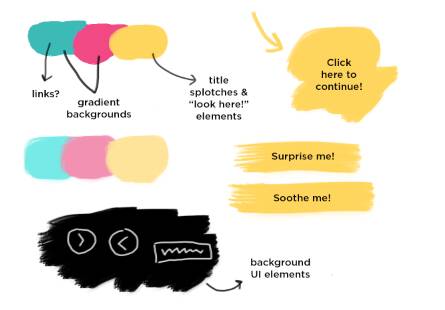 My brainstorm board for the brush round of iterations – note the attempt at introducing more colors
Early on, we came up with the idea of using yellow as the main focus color, with the idea that it would pop against different backgrounds to draw attention to buttons, links or titles. At several points, we considered incorporating additional spot colors. But it never seemed completely necessary, since we were using interstitial videos for almost all of the backgrounds in the project, and the yellow was taking care of the rest. Later on, we ended up swapping out all the interstitial videos for the same colorful animated gradients, which definitely helped unify the look of the generator.
The iteration cycle is especially apparent with the play button. We struggled to come up with a design that felt noticeably hand drawn, yet simple enough to recognize at a small size, and also could convey both a play and progress state. Only by trying a lot of things and tweaking the design after each round of feedback did we arrive at the final look.
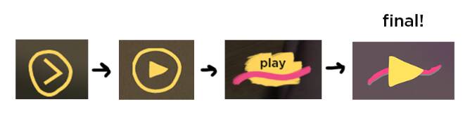 All of the play button designs I could find screenshots for, though we tried and scrapped many more.
Content-first components
Thomas:
Although it presents as a single-page application, similar to the “stories” that have become common on social networks, the Joy Generator is actually closer in spirit to a classic hypermedia document: All of its content lives in the page itself, and then we upgrade into the story interface using a library of web components.
While this isn’t the first time that we’ve used web components in a big project, it is the first time we used the shadow DOM extensively. Essentially, this is an API that lets you create a private section of the page inside an element that’s isolated from styles and JavaScript outside, similar to the way a <video> tag’s internal structure is hidden away.
Where this becomes really powerful and interesting is when you add <slot>, a new tag that “re-parents” an element’s children into a specific part of the shadow tree, but still leaves them in the “light” DOM for styling and access. For example, our custom <state-check> component uses a slot to let us easily set the label for a “smart” options checkbox, just by writing the contents like we would any other HTML tag. Here, we’ve created a <state-check> with the contents “Autoplay video” inside.
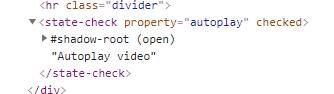 A
A <state-check> seen from the outside.
Inside the <state-check>, the markup is actually much more complicated than it appears from outside, but our label text is “revealed” in the slot at the correct location.
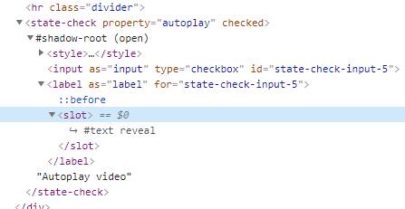 The same
 <state-check> with its shadow root open to reveal the slot for the label contents (“#text reveal” is replaced with “Autoplay video” for the user).
As far as our CSS is concerned, the contents of these labels are still just child elements inside of <state-check>, and they can be styled using our regular Less variables and macros. Almost every component in the Joy Generator uses slots to wrap content this way, including the <web-story> component that contains each chapter and controls its pagination and flow.
A good rule of thumb in this architecture is to use the shadow DOM when necessary, but no more. As much as possible, we kept styling for content in the light DOM, and only used the shadow for the interactive parts of a component that it generates for itself. We used CSS custom properties to export our Less values, treating the latter as the source of truth for colors and layout.
Visualizing Audio
Thomas:
Sound is an important part of NPR’s identity, but it’s not a popular format on the Internet. We know from metrics that, given a choice, most people visiting our projects don’t listen to the audio content for a variety of reasons, no matter how compelling we try to make it. And of course, there are accessibility concerns if you require sound for a story, as not everyone is equally capable of hearing it.
That said, part of the whole point of the Joy Generator was to not just write about soothing experiences, but to bring them to the audience directly. For chapters on ASMR and natural sounds, that meant we needed a way to integrate audio clips without abandoning users who won’t (or can’t) listen to them.
We started by adding closed captioning to several audio clips, using the browser’s built-in <track> elements and VTT caption files. As the browser plays audio, it issues “cuechange” events on the relevant track tags, which are displayed with a <closed-captions> component. In general, the modern web makes this easy to do. If you’re building a project where there’s significant audio, you really have no excuse not to provide closed captions or subtitles.
In testing, we found that the captions were not only appreciated, but users wanted more of them. They also appreciated having a heads-up when a chapter would have sound as a primary component, so we added tags to each title page and the “browse all” interface that noted when headphones would be required. This was also a nice opportunity to flag chapters with interactive toys, like the do-it-yourself blackout poetry block, in case people were interested in those specifically.
To give audio a little extra visual pizzaz, we also added a waveform visualizer component to the background. Using an AudioContext from the Web Audio API, it’s possible to get samples from a live media stream, and then draw the resulting wave to a canvas. In browsers that don’t support the capture stream API (namely, Safari), we fake it with some summed sine waves.
Testing
Connie:
We can’t talk about iterative design without mentioning the invaluable role that user testing played in the design of the Joy Generator. Once our interactive projects are done, we usually recruit a couple outside people to go through the app and give their impressions. For the generator, we had the foresight to test earlier in the development process than usual – a month before launch instead of a week.
Testing that early meant that users were seeing an unfinished product, but we were also able to change significant parts of the structure and design of the project based on their feedback. The main issue that testing revealed was that most users were confused to some degree about the structure and flow of the generator. Users seemed unsure of what to do when initially loading into the project, and later on, were confused about where to go next after reading a story.
To solve that larger problem, we made a number of changes. For example, originally you had to read through several introductory slides before arriving at the landing page of the project. The landing page then offered two buttons for your choice of story: “Surprise me!” or “Soothe me!” The idea behind the buttons was to give users the illusion of a fun choose-your-own adventure structure without actually building one out. Both buttons actually did the same thing and brought you to a random story.
After testing feedback, we tried a number of solutions, but eventually ended up scrapping the intro slides and writing more descriptive text on the landing page. We also removed the two surprise/soothe me buttons from both the landing page and the ending slide of each story. Instead, they were replaced with buttons that clearly stated their actual action – to “get more joy” (go to a story) or “browse all stories.” That seemed to reduce the amount of decision-making and clicks users had to do, as well as remove some confusion.
User testing also helped us refine the design of countless other elements and add features to improve accessibility. Another benefit of testing so early was that it helped us catch about a million – I’m exaggerating, but only a little – video and audio bugs in Safari, which we spent a significant amount of time fixing.
The Wilderness
Thomas:
As Connie notes, this brings us to the elephant in the room: Safari on iOS. The Joy Generator pushes boundaries on browser multimedia in a lot of ways, so it would not be unusual to encounter some compatibility issues across the web ecosystem, but the vast majority of our dealbreaker bugs were in one browser only. Here’s a few that we’ve run into on this project alone:
- Safari seems to have a soft limit on how many video tags it will allow to load on the page, and once you cross that limit, it will simply halt loading. No errors are thrown–the video just silently fails. To get around this, I built a custom element that wrapped many of the video tags in the project, and only actually placed a
<video>in the document when an Intersection Observer said they were visible, which is an enormously complicated and pointless hassle. - Similarly, video poster images sometimes refuse to load for no known reason. As a workaround, the
<simple-video>element fakes the poster with an image overlay instead of going through the video element itself. - Completing the trifecta of video quirks, Safari (both mobile and desktop) is the only major browser that grants autoplay on a per-player basis, instead of per-page. That means that if we want to play multiple videos with sound on, we have to route it through a single element for playback in multiple locations, or require users to manually unmute each individual video. Neither of these is an appealing option.
- If any input has a text size that’s smaller than 16px, focusing that input will cause the browser to zoom in on it without warning. As a result, we have to set the “font size” for the color picker on the zen doodle drawing toy, even though there’s no actual font anywhere in sight for that input.
- Audio tags in every browser have a volume property, which developers can use to set the gain on a media clip. However, in Safari, this property is read-only, and it silently ignores any change you make. For the nature sounds mixer component, we had to instantiate a new Web Audio context and wire the tags into its processing graph. Good thing we had that practice from the audio visualizer!
- Safari does not reliably support the full-screen API, which we would love to use on immersive experiences to hide the browser’s intrusive (and finicky) toolbars.
- Because Safari places those toolbars at both the top and bottom of the screen (other mobile browsers just pick one or the other), pages have to be designed to lose significant vertical real estate at any time. We eventually ended up using CSS custom properties to create reliable viewport units so that we could place UI at the top and bottom of the screen without overlapping content.
There have been other “problem browsers” in the past — I lived through IE7. But on desktop computers, there are alternatives: Worst-case, we can ask users to switch to another browser. On iOS, however, Apple does not allow anyone in their App Store to actually build a competing browser engine. (Although Chrome and Firefox are both native apps on iOS, they are simply thin wrappers around a Safari webview.) Apple says Safari is “the best way to experience the internet”–the joke is that it’s the only way.
The result is that the web on mobile–which is, for many people, their primary device–is forced to limit itself to keep pace with Safari. Many iOS users may have no idea that a browser can handle complex real-time interactions, play immersive games, or run applications while offline. When Apple cares about something in Safari, it’s clearly capable of doing superior work: Safari’s JavaScript performance is excellent. However, for our digital storytelling purposes, we’re rarely limited by JavaScript execution speed. What we need are more consistent multimedia and layout behaviors compared with other browsers. As developers, it’s frustrating to realize that we’re simply unable to deliver a first-class experience on a platform used by roughly a third of our audience.
(We should note here, in the interest of transparency: Google and Apple are both financial supporters of NPR.)
In the end, while this has negative effects on all our work, it ultimately causes the most harm to iOS users themselves. In the Joy Generator, our video transitions are less smooth in Safari, the interactive segments are harder to use, and loading times are longer.